

The current monetary policy tightening cycle has seen the fastest increases in the fed funds rate in more than 40 years. While not all tightening cycles have led to significant increases in mortgage rates (e.g., the 1988, 2016, and 2004 cycles), this time around mortgage rates have increased by close to 400 basis points (bps) in the first seven months since lift off (see figure A1 in the appendix). In this Chicago Fed Letter, we describe how this increase has shaped (and is still shaping) the dynamics of the housing sector.
The behavior of the housing sector thus far
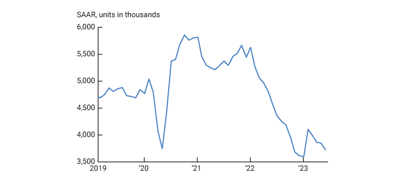
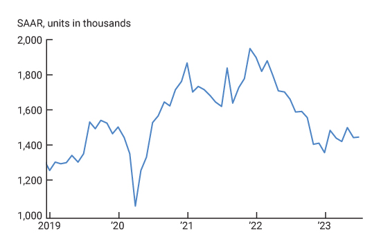
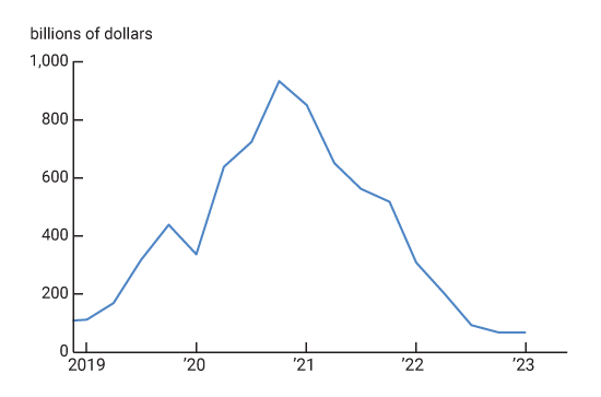
We begin with figure 1, which shows housing starts between January 2019 and July 2023. We see that between March 2022 (when the Fed started raising rates) and the end of 2022, the housing sector behaved pretty much like one would expect during a monetary tightening cycle: Starting from their high post-Covid-19 pandemic levels, housing starts decreased steadily.1 It is safe to associate this decrease with a contraction in demand, since figure 2 shows that the year-over-year house price growth decelerated sharply from some extremely high post-pandemic growth rates.
1. Housing starts, January 2019 to July 2023
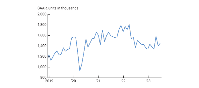
Source: U.S. Census Bureau from Haver Analytics.
2. Federal Housing Finance Agency Price Index: Purchase only
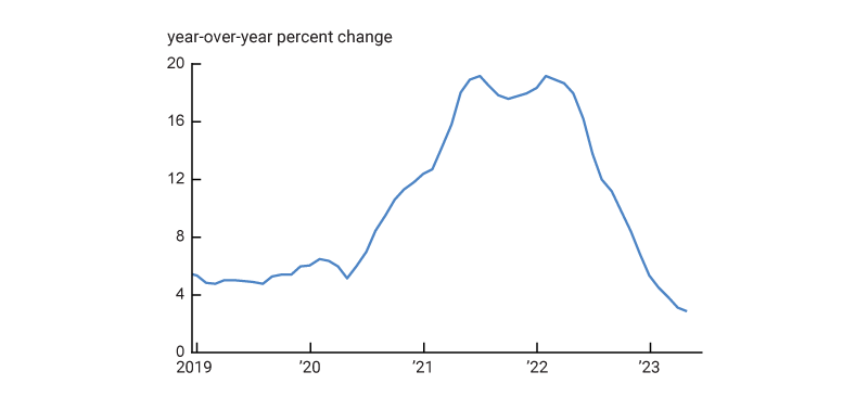
Source: Federal Housing Finance Agency from Haver Analytics.
After experiencing such a normal response to a tightening cycle, the behavior of the housing sector has become quite puzzling during the first half of the current year. Namely, housing starts stabilized at relatively high levels (see figure 1), despite mortgage rates remaining high. In addition, figure 2 shows that this strength in the construction sector took place while house price growth continued to decelerate. In what follows, we provide what we believe is a plausible account of what happened to the housing sector during the first half of the current year.
The key piece of the puzzle, in our view, is the behavior of refinancing activity. Refinancing volumes (shown in figure A3 in the appendix) peaked and started to decrease well before the start of the tightening cycle, during a period in which mortgage rates were at historically low levels. This suggests that most mortgages were able to be refinanced at interest rates well below those that could be obtained later.
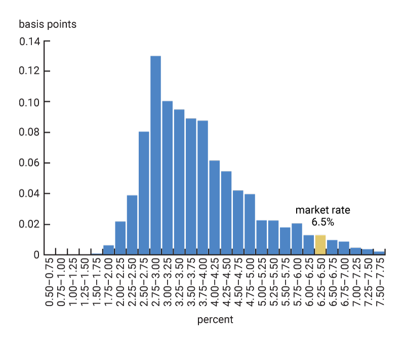
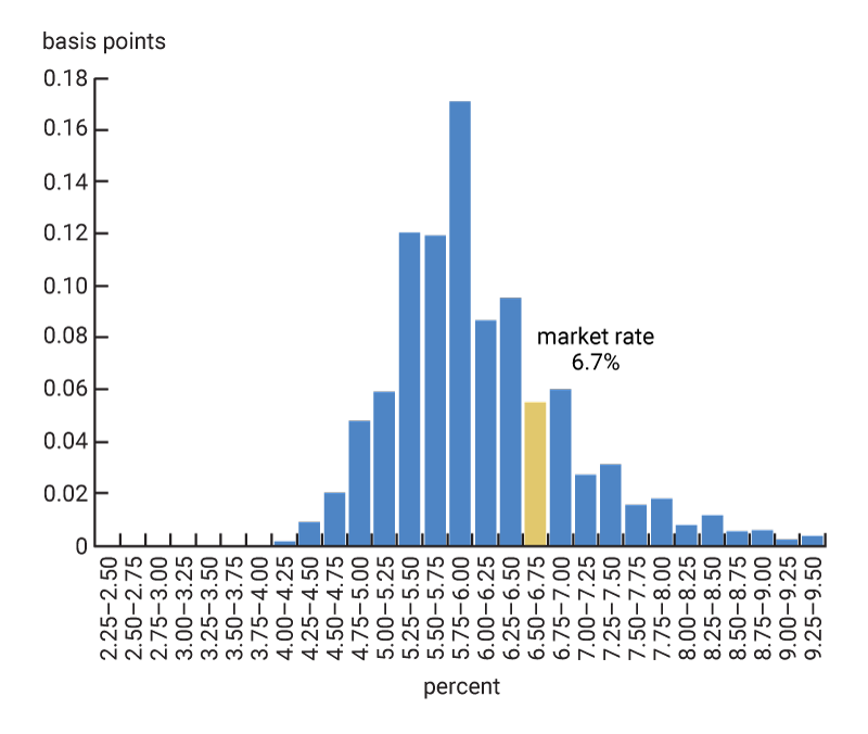
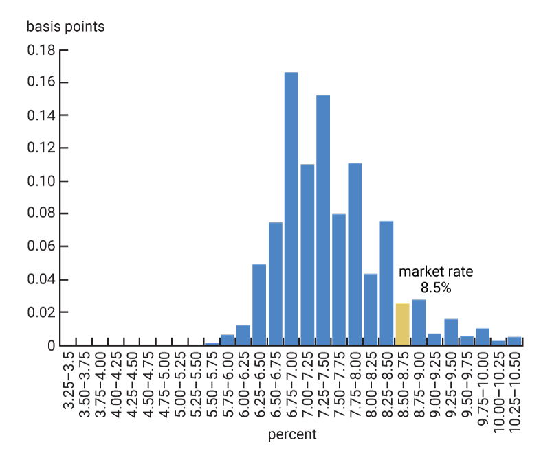
This is confirmed by figure 3, panel A, which shows the distribution of existing interest rates among homeowners with 30-year fixed-rate mortgage contracts during May 2023.2 We see that most of the distribution is well below the market mortgage rate of 6.5% observed at the time (shown in yellow). By comparison, figure 3, panels B, C, and D show similar distributions at the peak of the previous three tightening cycles (i.e., December 2018, June 2006, and May 2000), with the corresponding peak market rate shown in yellow. We see that these distributions are much closer to their corresponding market rates compared to the May 2023 distribution.
3. Rate distribution for fixed-rate mortgages
A. May 2023
B. December 2018
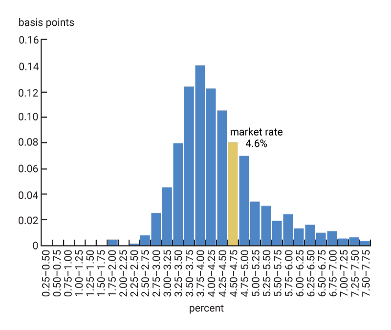
C. June 2006
D. May 2000
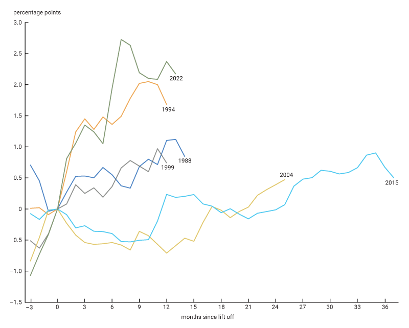
Indeed, figure 4 shows that while in May 2023, 71% of the fixed-rate mortgages were financed at rates at least 200 bps lower than the market rate, roughly only 1.5% of the mortgages were financed at least 200 bps below the market rate in previous tightening cycles. This tightening cycle is thus quite unusual in having a very high share of fixed-rate mortgages locked in at rates well below market rates. This is crucial because it suggests that during the current tightening cycle, homeowners have had unusually weak incentives to sell their homes (and lose the far-below-market rates at which their mortgage loans have been refinanced).
4. Share of outstanding mortgages at the peak of the cycle at least X bps below the then-current mortgage rate
| At the "peak" of the tightening cycle | ||||
|---|---|---|---|---|
| 1999 | 2004 | 2016 | 2022 | |
| Mortgage rate | 8.5 | 6.7 | 4.6 | 6.5 |
| Date of "peak" | May 2000 |
Jun 2006 |
Dec 2018 |
May 2023 |
| ( - - - - - - - - - - - - - - - - - - - - - - - - - - - - - - percent - - - - - - - - - - - - - - - - - - - - - - - - - - - - - -) | ||||
| > 50 bps gap | 65 | 55 | 43 | 91 |
| > 100 bps gap | 42 | 26 | 17 | 87 |
| > 200 bps gap | 2 | 1 | 1 | 71 |
| > 300 bps gap | 0 | 0 | 0 | 38 |
Interestingly, when the distributions in figure 3 are size-weighted (not displayed), the second last row (in bold) in figure 4 does not change much: The fraction of total mortgage values financed at rates at least 200 bps below the market rate increases only to 77% in May 2023 (from the original unweighted 71%), while that fraction remains essentially unchanged at about 1.5% during the previous tightening cycles. Thus, while there is evidence that more-affluent borrowers have been somewhat more effective in making refinancing decisions, the low incentives of homeowners to sell their homes have been present across the board.
The effects of this are clearly seen in figure 5, which shows that existing home sales have plummeted since the start of the tightening cycle. While existing home sales may be expected to fall during a tightening cycle (due to the lock-in effects mentioned earlier), the magnitude of the fall during the current cycle is much larger than in any of the other recent tightening cycles (consistent with the lock-in effects being much larger this time around). What we want to emphasize next is that this sharp drop in existing home sales had large effects on the new homes segment of the market.
5. Existing single-family home sales
Source: National Association of Realtors from Haver Analytics.
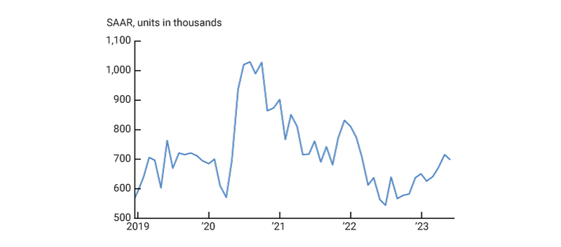
Figure 6 shows that new home sales decreased steadily from the start of the tightening cycle until the end of 2022, while the inventory of new houses for sale increased continuously during the same period (shown in figure A4 in the appendix). Again, this is what one would normally expect to happen during a tightening cycle.
6. New single-family houses sold
Source: U.S. Census Bureau from Haver Analytics.
However, we believe that the declines in existing home sales during the first half of 2023 (after a very small short-lived rebound early in the year) led to an increase in the demand for new construction, even though total housing demand probably continued to decrease (as indicated by the further deceleration in house prices shown in figure 2). To see why, let’s step back and consider the normal type of dynamics experienced by the housing market. We can start by considering the segment of the market consisting of existing homeowners who would like to reoptimize their housing holdings while remaining homeowners. Ordinarily, as homeowners receive shocks to their incomes or their preferences change, some of them want to upgrade and some to downgrade the type of homes that they live in. Also, some homeowners normally take advantage of job opportunities in other locations, leading them to sell their houses at origin and buy houses elsewhere. When homeowners are locked into mortgages with interest rates well below market rates, this process of reallocating houses among existing homeowners is greatly reduced. We believe that a large proportion of the decrease in existing home sales that we have observed reflects this weakened flow of house churning.
Since the reduced purchases by existing homeowners are roughly matched by the reduced sales by existing homeowners, we believe that the lower amount of house churning in this market segment has been roughly a wash in terms of its impact on new construction. Moreover, to the extent that some of the houses purchased by continuing homeowners are normally new houses, the reduced amount of house churning between continuing homeowners probably translated into a somewhat lower demand for new construction.
So why is it that we believe that the reduced amount of house churning due to the lock-in effects translated into higher demand for new construction? The reason lies in the impact on entries and exits from home ownership. First, we look at the impact on exits. Given that their mortgages were locked into low rates and that rents increased quite considerably, people who normally would have decided to exit homeownership were likely to postpone that decision. This effectively took away from the market a number of existing homes that would otherwise have been offered for sale.
This brings us to the last group of market participants: the new entrants to homeownership. Since many of the people who would normally exit homeownership (and many of the existing homeowners who would normally sell to the new entrants) held on to their properties due to the lock-in effects, the new entrants had to look into new construction in order to satisfy their demand. This is a large group. According to Equifax data, normally about 40% of all home sales (both of existing houses and new construction) are to first-time homebuyers.3 With such a large group of market participants shifting part of their demand from existing homes to new construction, it is not surprising to observe the large increase in the number of new houses sold during the first half of 2023 (figure 6) and the significant decrease in the inventory of new houses for sale (figure A4 in the appendix). In turn, this unusual demand for new houses led to the high levels of housing starts during the first half of 2023, which is what we found puzzling in figure 1.
As these housing dynamics unfolded, it is worth noting that another potential contributor to the inventory of homes available for sale—foreclosures—remained low. Foreclosures declined from already low levels in 2020–21, helped by moratoriums and forbearance programs. Since then, healthy household balance sheets and strong labor markets have kept forced sales and foreclosures at very low levels (see figure A5 in the appendix).
And what to expect going forward
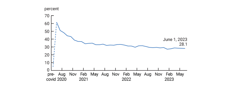
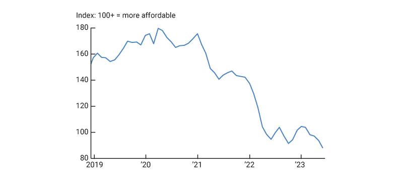
The fundamentals for housing demand remain strong in the long run: Figure 7 shows that the fraction of full working days supplied from home has stabilized at around 29%, increasing the demand for housing services relative to before-Covid pandemic levels (since people spend more time in their homes, and they value this time). However, in the short run the demand for housing services is likely to continue to weaken. The reason is that house prices and mortgage rates (on new loans) remain very high. In fact, figure 8 shows a sharp drop in the National Association of Realtors affordability index (see Gillet and Hull, 2023, for a detailed discussion of the recent changes to housing affordability). This index evaluates how hard it is for a hypothetical family of median income to make mortgage payments at current interest rates and house prices. The low affordability of purchasing homes is likely to take a toll on total housing demand going forward, especially if the labor market finally turns down after long lags in its response to the current tightening cycle. Lower total housing demand is likely to lower the demand for new construction if, as expected, existing home sales stabilize.4
7. Share of full working days supplied from home
8. National Association of Realtors Housing Affordability Index, fixed-rate mortgages
Appendix: Supplementary Figures
A1. Cumulative changes in 30-year mortgage rates
A2. New private housing units authorized by building permit
Source: U.S. Census Bureau from Haver Analytics.
A3. Mortgage originations: one-to-four family refinancings
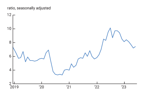
A4. Ratio of stock of new single-family houses for sale to monthly sales
A5. Houses in foreclosure
Notes
1 Housing permits followed a similar pattern (see figure A2 in the appendix).
2 Over the past decade, adjustable-rate mortgages averaged less than 10% of mortgage originations (Urban Institute, July 2023). Data collected under the Home Disclosure Mortgage Act in 2021 suggest that 30-year fixed-rate contracts represented the vast majority (70%) of mortgage originations.
3 According to National Association of Realtors surveys, the share is somewhat lower: about 30%.
4 The recently published 11% decrease in housing starts in August 2023 could indicate that the lower demand for new construction may already be in the works. However, the 6% increase in housing permits during that same month muddles the view.


