

In this article, we explore differences in inflation dynamics across U.S. regions. Looking independently at the impact of consumption patterns and inflation by expenditure categories, we find that recent gaps across regions have existed largely because of different regional inflation rates for the housing category. Yet we also find that overall inflation is very highly correlated across regions.
There has been considerable concern in the United States over the elevated inflation rate. With inflation higher than it’s been in decades, it is natural to ask whether inflation is higher in certain areas of the country than in others and why. When talking, teaching, or learning about inflation, we often focus solely on national inflation.1 However, there are often important differences between regional and national inflation. For the calculation of the Consumer Price Index (CPI), the national inflation rate is an aggregation of the inflation rates of the various urban areas surveyed by the U.S. Bureau of Labor Statistics (BLS). These urban area inflation rates can also be aggregated to calculate the CPI inflation rates of the four Census regions of the United States: the Midwest, the Northeast, the South, and the West. We would expect the different regions of the country to largely follow the same inflation trends because of the integrated nature of the U.S. economy. While this is generally true, there are often notable differences, which we will explore in this Chicago Fed Letter. As we will show, differences in price changes in the housing category are the major source of the differences in overall regional inflation rates.
What is regional inflation and why is it important?
Regional inflation is the inflation rate for a specific broad area of the United States. We focus on the Consumer Price Index because it is the only measure of inflation from a U.S. statistical agency that provides timely data on national inflation, regional inflation, and the inflation rates of different metropolitan statistical areas (MSAs). The U.S. Bureau of Economic Analysis’s (BEA) Personal Consumption Expenditures (PCE) report provides state and metropolitan area inflation data in the form of annual changes in implicit price deflators, but only provides annual information and releases these data with a substantial lag. For example, the December 2022 PCE report provides information for calendar year 2021. The Producer Price Index (PPI) from the BLS provides timely monthly regional inflation measures, but only for a small subset of items in the energy and construction categories (see, e.g., the February 2023 PPI Detailed Report).
Differences in inflation across areas measure the differences in the rates of change in the price level. The price level for a region is equivalent to the cost of living. Inflation is distinct from the price level in that inflation captures the change in the price level for a given area. For example, Chicago may have a higher cost of living (price level) than Madison, Wisconsin. However, they could both have the same inflation rate (price change)—i.e., prices in both places could be increasing by 2% annually.2 The CPI data do not speak to differences in price levels, which can be substantial. For instance, PCE data show that in 2021, the price level in Hawaii was 113.2% of the national average, while the price level in Mississippi was 86.6% of the national average. The BEA attributes a substantial portion of such gaps to differences in the cost of housing services as captured by rents.
Regional inflation and regional price levels are both important because differences in price growth and in the cost of living in various places can affect the purchasing power and, consequentially, the well-being of households. However, we do not investigate differences in price levels in this article. Furthermore, while it is true that income and wage levels and income and wage growth may also differ across areas—which could mitigate or exacerbate differences in well-being due to differences in price levels or inflation—we also do not cover these differences in this article. Instead, we explore regional differences in inflation to better understand what is happening at a local level and where within the country the economic hardship due to rapidly rising prices has been experienced most acutely.
Inflation across regions
Panel A of figure 1 presents annual CPI inflation, by month, for each Census region and for the entire United States from January 2002 through January 2023. Panel B of figure 1 zooms in, presenting these inflation data from January 2019 through January 2023. From figure 1, we can see that inflation rates have been very similar across regions over the past 20 years. However, there are a couple of noticeable gaps: First, inflation was moderately higher in the West than in the rest of the United States over the period 2014–20. Second, inflation was modestly lower in the Northeast compared with other parts of the nation between mid-2021 and late 2022.
1. Annual Consumer Price Index inflation, by U.S. region
A. January 2002–January 2023
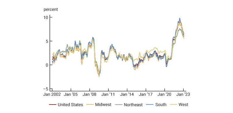
B. January 2019–January 2023
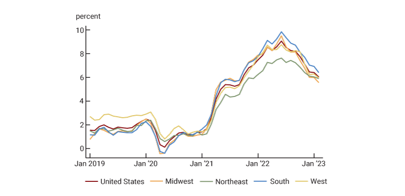
Source: U.S. Bureau of Labor Statistics from Haver Analytics.
Figure 2 presents the correlation between annual inflation rates of different regions in the United States. Consistent with figure 1, this figure shows that inflation is very highly correlated across regions. However, there is some variation: The lowest correlation is between the Northeast and the West, whereas the highest correlation is between the South and the Midwest. Inflation in the South is most highly correlated with the national level.
2. Correlations in Consumer Price Index inflation across U.S. regions, January 2002–January 2023
| United States | Midwest | Northeast | South | West | |
| United States | 1.000 | ||||
| Midwest | 0.986 | 1.000 | |||
| Northeast | 0.970 | 0.949 | 1.000 | ||
| South | 0.995 | 0.986 | 0.964 | 1.000 | |
| West | 0.961 | 0.922 | 0.896 | 0.939 | 1.000 |
Source: Authors’ calculations based on data from the U.S. Bureau of Labor Statistics from Haver Analytics.
In figure 3’s first and second rows of data, we present the cumulative inflation rates over two different time periods for each region (and the nation). We do this based on our own calculations of regional inflation using annual regional expenditure weights and regional price changes.3 Cumulative inflation compares prices at the beginning of 2023 with prices at the start of 2002 (first row) and with prices at the start of 2019 (second row). For example, the number 69.0 for the United States in the first row indicates that prices in the nation in January 2023 were 69.0% higher than they were in January 2002. Over the longer time horizon, cumulative inflation has been highest in the West and lowest in the Midwest. The Northeast has become a recent outlier, as prices have increased 16.6% there between January 2019 and January 2023, as opposed to 18.8% for the nation overall (see second row). The final column of figure 3 presents the magnitude of the largest gap in inflation rates between regions. Later in this article, we will discuss the other rows of data using different weights and price changes.
3. Cumulative Consumer Price Index inflation in U.S. regions, using different weights and price changes during two periods
| United States | Midwest | Northeast | South | West |
Largest gap |
||
| Using regional weights and regional price changes | |||||||
| Jan 2002–Jan 2023 | 69.0 | 61.6 | 68.3 | 70.4 | 74.2 | 12.6 | |
| Jan 2019–Jan 2023 | 18.8 | 18.6 | 16.6 | 19.7 | 19.5 | 3.1 | |
| Using U.S. weights and regional price changes | |||||||
| Jan 2002–Jan 2023 | 69.0 | 61.5 | 68.6 | 70.3 | 73.8 | 12.3 | |
| Jan 2019–Jan 2023 | 18.8 | 18.6 | 16.8 | 19.5 | 19.3 | 2.7 | |
| Using regional weights and U.S. price changes | |||||||
| Jan 2002–Jan 2023 | 69.0 | 69.0 | 68.4 | 69.1 | 69.4 | 1.0 | |
| Jan 2019–Jan 2023 | 18.8 | 18.7 | 18.5 | 18.9 | 18.9 | 0.4 | |
| Using regional weights and regional price changes except for U.S. price changes for housing goods and services | |||||||
| Jan 2002–Jan 2023 | 69.0 | 67.8 | 69.2 | 69.2 | 70.2 | 2.4 | |
| Jan 2019–Jan 2023 | 18.8 | 19.2 | 18.1 | 18.9 | 18.9 | 1.1 |
Source: Authors’ calculations based on data from the U.S. Bureau of Labor Statistics from Haver Analytics.
Explaining differences
Regional inflation as measured by the CPI is the weighted average of price changes for categories of expenditure in the region where the weights depend on regional expenditure patterns. As a result, differences in inflation across regions are due to either differences in inflation by category or differences in expenditure patterns as captured by the weights.4 We investigate whether weights or price changes are driving differences across regions over time—first, by asking how much weights and price changes differ across regions and second, by performing some counterfactual exercises. We find that cross-regional differences in inflation rates are mainly due to different price changes by category, rather than different expenditure patterns. Figure 4 presents each U.S. region’s (plus the entire nation’s) expenditure weights for 2022 broken up into eight major expenditure categories, and figure 5 presents cumulative inflation from January 2002 through January 2023 for each of these categories. Figure 4 shows notable differences in expenditure weights across regions—e.g., expenditure on transportation has a higher weight, while expenditure on housing has a lower weight, for people in the Midwest than for those in the West and Northeast. With that said, figure 5 shows substantial differences in cumulative price changes within categories across regions—e.g., prices for housing goods and services are up over 25 percentage points more in the West than in the Midwest over the past two decades or so. This suggests that price changes may be the main driver of regional inflation differences. We explore this further next.
4. Expenditure weights, by category, for U.S. regions, 2022
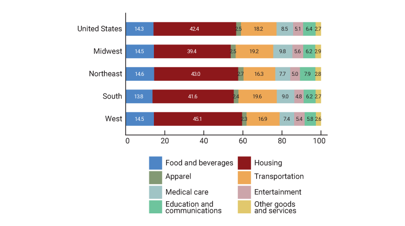
Source: U.S. Bureau of Labor Statistics from Haver Analytics.
5. Cumulative Consumer Price Index regional price changes, by expenditure category, January 2002–January 2023
| United States | Midwest | Northeast | South | West | ||
| Total | 68.9 | 61.1 | 67.8 | 70.2 | 74.1 | |
| Food and beverages | 79.7 | 77.7 | 79.6 | 79.5 | 81.7 | |
| Housing | 76.7 | 60.9 | 74.1 | 79.6 | 86.1 | |
| Apparel | 6.2 | 1.6 | 12.6 | 2.7 | 10.2 | |
| Transportation | 73.5 | 68.8 | 67.5 | 78.8 | 74.9 | |
| Medical care | 97.2 | 99.0 | 93.4 | 92.6 | 105.7 | |
| Entertainment | 26.8 | 29.2 | 28.5 | 27.0 | 23.2 | |
| Education and communications | 35.6 | 31.0 | 44.5 | 30.8 | 37.2 | |
| Other goods and services | 81.6 | 80.0 | 91.5 | 78.7 | 78.3 |
Source: Authors’ calculations based on data from the U.S. Bureau of Labor Statistics from Haver Analytics.
We separately investigate the importance of differences in expenditure weights versus differences in category price changes by setting one or the other to national levels. For instance, we can ask what inflation would have been in the Midwest if we use the Midwest’s expenditure weights but the nation’s price changes for each category. We can also ask what inflation would have been in the Midwest by using the Midwest’s price changes but the nation’s expenditure weights.5
Figure 6 shows the result of using the U.S. expenditure weights and the actual regional price changes for each category over the period January 2019–January 2023. The picture looks remarkably similar to panel B of figure 1, indicating that differences in the weights across the eight categories are not driving the regional inflation differentials. This is confirmed by the fact that the correlations across the regions (not shown here, but available upon request) are similar to those in figure 2 and that cumulative inflation with U.S. weights and regional price changes (reported in figure 3’s third and fourth rows of data) remains similar to that with regional weights and regional price changes (reported in figure 3’s first and second rows). Notably, using U.S. expenditure weights does not meaningfully narrow the inflation gaps across regions.
6. Annual Consumer Price Index inflation using U.S. expenditure weights and regional price changes, January 2019–January 2023
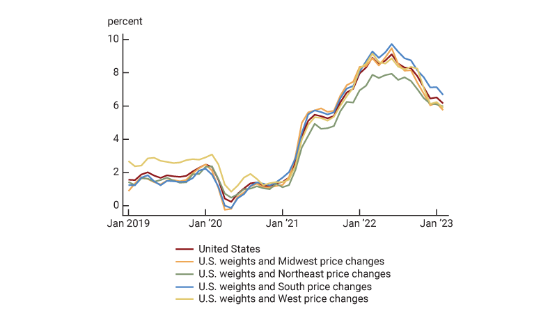
Source: Authors’ calculations based on data from the U.S. Bureau of Labor Statistics from Haver Analytics.
In figure 7, we perform the opposite exercise and use the actual regional weights and U.S. price changes for each category. In this case, most of the lines are nearly on top of one another over the sample period and the gaps in cumulative inflation nearly disappear (as also indicated in the fifth and sixth rows of figure 3). The largest gap in figure 7 is between the Northeast and other regions from mid-2021 through late 2022; a recent blog post by Chakrabarti, Garcia, and Pinkovskiy attributes this to a lower transportation expenditure weight in the Northeast combined with high transportation inflation over this period.
7. Annual Consumer Price Index inflation using regional expenditure weights and U.S. price changes, January 2019–January 2023
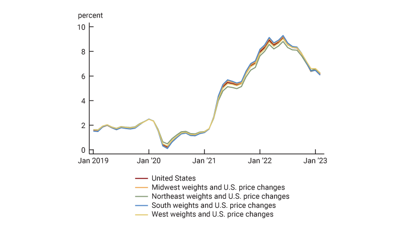
Source: Authors’ calculations based on data from the U.S. Bureau of Labor Statistics from Haver Analytics.
These tabulations and plots suggest that differences in inflation across regions can largely be explained by regional differences in price changes for the eight categories of expenditures.6
The housing sector’s role in regional inflation discrepancies
We can also investigate the contribution of price changes within individual expenditure categories by asking what inflation would have been if we changed the inflation rate of one category at a time. In other words, we can keep everything at its actual regional level (weights and price changes) except for one category’s price change. This exercise highlights the crucial role of housing in determining inflation gaps. Figure 8 shows what regional inflation would have been using actual regional data on expenditure weights and price changes except that we force all regions to have U.S. price changes for housing goods and services. The final two rows of figure 3 show that cumulative inflation gaps over both time periods (i.e., January 2002–January 2023 and January 2019–January 2023) would have been substantially smaller. Using the U.S. level of inflation for housing goods and services significantly narrows the gap between U.S. and West cumulative inflation over the period January 2002–January 2023 from 5.2 percentage points (first row of figure 3) to 1.2 percentage points (seventh row). Moreover, using the U.S. level of inflation for housing goods and services narrows the gap between U.S. and Northeast cumulative inflation over the period January 2019–January 2023 from 2.2 percentage points (second row of figure 3) to 0.7 percentage points (eighth row). After digging more deeply into the housing sector, we find that this is really a story about shelter pricing rather than the other subcategories of housing—i.e., household fuel and furnishing. Shelter expenditure made up about 75% of the housing category.
8. Annual Consumer Price Index inflation using regional expenditure weights and regional price changes except for U.S. price changes for housing goods and services, January 2019–January 2023
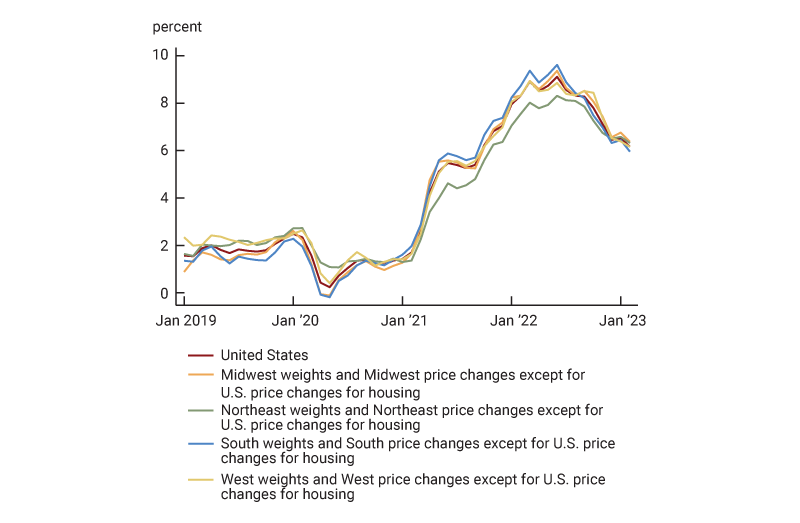
Source: Authors’ calculations based on data from the U.S. Bureau of Labor Statistics from Haver Analytics.
Regional discrepancies in inflation can largely be explained by differences in price changes for shelter, which includes rent and owners’ equivalent rent (OER).7 The BLS measures increases in shelter costs for owner-occupiers based on what is occurring in the rental market for similar products. The BLS does not use house prices because it is trying to measure the value of housing services consumed in a period, which corresponds to rents for people who rent and rental equivalents for people who own. By contrast, house prices denote the value of an asset that yields a stream of housing services over time and also serves as an investment vehicle.
The fact that shelter prices are a major source of discrepancy is not surprising because housing cannot move across areas and is relatively inelastically supplied.8 This is also consistent with other findings, including one where the BEA attributes a substantial portion of regional price level differences to housing costs, as previously noted. Previous research on regional inflation within the United States also points to the central role of housing (see Gascon and Fuller, 2022). Overall inflation and housing inflation have been the highest in the South and West, and those are the regions that have experienced the highest percent changes in population over the periods covered in figures 3 and 5. As a result, demand for housing in those areas has likely increased most dramatically—which is consistent with the greater housing inflation. However, by most metrics, the population increase has been greatest in the South, while the highest overall price increases and housing price increases have been in the West, so population dynamics do not tell the entire story about the gaps in regional inflation rates.9
Conclusion
We find that price changes in the housing sector are the main driver of regional differences in inflation in the two time periods we investigate: January 2002–January 2023 and January 2019–January 2023. Although residents in different areas do have different purchasing patterns, we find that this plays only a small role in discrepancies in regional inflation. One exception to this is that lower transportation expenditure weights in the Northeast have contributed to lower inflation readings in the Northeast recently. While these differences are notable, we also observe that inflation across regions tends to move together and that in all four Census regions, inflation rates have been far higher in recent years than in previous periods. We will follow up this Chicago Fed Letter article with another one that explores inflation dynamics within the Midwest region—where the entirety of the Seventh Federal Reserve District, which the Chicago Fed serves, is located.
Notes
1 A recent exception is a January 2023 Liberty Street Economics blog post by Rajashri Chakrabarti, Dan Garcia, and Maxim Pinkovskiy, of the New York Fed, which explored recent gaps in regional inflation and gaps between rural and urban households.
2 Economists at the St. Louis Fed develop this argument more clearly in Gascon and Fuller (2022).
3 We recalculated regional inflation using data on annual regional expenditure weights combined with data on regional price changes for different expenditure categories. We do this so that these calculations are consistent with our later calculations investigating the separate impacts of weights versus price changes on regional inflation differences. For our calculations, we use fixed expenditure weights for each region and the nation for each year. For example, the weight for food and beverages for the Midwest is constant for all of 2022. For the official calculations, plotted in figure 1, the BLS updates the weights every month in response to price changes, increasing the weights for the items where prices grew relatively more. This adjustment is called relative importance. At monthly and annual frequencies, there is a very high (about 0.998) correlation between regional inflation measured with fixed annual weights and with updated monthly weights. We use the annual weights as it makes the calculations more straightforward and easier to interpret. The annual weights do partially reflect changes in prices by category since the timing of the expenditure survey on which they were based. For example, the 2023 weights are based on expenditures in 2021 updated for price changes through December 2022. Figures 1, 2, and 5 are based on the official BLS data, with expenditure weights that are updated every month. Figures 3, 6, 7, and 8 are based on our calculations using annual expenditure weights from the BLS. Figure 3 is based on cumulated monthly inflation rate calculations. Figures 6, 7, and 8 are based on annual category price changes and annual expenditure weights for the year corresponding to the data point.
4 Note that the weights are not simply expenditure shares because they also reflect price changes since the timing of the expenditure survey.
5 These counterfactual exercises are not as clean as this breakdown suggests because the annual weights partly depend on past price changes and the price changes partly depend on expenditure weights for the items within each expenditure category.
6 We explored whether using 13 categories of expenditure (the maximum feasible with available data) rather than eight ends up assigning more of the gaps across regions to expenditure weights, and found that it does not.
7 Owners’ equivalent rent is the hypothetical rent that homeowners would pay if they did not own their homes or the hypothetical rent they miss out on by not renting out their residences. Shelter also includes two small additional categories—lodging away from home and tenants’ and household insurance. Over 95% of the category weight is in rent and OER at the national level.
8 A good is inelastically supplied when the supply of that good is not very responsive to price changes. This often happens in places where zoning and natural barriers limit the opportunity to add to the housing supply.
9 For the changes in population by region between 1981 and 2021, see table A-2 of the U.S. Census Bureau’s CPS Historical Migration/Geographic Mobility Tables.


