Internal Migration Patterns After the 2008 Financial Crisis: Evidence from a Credit Panel
The 2008 financial crisis and the recession that followed saw unemployment soaring and house prices declining. The unemployment rate remained stubbornly high during the recovery that started in 2010. One factor that helps us to understand the slow pace of the recovery is the lack of internal migration to better job markets within the United States. While substantial internal migration flows have long been an important feature of the U.S. labor market,1 internal migration dropped significantly during and after 2008 and reached a record low during the global financial crisis (Kaplan and Schulhofer-Wohl, 2017).2 Prior research suggests that the decline in house prices, which meant that homeowners were less likely to sell their homes and move to new job opportunities, lowered migration rates.3 Less internal migration likely contributed to a misallocation of workers and therefore contributed to the slow pace of the recovery.
Utilizing credit bureau data, we take a fresh look at U.S. internal migration between 2011 and 2019—that is, after the Great Recession and before the 2020 Covid-19 pandemic—and study whether and, if so, when internal migration recovered.4 Using the ZIP codes households live in that are included in the credit bureau data, we can track whether households left a metropolitan statistical area (MSA). Moving from one MSA to another is a clear indication of a longer distance move, presumably for work reasons, rather than changes at the ZIP code level, which could indicate moves within an MSA without changes in employment. So, we calculate migration rates at the MSA-level that we use to document internal migration flows. We find that starting around 2016, when the national unemployment rate dropped below 5%, indicating a tight labor market, internal migration increased significantly. We also document that during this period, migration of individuals ages 25 to 35 years old shifted sharply towards MSAs with larger shares of white-collar jobs, consistent with the most mobile workers moving to new opportunities.
We then zoom in on the Seventh District.5 We find that while the District’s migration rates were lower than the national average, its migration patterns were comparable to those of the U.S. We document that most MSAs in the Seventh District exhibited higher net outmigration rates of younger workers than of all workers.
Data
Our analysis relies on the Federal Reserve Bank of New York/Equifax Consumer Credit Panel (FRBNY CCP), which consists of detailed credit-report data for a unique longitudinal panel of individuals and households in quarterly increments beginning in 1999. The FRBNY CCP is an anonymized, nationally representative 5% random sample of individuals that have a Social Security number and credit report. This data set allows us to track all aspects of household-level credit and debt, including student loans, and crucially, the ZIP code of residence, which can be assigned to a county in a given quarter. Using the geographical information, we construct migration patterns on the individual level.
Since we are interested in migration patterns after the Great Recession, we use data from the first quarter of 2011 to the fourth quarter of 2019. Additional sample restrictions that we impose are: All individuals need to be in the sample for at least five years. The reported data on the individual are available for each quarter without gaps. The individual did not move between counties more than once in a given year.
We focus on moves between MSAs. For this purpose, we match county Federal Information Processing Standards (FIPS) codes with the corresponding MSA identifier. We then aggregate inflows and outflows to the MSA level.6
For our analysis, we also use MSA-level occupational employment and wage statistics from the Bureau of Labor Statistics (BLS). Specifically, we used total employment numbers for white-collar/professional occupations.
Time series evidence
We begin our analysis by examining the internal migration between MSAs during the recovery from the Great Recession to assess whether migration rates stayed at low levels or increased.
1. Annual internal migration rates between MSAs
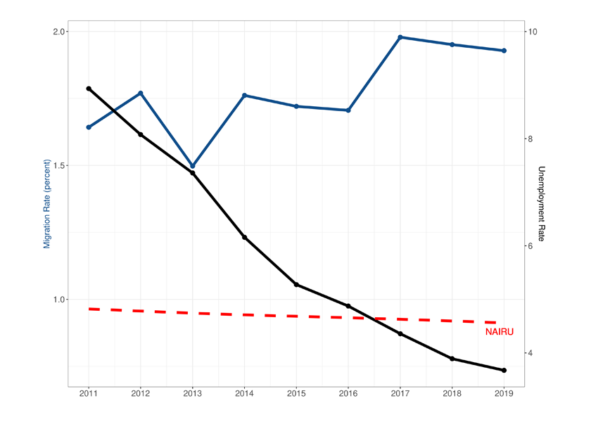
Source: NYCCP/Equifax, BLS (via FRED), CBO (via FRED).
The blue line in figure 1 plots the internal migration rate defined as the number of individuals moving between MSAs divided by the total population in a given year from 2011 to 2019.7 Consistent with migration rates during the recession reported by Kaplan and Schulhofer-Wohl (2017), in the first five years of our sample, internal migration rates were between 1.5% and 1.7%. Starting in 2016, internal migration rates notably increased to about 2%.
One potential reason for increased internal migration rates is improved labor market conditions encouraging workers to move MSAs for new job opportunities. The black line in figure 1 plots the national unemployment rate during the sample period. The red dashed line shows the non-acceleration inflation rate of unemployment (NAIRU) or natural rate of unemployment. The NAIRU is a common measure of how tight the labor market is. If the unemployment rate is above the NAIRU, then unemployment is higher than expected in the long run. If, in contrast, the unemployment rate falls below the NAIRU, the labor market is considered to be tight, and firms have to offer higher wages to attract workers. The figure shows that by 2016, the unemployment rate had decreased to about 5%, close to estimates of the NAIRU—suggesting a tight labor market. Consistent with tight labor markets increasing wages and, hence, opportunities for workers, the internal migration rate picked up around 2016 and remained at a higher level.
MSA-level evidence
We now focus on the MSA level to better understand which MSAs were seeing in-migration and outmigration, on net, in each year between 2011 and 2019. We define the annual net migration rate as the annual inflow minus annual outflow of people as a percentage of the total MSA population. We then take the average over these net migration rates over our sample period and plot these average net migration rates for the period 2011–19 in the figures below. We also construct migration rates for younger workers, those ages 25 to 35, to assess potential drivers for migration patterns.
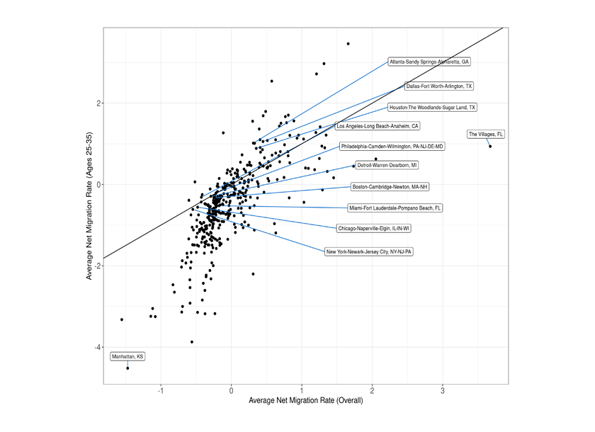
Figure 2, panel A plots the average net migration rates for the overall MSA population against the net migration rates for those ages 25 to 35.8 Most MSAs exhibit average net migration rates close to 0. MSAs below the 45-degree line in the bottom-left quadrant see a net outmigration that is driven by differentially larger outflows of 25- to 35-year-olds compared with the total average net migration. These MSAs are likely to experience medium- and long-term challenges to their economic prospects, as a differentially larger net outflow of younger workers does not only suggest a lack of labor market opportunities for these workers, but also limits the attractiveness of the area for new potential employers going forward. There are a significant number of MSAs (218) in the bottom-left quadrant. While these areas tended to be smaller, we found no discernable regional patterns.9
2. Average net migration rate (overall) vs. average net migration rate (ages 25–35)
A. Full sample
B. Top 50 MSAs
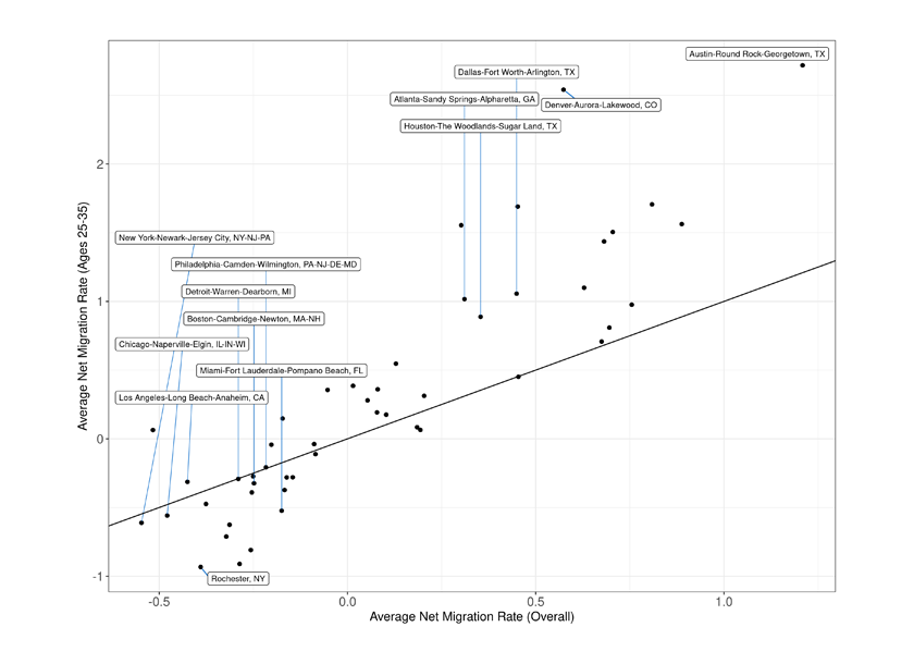
Source: NYCCP/Equifax.
Figure 2, panel B focuses on the top 50 most populated MSAs. The top ten most populated MSAs in the sample along with outliers are labeled. Of the top ten, only the Atlanta-Sandy Springs-Alpharetta, Dallas-Fort Worth-Arlington, and Houston-The Woodlands-Sugar Land areas experienced net in-migration from other MSAs. This in-migration was driven by younger workers, ages 25–35. The other seven of the top ten MSAs experienced small outflows, on net, with little difference between the overall population and younger workers.
We now study the composition of migrant workers in more detail. Specifically, we examine the average net migration rates of workers ages 25 to 35 who were college educated. Since Equifax does not contain information on individual educational attainment, we use student loans as an indicator for having gone to college. There are several caveats to this measure: 1) some students never took out student loans, 2) not everyone taking out student loans finished college, and 3) some households may have already paid off their student loans.10
3. Average net migration rate (overall) vs. average net student migration rate (ages 25–35)
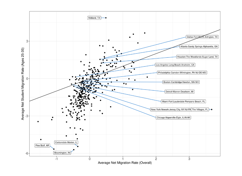
Source: NYCCP/Equifax.
Figure 3 plots the average net migration rates of those with student loans against the net migration rate of the MSA population. While the overall patterns are comparable to those in figure 2, it is worth noting that the largest MSAs appeared to experience less outmigration of college-educated, young workers, on net. For instance, the Miami-Fort Lauderdale-Pompano Beach metropolitan average is now above the 45-degree line, while it was below the 45-degree line in figure 2. This pattern indicates that this MSA experienced less net outmigration of college-educated young workers than of non-college-educated young workers, resulting in a somewhat more educated workforce, on average.
More generally, the MSAs in the lower left quadrant are smaller. These MSAs experienced a differently larger net outmigration of college-educated young workers, suggesting that these smaller MSAs were experiencing a “brain drain.”11
We also study migration patterns by the prevalence of jobs that are more likely to require college degrees. For this purpose, we split the sample by above and below the median share of white-collar jobs in 2011 based on the Bureau of Labor Statistics’ Occupational Employment and Wage Statistics data, which provides annual total employment numbers by occupation for each MSA.12 Since figure 1 showed an acceleration in internal migration, we further split the data into a pre period from 2011 to 2016 and post period from 2017 to 2019.13 For each period, we calculate the mean net migration rates for each split by age group.
Figure 4 shows the difference in the net migration rates between those above and below the 2011 median white-collar job shares for the 2011–16 and 2017–19 periods for all workers ages 25–35 and those with student loans. To give a sense of magnitude, the blue bar in the left panel indicates that MSAs with relatively more white-collar jobs attracted, on net, 0.17 percentage points more workers ages 25–35 annually than MSAs with relatively fewer white-collar jobs during 2011–16. In the left panel, we see that the difference in net migration rates increases to 0.43 percentage points annually between 2017 and 2019. This increase indicates that when internal migration rates increased in general, net migration to MSAs with relatively more white-collar jobs increased significantly more than to MSAs with relatively fewer white-collar jobs. This change in the difference is particularly pronounced for college-educated young workers (figure 4, right panel). Here, the difference in net migration rates increases from 0.38 percentage points annually to 0.86 percentage points annually. One interpretation of this finding is that with an overall increase in migration, the brain drain experienced by smaller MSAs with fewer professional jobs accelerated.
4. MSA average net migration rate difference
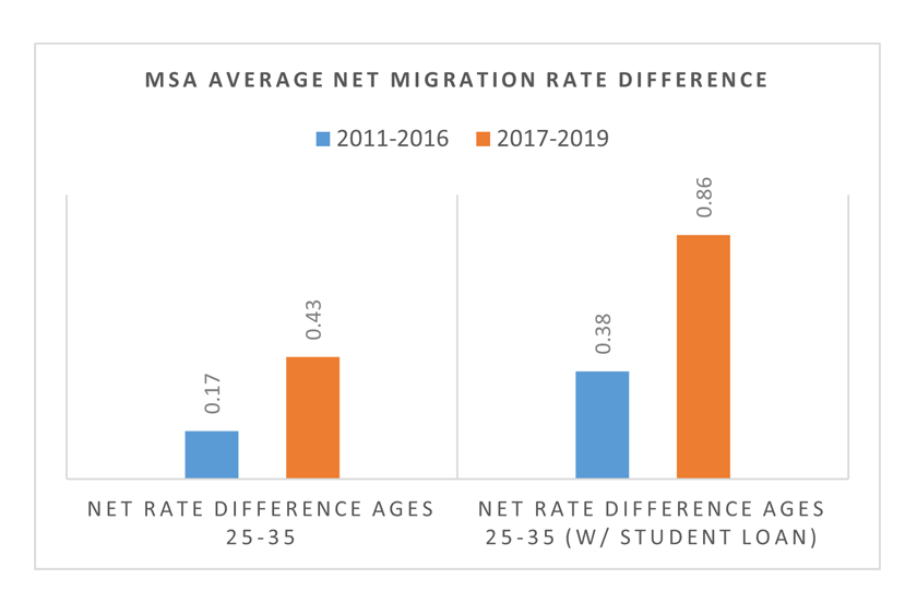
Source: NYCCP/Equifax, BLS.
5. Annual MSA migration rates (Seventh District/U.S.)
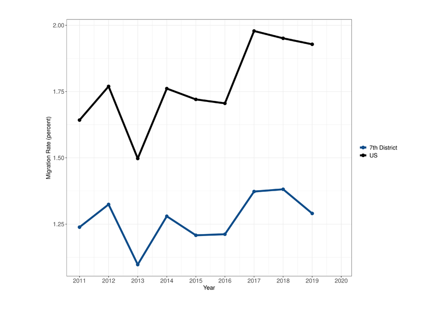
Source: NYCCP/Equifax.
Seventh District
We now zoom in on the Seventh District. Figure 5 compares annual MSA migrations rates between the Seventh District and the U.S. The migration rates for the Seventh District are lower than for the U.S. However, the Seventh District exhibits the same aggregate pattern over time. Migration rates went up after 2016, though the increase was less pronounced in 2017 than for the U.S.
Figure 6 recreates figure 2, panel A for the Seventh District with the five most populated MSAs and notable outliers labeled. Most MSAs were experiencing net outmigration with little difference by age group for the largest MSAs. However, we note that most MSAs in the Seventh District saw higher net outmigration of younger workers than of the population. While MSAs with large universities faced the largest outflows of young workers, the overall net loss of younger workers across the Seventh District illustrates the challenges due to the long run decline in manufacturing in the Midwest.14
6. Seventh District average net migration rate (overall) vs. average net migration rate (ages 25–35)
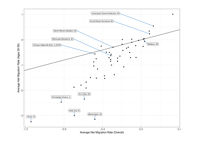
Source: NYCCP/Equifax.
Conclusion
We show that starting in 2016, internal migration rates across U.S. MSAs went up, with a tight labor market being the likely driver. We provide supporting evidence by showing that more young people, especially those with a college education, moved to MSAs with higher shares of white-collar/professional jobs. This trend holds for the Seventh District as well, although it is less pronounced than for the nation as a whole.
Notes
1 Molloy, Smith, and Wozniak (2011) discuss the history and trends of internal migration in the U.S.
2 DeWaard, Johnson, and Whitaker (2019) find continued low migration rates after the 2008 financial crisis, when compared to earlier periods.
3 Kothari, Saporta-Eksten, and Yu (2013) report a drop in migration rates of homeowners by 27%. Whether negative home equity accounts for this drop is subject to debate. While Ferreira, Gyourko, and Tracy (2011, 2012) present some evidence for the importance of the decline in home values, Schulhofer-Wohl (2012) finds that households with negative home equity were somewhat more likely to move and Aaronson and Davis (2011) find no evidence for differences between homeowners and renters.
4 Lavelle and Kepner (2022) use data from a large moving company and show that the patterns of migration in the Seventh district did not change during Covid.
5 The Seventh Federal Reserve District covers the state of Iowa; 68 counties of northern Indiana; 50 counties of northern Illinois; 68 counties of southern Michigan; and 46 counties of southern Wisconsin.
6 For robustness, we also constructed the same measures for commuting zones and found similar results.
7 Note that these internal migration rates are somewhat biased downward as we divide by total population and not by population living in MSAs.
8 We only consider MSA-to-MSA migration.
9 Thirty-five percent of these MSAs are in the Midwest, 32% in the South, 18% in the Northeast, and 15% in the West.
10 About 72% of college students financed their studies with debt (Ison, 2022).
11 Some of these MSAs are college towns such as Bloomington, IN and hence this pattern is expected for some smaller MSAs.
12 The occupations we included to calculate the share of white-collar jobs were Management, Business and Financial Operations, Computer and Mathematical, Architecture and Engineering, Life, Physical, and Social Science, Legal, and Office and Administrative Support. We chose these occupations according to NAICS code 54 (Professional, Scientific, and Technical Services).
13 We drop MSAs for which less than 1,000 individuals were sampled.
14 Ames, IA, is home to Iowa State University, Iowa City to the University of Iowa, Urbana-Champaign to the University of Illinois, Urbana-Champaign, Ann Arbor, MI, to the University of Michigan, and Bloomington, IA, to Indiana University. These MSA are most likely experiencing a large net outflow of young individuals because these individuals were graduate students.


