

The following publication has been lightly reedited for spelling, grammar, and style to provide better searchability and an improved reading experience. No substantive changes impacting the data, analysis, or conclusions have been made. A PDF of the originally published version is available here.
Since the beginning of the year, roughly 1.25 million jobs have been added to payrolls, consistently outpacing population growth for the first time in four years. With the jobless recovery apparently complete, it is natural to examine next the type of jobs being created.
This Chicago Fed Letter presents several summary measures that gauge the extent to which employment is growing in higher-paying sectors of the economy and, importantly, how this compares with recent history.
We find that the share of job growth in higher-paying sectors typically responds favorably to overall employment growth and, conversely, falls when labor markets weaken. Recent history falls squarely in this pattern. Recent estimates of higher-paying industry job growth have rebounded over the last year and currently stand about where we would expect given the state of the labor market.
Background and data
Compensation-based computations of employment growth are often characterized as a measure of job quality. While there is an element of truth to this, it is incomplete. One important reason is that, in accepting employment, workers try to maximize both the pecuniary and nonpecuniary features of their employment. Clearly, higher compensation is an attractive aspect of a job, but other factors, such as working conditions, safety, tasks, opportunities for advancement, on-the-job learning, hours flexibility, and commuting time, matter as well.
Unfortunately, data on job characteristics tend not to be easily available, particularly on a timely basis. The best we can do is rely on the two large monthly surveys that report employment and hourly wages: the Current Population Survey (often called the household survey) and the Current Employment Statistics survey (the payroll survey). The household survey is a monthly sample of 60,000 representative households and is the basis for the widely reported monthly unemployment rate. The payroll survey is a larger, nationally representative sample of 160,000 businesses and government agencies covering 400,000 establishments and is the basis for headline employment growth numbers such as the 1.25 million jobs number cited above. Yet even the compensation measure embedded in these surveys, known as average hourly earnings, is not ideal. It does not include nonwage compensation and represents only the 80% of workers who are classified as production or nonsupervisory workers by the Bureau of Labor Statistics.1
In some ways, the household survey is the superior source for describing the types of jobs being created because it includes worker-specific data on employment and wages, as well as education, occupation, industry, and other useful background. However, over short time frames, the household survey’s count of net employment growth is less reliable and can diverge from the payroll survey’s count.2 Consequently, we concentrate on the payroll survey for the computations reported here. But it is important to note that there is some evidence that the payroll survey results on job quality can differ, perhaps markedly so, from those that rely on the household survey.3
Although the payroll survey does not allow for an analysis of the characteristics of individual jobs, it does dissect employment and wages by industry. Therefore, it is possible to exploit variation in industry trends to infer whether jobs are being created in high-paying sectors, such as utilities, or low-paying sectors, such as retail trade.
While this is a useful exercise, it is worth noting that even at the finest industry detail, we still must assume that all jobs created within the sector are paid at that sector’s average wage. This is clearly a simplification that we would rather not have to make.
With these caveats in mind, figure 1 displays employment growth for a common industry classification, the 14 “supersectors,” for the six months from December 2003 through June 2004. During that span, payroll employment swelled by 1.27 million and was sectorally broad-based, growing by at least 100,000 in five supersectors (construction, retail trade, professional and business services, education and health services, and leisure and hospitality) and falling in only one (nondurables manufacturing).
1. Change in employment, by supersector
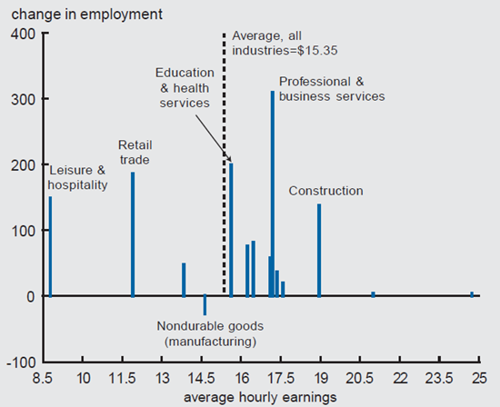
The placement of industries along the horizontal axis in the figure is determined by the industry’s average hourly earnings in 2003. This allows us to examine how much of the recent surge in employment derives from industries that pay higher (or lower) wages. By this chart, the answer seems unambiguous. Those sectors paying above the national average constitute just under three-fourths of total employment growth (including five of the seven fastest growing industries), despite representing only 65% of total employment. Thus, it appears that high-paying sectors are adding jobs faster than we might expect given their share of total employment.
However, these results are sensitive to the level of industry aggregation. For example, figure 2 offers the same evidence as figure 1, but uses 84 industry sectors.4 With this finer decomposition, above-average wage sectors added 41% of recent employment gains, while constituting 51% of total employment.
2. Change in employment, by subsector

As it turns out, about 60% of the difference between the 72% number in figure 1 and the 41% number in figure 2 is due to a single sector that has exhibited particularly strong employment growth recently, professional and business services (PBS). In the supersector calculations of figure 1, PBS, responsible for almost one-quarter of total employment gains over the last six months, is considered a high-paying sector, with average wages 12% above the national norm. But, when we disaggregate the PBS sector, almost three-fourths of its employment gains are in administrative and support services, where average hourly earnings run 17% below the national norm.5 This suggests that looking at industry definitions that are too broad may cause us to misstate the types of jobs created.
Historical trends of a summary measure
How can we interpret the current environment relative to the recent past? Figure 3 offers an initial approach that is in keeping with the discussion thus far. Our strong preference is to base these calculations on detailed industry data, like those displayed in figure 2. However, to get a long enough time series, data limitations force us to use the supersectors. In the next section, we show what the available detailed industry data look like since the early 1990s.6
3. Difference in monthly employment growth

Source: Bureau of Labor Statistics data from Haver Analytics.
The 14 supersectors are divided into two groups based on the national average wage rate. Those paying above the national average are labeled high wage and those paying below are low wage.
The figure graphs the 12-month moving average of the difference in the monthly employment growth for high- and low-paying sectors, normalized by total employment. A positive number indicates employment growth is stronger among industries that pay above-average wages. A negative number implies employment growth is stronger in below-average wage sectors.
Overall, there appears to be a fairly strong cyclical pattern in this measure. During recession months (treating 1980 and 1982 as one long recession), below-average wage sectors grow 0.077% faster than above-average wage sectors. Furthermore, the measure falls during each of the four recessions in our sample. By contrast, the low- and high-wage sectors grow at the same pace during expansion months, on average, and the measure tends to rise during expansion periods (although the pattern of the 1980s expansion differs markedly from the 1990s expansion).
The most recent estimates in figure 3 look quite encouraging. But, as we learned above, calculating industry job quality at too aggregated a level can be misleading. The blue line in the figure makes one small adjustment, adding a 15th sector that separates the temporary help services industry from the remaining professional and business service employees.7 This modification alone causes the June 2004 estimate to drop from 0.00068 to 0.00033.
More detailed industry computations
Figure 4 recalculates the estimates displayed in figure 3 for 84 sectors. Again, because of data limitations, finer detail comes at the cost of a shorter, but more accurate, time series.
4. Difference in monthly employment growth

Source: Bureau of Labor Statistics data from Haver Analytics.
As in figure 3, there is a fairly clear cyclical pattern to this measure; it falls when labor markets are struggling and rises as employment recovers. The most recent estimates are negative and low by the standard set during the mid- to late 1990s, but relatively high compared with the early 1990s and the last few years.
Most recently, the measure has improved from a low of –0.00063 during 2003 to –0.00026, comparable to the average value since 1992.
Splitting the industry sample by the nation’s average wage is somewhat arbitrary. The blue line in figure 4 offers one (of many) reasonable alternatives. Here, high- and low-wage industries are those in the top or bottom quartile, respectively, of the industry wage distribution. Again, the gap in monthly employment growth between the two groups is our indicator of the “quality” of job growth. This produces a somewhat different pattern, but still the same general improvement from the lows of the early 1990s to the mid- to late 1990s, deterioration during the most recent recession, and gradual improvement over the latest two years.
An alternative measure
The estimates presented thus far delineate employment growth across the industry wage distribution. Another way of describing these trends is to compare the average wage levels of growing and contracting industries. If the average wage of the expanding industries is higher than that of the contracting industries, the measure would be positive, reflecting higher wages in sectors that are growing. A negative estimate shows wage growth is faster in sectors that are in decline. This is the method proposed by the Employment Policy Institute (EPI), although my measure differs from theirs in the level of industry disaggregation, the scheme used to weight industry wages, and the definition of expanding and contracting sectors.
Figure 5 offers a time series of this alternative measure. Not surprisingly, the same general cyclical pattern reappears. The EPI measure was low during the early 1990s, recovered slowly starting in 1993, reached positive territory in 1996, turned negative again in 2001, and has begun to recover since last fall. Most recently, the average wage of expanding industries was 7% lower than the average wage of contracting industries. But this was up from a low of 16% last year and current observations are fairly similar to the employment recovery in the early to mid-1990s.
5. Difference in wages, expanding and contracting sectors

Source: Bureau of Labor Statistics data from Haver Analytics.
Thus, it appears that the current situation is pretty much what one would expect given the business cycle. This is particularly evident when we adjust this measure for the state of the labor market (i.e., control for the contemporaneous unemployment rate). The blue line in figure 5 shows that conditional on a 5.6% unemployment rate, there is currently no difference in the average wage of contracting and expanding industries.
Conclusion
We provide some historical context for recent claims regarding the “quality” of job creation during the beginning of this employment expansion. These calculations have some serious limitations—especially the inability to provide information on benefits and other job characteristics and, perhaps particularly troubling, differentiating heterogeneity in employment and wage growth within industries. Nevertheless, across a variety of payroll survey calculations, job growth seems to be occurring in high- and low-wage sectors in a fairly typical way given where the economy is in the employment cycle.
Notes
1 By industry, this would include production workers in mining and manufacturing, construction workers in construction, and nonsupervisory workers in service-producing industries.
2 See Daniel Aaronson, Ellen Rissman, and Daniel Sullivan, 2004, “Assessing the jobless recovery,” Federal Reserve Bank of Chicago, Economic Perspectives, Second Quarter, for a detailed description of surveys, their strengths and weaknesses, and how they have performed during the recent jobless recovery. For the most part, the household and payroll surveys can be reconciled once adjustments are made for conceptual differences between them.
3 See www.FactCheck.org. “Economy producing mostly bad jobs? Not so fast,” July 9, 2004. Their analysis uses unpublished Bureau of Labor Statistics data on 14 industries (our “supersectors”) and 11 occupations.
By this disaggregation, all the 1.2 million household employment growth between June 2003 and June 2004 is in industry-occupation groups that pay above the median of weekly earnings. Over 1 million of these jobs are due to two sectors—construction and extraction occupations in the construction industry and professional occupations in the education and health services industry. Note that these figures rely on weekly earnings, rather than hourly earnings and therefore may confound wages with hours worked. This may be particularly important in categorizing occupation–industries, like construction in this example, that are very close to a threshold and where the workweek is long (13% longer than the aggregate economy in 2003, according to the payroll survey).
4 Industries are classified based on their principal activity in accordance with the 2002 version of the North American Industry Classification System (NAICS). Because of data limitations, we exclude one small sector (monetary authorities: central bank) and combine two (rail transportation and water transportation) into one.
5 Much of these gains are due to temporary help services, an industry that typically leads the business cycle.
6 Employment and wage data for the detailed industry classifications are not available prior to 1990. Standard industrial classification (SIC) data are available for some detailed industries prior to 1990, but they are sporadic and do not coincide with the NAICS classifications.
7 SIC employment and wage data are available for temporary help services back to 1982.


