

Following recent releases of Consumer Price Index (CPI) data, some commentators have noted that inflation in the Chicago metropolitan area has been higher than in the rest of the nation.1 In this article, I investigate that finding further.
The five key results from my close examination of the CPI data are as follows:
- Recent annual inflation readings show that inflation in Chicago has been higher than overall U.S. inflation and among the highest of the urban places for which the U.S. Bureau of Labor Statistics (BLS) reports CPI data.
- Higher Chicago inflation is a relatively recent phenomenon; over a longer time horizon, Chicago inflation has been in line with U.S. inflation and ranked close to the median across places for which the BLS reports CPI data.
- In recent months, the higher inflation readings for Chicago relative to those for the entire nation are primarily due to higher price increases for housing and transportation—with little contribution to the inflation gap coming from differing expenditure patterns between Chicago and the U.S.
- Within housing, the primary contribution to Chicago’s higher inflation reading has been from shelter costs, such as rents, rather than from purchases of furnishings and household operations expenses that are also included in the BLS’s housing category.
- Within transportation, the largest contribution to Chicago’s higher inflation reading has been from motor vehicle expenses—which reflect costs for vehicle parts, repairs, and auto insurance, plus related fees (such as parking fees and road tolls), but not vehicle purchases and motor fuel costs.
In the rest of this article, I describe how Chicago inflation compares with U.S. inflation, as well as inflation in other U.S. metro areas, and discuss the sources of relatively higher inflation in Chicago.
Recently, inflation in Chicago has been higher than in the nation overall
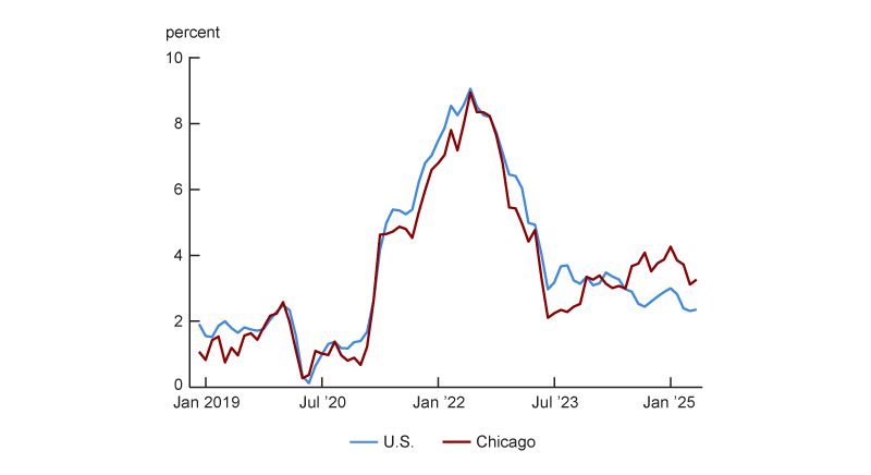
In addition to the national CPI, which is used to calculate the annual rate of inflation for U.S. urban consumers, the BLS releases inflation measures for individual urban areas (e.g., the Chicago metropolitan area), sets of urban areas (e.g., small Midwest cities, each with a population of 2,500,000 or less), and the urban areas of regions (e.g., the urban Midwest).2 Based on the CPI data, I observe that inflation in Chicago has been higher than in the nation recently. Figure 1 presents annual inflation for the overall U.S. and for the Chicago metropolitan area since December 2018.3 For the 12 months ending in May 2025, CPI inflation was 2.4% for the U.S. and 3.3% for Chicago (a gap of 0.9 percentage points). Figure 1 also shows that the Chicago inflation rate has consistently been above the overall U.S. inflation rate since the middle of 2024. With that said, I also observe that in the majority of months since December 2018, Chicago’s inflation rate has been below that of the nation.
1. Chicago and U.S. annual Consumer Price Index inflation
Recent Chicago inflation has been higher than in most other metro areas
Recent Chicago inflation can also be compared with that of other places for which the BLS reports CPI data. These data are reported for the four Census regions and nine Census divisions, plus 27 metro areas—23 large metro areas (including Chicago) and four collections of smaller cities (one in each Census region). A map of these places (i.e., CPI primary sampling units, or PSUs), established in 2018, is available online.4
To determine how much higher (or lower) Chicago inflation is relative to inflation in most urban places, I compare inflation in Chicago and 26 other metro areas (or collections of metro areas) the BLS reports CPI data for. Of these 27 places, seven are reported each and every month (the top three metro areas by population as of the 2010 U.S. Census—New York, Los Angeles, and Chicago—and the small-city collections within each of the four Census regions), 11 in only even months (February, April, and so on), and nine in only odd months (January, March, and so on). I refer to the 18 areas observed in even months as “even-month-reporting places” and the 16 areas observed in odd months as “odd-month-reporting places.”
The BLS publishes inflation data. It does not publish data on the level of prices across places. Data that compares the price levels across places is released annually by the U.S. Bureau of Economic Analysis (BEA). The most recent BEA data release comparing price levels across places is for a vast set of places throughout the U.S. in 2023.
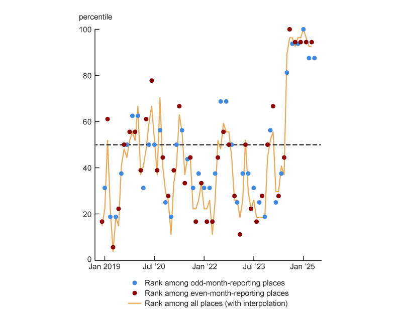
Figure 2 shows Chicago’s percentile rank for annual inflation (with higher ranks equating to higher inflation) relative to the 26 other areas over time in three ways. First, it compares Chicago with the 15 other odd-month-reporting places. Second, it compares Chicago with the 17 other even-month-reporting places. Third, it compares Chicago with all 26 other metro areas. To make this third comparison, I interpolate price indexes between available months and drop the last month of data. More specifically, as of June 2025, I have May CPI data. However, for May 2025, I do not have data for the even-month-reporting places. So I end this sample in April 2025, given that I already have April data for even-month-reporting places and can linearly interpolate April data for the odd-month-reporting places based on the March and May data.
2. Chicago’s percentile rank for annual Consumer Price Index (CPI) inflation
Source: Author’s calculations based on data from the U.S. Bureau of Labor Statistics from Haver Analytics.
Figure 2 shows that Chicago has had high annual inflation relative to other areas’ annual inflation recently. For instance, for January 2025, Chicago had the highest inflation reading not only among all odd-month-reporting places but also among all places (with interpolation). And for April 2025, Chicago was at the 94th percentile for inflation among the even-month-reporting places and at the 93rd percentile for inflation among all places (with interpolation). Only New York City and San Diego had higher annual inflation in April 2025. That said, I also observe that in the majority of months covered in figure 2, Chicago inflation is below the median.
Chicago’s cumulative inflation since January 2021 has been similar to the nation’s
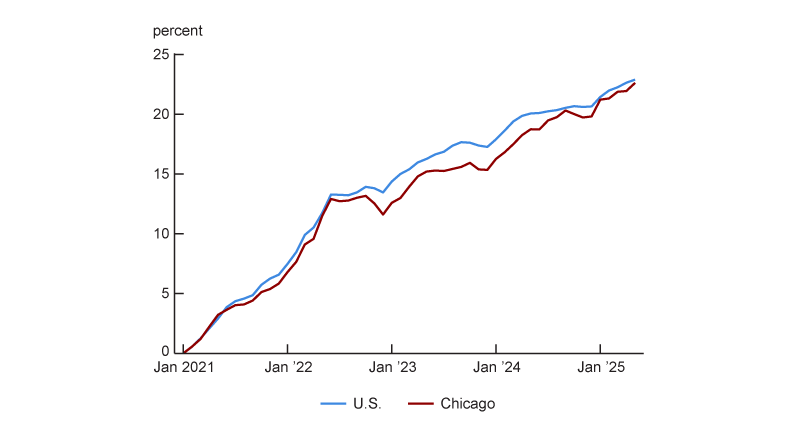
From figure 1 it is clear that for most of the period since December 2018, annual inflation has been lower in Chicago than in the U.S. as a whole, though recently it has been higher. Rather than annual inflation, figure 3 plots cumulative inflation (i.e., the total percentage change in the price level) since January 2021—a period that covers the Covid-related run-up in inflation and the more recent decline. This figure shows that as of May 2025 the percentage change in the price level in Chicago is just below (about one-quarter of a percentage point) the national total since January 2021. For most of this period, Chicago’s cumulative inflation since January 2021 was below that of the U.S., but recently the gap has been narrower.
3. Chicago and U.S. cumulative Consumer Price Index inflation since January 2021
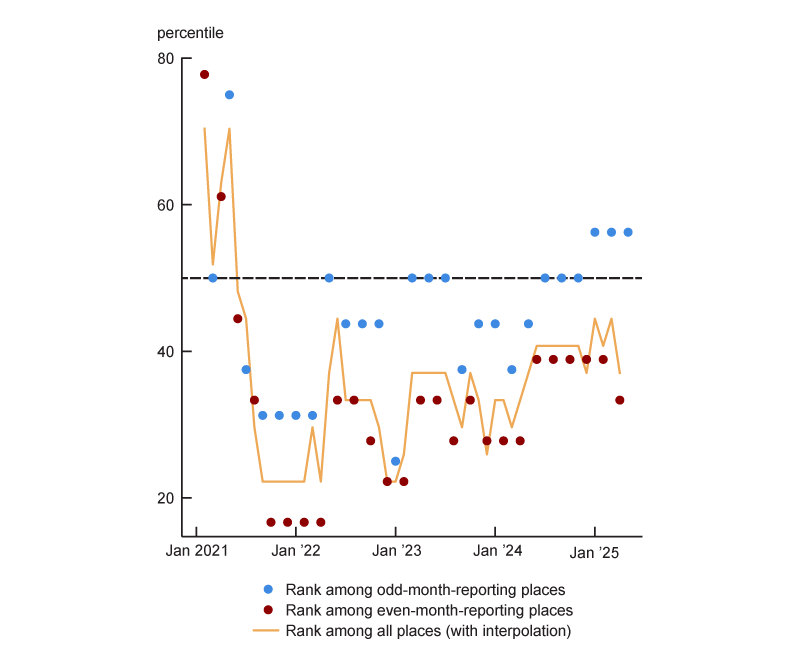
I can also compare cumulative inflation in Chicago with cumulative inflation in other places. Figure 4 shows Chicago’s percentile rank for cumulative inflation since January 2021 among the odd-month-reporting places, the even-month-reporting places, and all places (with interpolation) through the month prior to the last month of data in my sample. Given how close Chicago’s cumulative inflation has been to the nation’s through 2025 (see figure 3), it is not surprising that Chicago is ranked close to the median in 2025: Through April 2025, Chicago was at the 37th percentile for cumulative inflation since January 2021 among all places (see figure 4). Figures 3 and 4 also demonstrate that some of the recent higher annual inflation in Chicago represents Chicago’s cumulative inflation since January 2021 catching up after being below the level of cumulative inflation in the U.S. and other metro areas. However, even after the recent catch-up, cumulative inflation in Chicago since January 2021 is below both the U.S. level and the median across the surveyed metro areas.
4. Chicago’s percentile rank for cumulative Consumer Price Index (CPI) inflation since January 2021
Source: Author’s calculations based on data from the U.S. Bureau of Labor Statistics from Haver Analytics.
Chicago inflation has been higher recently because of housing and transportation
Next, I want to investigate whether there are specific expenditure categories driving Chicago annual inflation higher than inflation in other places in the recent months of data. I focus on the period since January 2024—the first time Chicago inflation has been above U.S. inflation since the fall of 2022, when the former was slightly higher for a couple months (see figure 1)—and on the comparison with overall U.S. inflation.
To investigate which specific expenditure categories are driving higher Chicago inflation, I take advantage of the underlying data used to generate the BLS inflation numbers. To create inflation data for metro areas and broader regions, the BLS surveys prices in different urban areas and publishes percent changes in prices for about 60 different items or categories of items on either a monthly basis or bimonthly basis (i.e., in only odd or even months, depending on the place). To generate an inflation reading for an area, the BLS weights these price changes by spending in each category based on area expenditure data collected as part of the Consumer Expenditure Survey.
Figure 5 shows expenditure weights for the eight major expenditure categories and selected sets of expenditure subcategories (for December 2023) and May 2024–May 2025 inflation for each of these categories and subcategories for Chicago and the U.S. The set of CPI inflation data available for Chicago is more limited than that for the U.S. as a whole.
5. Chicago and U.S. Consumer Price Index expenditure weights for December 2023 and category price changes for May 2024–May 2025
| Chicago | United States | |||
| Expenditure weight |
Price change |
Expenditure weight |
Price change |
|
| Total | 100.0 | 3.3 | 100.0 | 2.4 |
| Food and beverages | 15.0 | 3.2 | 14.4 | 2.8 |
| Housing | 44.6 | 5.3 | 45.1 | 4.0 |
| Shelter | 35.4 | 5.4 | 36.2 | 3.9 |
| Fuels and utilities | 4.2 | n.a. | 4.4 | 6.0 |
| Household furnishings and operations | 5.0 | 1.3 | 4.5 | 2.7 |
| Apparel | 3.0 | –0.3 | 2.5 | –0.9 |
| Transportation | 12.2 | –2.3 | 15.9 | –1.3 |
| Private transportation | 10.9 | –2.7 | 14.8 | –1.0 |
| New and used motor vehicles | n.a. | –0.1 | 6.4 | 0.5 |
| Motor fuel | 3.0 | –15.1 | 3.4 | –11.9 |
| Motor vehicle parts and equipment | n.a. | n.a. | 0.5 | 1.7 |
| Motor vehicle maintenance and repair | n.a. | n.a. | 1.2 | 5.1 |
| Motor vehicle insurance | n.a. | n.a. | 2.8 | 7.0 |
| Motor vehicle fees | n.a. | n.a. | 0.5 | 1.5 |
| Public transportation | n.a. | n.a. | 1.1 | –5.4 |
| Medical care | 8.7 | 3.3 | 8.0 | 2.5 |
| Recreation | 6.1 | 3.5 | 5.3 | 1.8 |
| Education and communication | 6.9 | 0.6 | 5.9 | 0.3 |
| Other goods and services | 3.5 | 7.1 | 2.9 | 3.8 |
Source: U.S. Bureau of Labor Statistics from Haver Analytics.
Figure 6 breaks down Chicago inflation into contributions from the eight major categories; for this figure, I use annual price changes by category and expenditure weights from the previous December. Figure 6 also features a ninth category, labeled “measurement,” because my calculation differs modestly from the official CPI inflation calculation.5 Including this ninth category guarantees that the bars in figure 6 sum up to total Chicago inflation.
6. Contributions to Chicago annual Consumer Price Index inflation, by major expenditure category
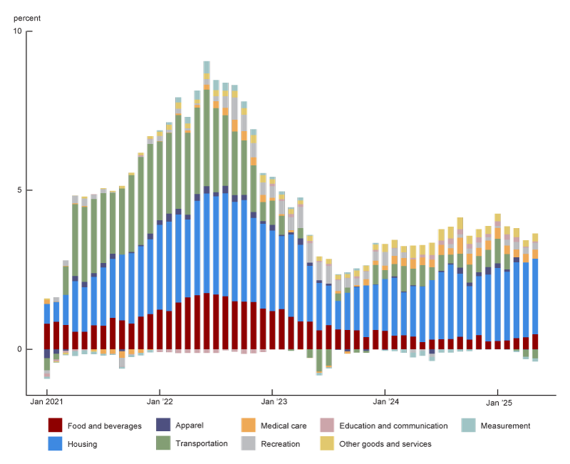
Source: Author’s calculations based on data from the U.S. Bureau of Labor Statistics from Haver Analytics.
An expenditure category can have a high contribution to inflation if it has been experiencing large price increases or if the category receives a lot of weight because it is a big component of overall spending. A couple of patterns emerge in figure 6. Most notably, the figure is dominated by the blue housing category, which represents over 40% of the Chicago expenditure weight. Note that the BLS housing category comprises shelter expenses (in particular, rent and owner’s equivalent rent), household fuel and utility expenses, and expenses for household furnishings and operations (e.g., dishes and lawn care). For May 2025, housing contributed 2.4 percentage points to Chicago inflation.
Figure 6 shows the sources of Chicago inflation by category. But I am more interested in the sources of the gap in inflation between Chicago and the U.S. by category. To figure this out, I do the following. First, I ask whether the difference in inflation between Chicago and the U.S. in figure 1 is due to differences in expenditure weights by category or differences in percent changes in prices by category. And second, once I establish that the differences in price changes by category are more important, I investigate contibutions to the gap by category by using a common set of expenditure weights—in other words, by assuming Chicago and the U.S. had the same expenditure patterns (i.e., the U.S. patterns).
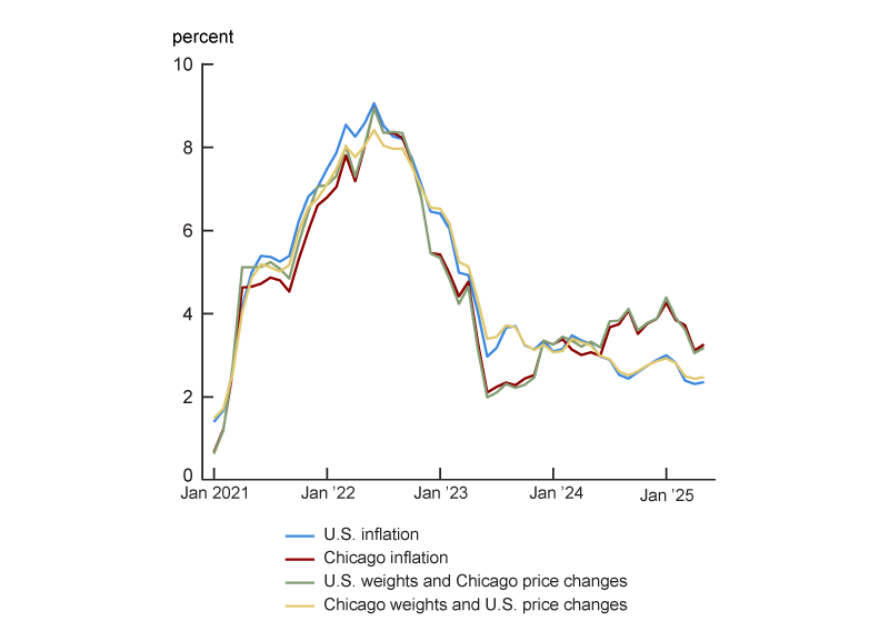
To determine whether expenditure weights or category price changes are more important, I generate two counterfactuals. The first counterfactual is what inflation would be if an area had U.S. expenditure weights and Chicago price changes by category. And the second counterfactual is what inflation would be if an area had Chicago expenditure weights and U.S. price changes by category. Figure 7 displays the data from these two counterfactuals, along with annual inflation for Chicago and the U.S. (the same two series plotted in figure 1). In the most recent period, when inflation has been running higher in Chicago than in the broader U.S., Chicago inflation and the counterfactual calculated by subbing in U.S. expenditure weights for Chicago weights are nearly identical. And conversely, U.S. inflation and the counterfactual calculated by subbing in Chicago expenditure weights for U.S. weights are nearly identical. Given what figure 7 shows, I can conclude that differences in expenditure weights for Chicago relative to those for the U.S. as a whole are not driving the recent gap in inflation.
7. Actual Chicago and U.S. annual Consumer Price Index inflation versus counterfactual inflation
Source: Author’s calculations based on data from the U.S. Bureau of Labor Statistics from Haver Analytics.
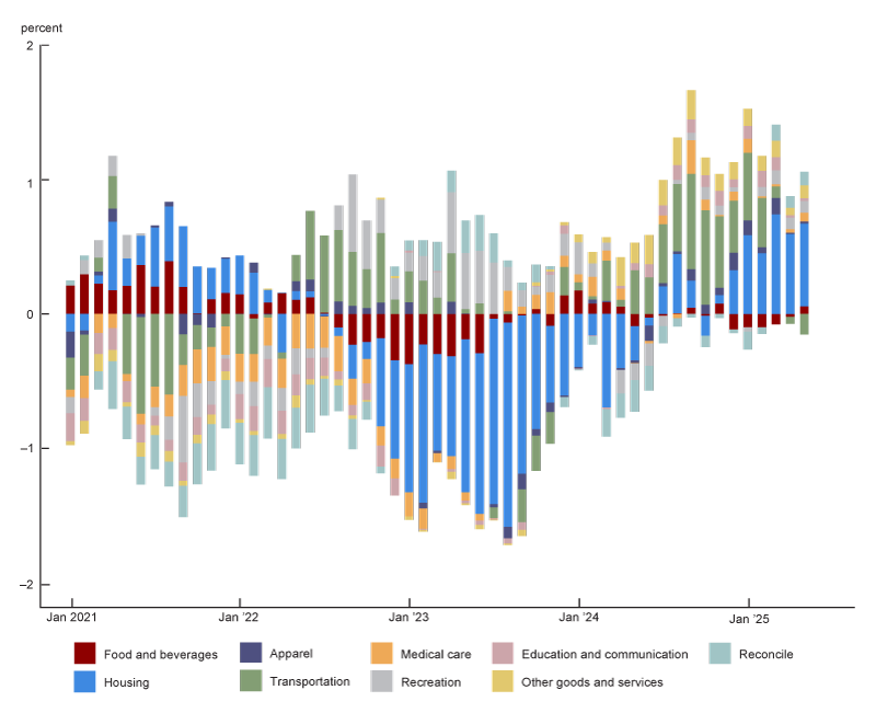
I next break down the inflation gap between Chicago and the U.S. into what is due to differences in price changes for each of the eight major expenditure categories based on the U.S. expenditure weights. I display this breakdown in figure 8. The figure also includes a ninth category, labeled “reconcile,” because it makes the total inflation gap in the figure equal the total gap in the official BLS data. The necessity for this ninth category arises from the differences due to my use of the U.S. expenditure weights to determine the contributions of the eight major expenditure categories to total inflation for not only the nation but also Chicago (so I am not matching the true calculation for Chicago inflation, which uses Chicago expenditure weights); and it also arises from the differences between my measurement methodology and the offical CPI measurement methodology (see note 5).6
8. Sources of the gap in annual Consumer Price Index inflation between Chicago and the U.S.
Source: Author’s calculations based on data from the U.S. Bureau of Labor Statistics from Haver Analytics.
Of the 0.9 percentage point gap in inflation between Chicago and the U.S. in May 2025, 0.6 percentage points were due to housing. While the contribution from housing dominates in the last few months of my sample, the contribution from transportation was a major part of the story during the latter half of 2024 and into the first couple months of 2025. However, the contribution from transportation has been negative in the final two months of my sample (April and May 2025), indicating that annual transportation inflation was lower in Chicago. There are two other patterns to notice in figure 8. First, nearly all the contributions are positive in the last few months, indicating that annual price changes by category have been higher for Chicago in nearly every category for almost a year. This is unusual because typically, contributions from some categories are above zero, while contributions from others are below zero. Second, from late 2022 to mid-2024, housing’s contribution was actually a driving force behind lower inflation in Chicago than in the broader U.S.
Further breakdowns highlight shelter costs and vehicle expenses as sources of higher Chicago inflation
Available data on U.S. inflation by subcategory allow me to further break down the contribution from housing to the inflation gap between Chicago and the U.S. (using U.S. expenditure weights). This contribution from housing can be further disaggregated into the following: contributions from shelter costs (e.g., rent, owners’ equivalent rent, and costs for lodging away from home); costs for household furnishings and operations; and a residual, which includes costs for fuels and utilities as well as the factors in the “reconcile” category in figure 8.7 I find that the recent gap in housing inflation between Chicago and the U.S. is almost entirely due to the shelter subcategory.
Further breakdowns of transportation’s contribution to the inflation gap between Chicago and the nation are trickier because the BLS provides a limited set of price change data for Chicago (see figure 5). However, I do have expenditure weight data for the U.S., which allow me to divide transportation into public and private subcategories and then further divide private transportation into motor vehicle purchases, motor fuel costs, and a third subcategory, which I call “motor vehicle expenses.” These vehicle expenses comprise costs for parts, repairs, and insurance, plus related fees (such as parking fees and road tolls). I also have data on price changes in Chicago for the private transportation subcategory, as well as the motor vehicle purchases and motor fuel subcomponents, allowing me to estimate price changes in public transportation and vehicle expenses. In this case, because of how this estimation is done, the only source of a residual is a measurement category.8 Based on these estimates (using U.S. weights), I find that over most of the past 18 months, vehicle expenses have been the primary source of the transportation inflation gap between Chicago and the U.S. Over the sample’s last couple of months, when the transportation inflation gap has been negative, the contribution from vehicle expenses has also been negative.
Conclusion
Relatively high inflation in Chicago has garnered some recent headlines. In this article, I closely examined the data behind the inflation gap between Chicago and the U.S. and found that this is a relatively recent phenomenon driven by higher contributions to the gap from housing and transportation costs—and, more specifically, from shelter costs and vehicle expenses.
Notes
1 Jack Grieve, 2025, “See how rising prices in Chicago compare to other metro areas,” Crain's Chicago Business, February 13, available online by subscription; and Ethan Illers, 2025, “Chicago feels inflation more than any US city, new data shows,” WGN-TV, February 16, available online.
2 Further information on all these different CPI inflation measures is available online.
3 The BLS provides inflation data for core-based statistical areas (CBSAs), as defined by the Office of Management and Budget and used by the BLS for CPI purposes, as explained in the CPI’s 2018 geographic revision notice. However, I will use city or metropolitan (or metro) area rather than CBSA throughout this article. For instance, I refer to the CBSA of Chicago–Naperville–Elgin, IL–IN–WI, as the city of Chicago or Chicago metro area. I start examining the CPI data in December 2018 because that is when I can first calculate annual inflation using the current BLS geographic sample.
4 CPI data are also reported for all the large cities together (size Class A cities), all the small cities together (size Class B/C cities), and the large cities by region (e.g., Midwest size Class A cities). According to BLS definitions, Class A cities have a population greater than 2,500,000 and Class B/C cities have a population of 2,500,000 or less. The 27 metro areas (or collections of metro areas) I focus on are those that do not geographically overlap with one another. For example, I only include Chicago in my sample of places for this article and exclude size Class A cities and Midwest size Class A cities because Chicago is part of those two collections of metro areas.
5 In particular, I do not update weights every month based on price changes as is done for the official CPI (an adjustment the BLS calls relative importance).
6 There is a second way to break down this inflation gap—which is to compare the contributions to Chicago inflation by category (as in figure 6) with the contributions to U.S. inflation by category. This comparison would also highlight the transportation and housing categories as the largest contributors to the difference in inflation between Chicago and the U.S. The advantage of the methodology I chose is that there will be no gap attributed to a category if the price changes for that category in Chicago and the U.S. are the same.
7 The fuels and utilities subcategory was discontinued at the subnational level after December 2024 (see the notice regarding ceasing publication of utility indexes in this January 15, 2025, BLS release for Chicago–Naperville–Elgin CPI data for December 2024). As a result, I cannot break this residual down further for 2025 data. I am, however, able to break it down for data before 2025 and observe that this category is dominated by fuels and utilities.
8 This residual arises because the total U.S. transportation inflation contribution is not exactly equal to the sum of the U.S. transportation subcategories’ inflation contributions as a result of my not perfectly replicating the BLS procedure for calculating inflation (see note 5).


