

Tariffs are taxes on goods and services imported from foreign countries. Economic theory suggests tariffs make imported products relatively more expensive than domestically made ones, encouraging households and businesses to buy products made in their home country and encouraging businesses to produce domestically. Not all households and businesses are equally affected by tariffs. For example, lower-income households spend a greater share of their budgets on imports.1 And among businesses, some import more of their inputs, some receive tariff protection, and some export more, potentially making them subject to tariffs by foreign countries.
If trade-intensive households and businesses are concentrated in certain parts of the country, these regions will be more affected by tariffs. While the share of households that are lower income is quite similar across U.S. regions,2 industrial composition is not. In this article, we show that places in the middle of the country trade the most because they are concentrated in the manufacturing industry or the natural resources and mining industry (or both). These industries import and export the most, and they are most likely to receive tariff protection via import tariffs.
States in the center of the U.S. are more trade intensive
In 2024, the U.S. imported $4.1 trillion worth of goods and services and exported $3.2 trillion. But where did the imports go once they arrived in the U.S., and what parts of the U.S. produced the exports? There is no perfect source of data that answers these questions, so we combine data from several sources to estimate trade intensity at the state level.3 The first source is the Organisation for Economic Co-operation and Development’s (OECD) Inter-Country Input-Output (ICIO) tables, which provide estimates of the dollar value of trade across 76 countries (all others are grouped together) and 45 industries (including subsectors). For example, the OECD estimates that in 2019, the Danish pharmaceutical manufacturing industry imported $19 million worth of chemicals from the U.S. and that it exported $5.6 billion worth of medicine to U.S. households. (The data go through 2020, but we use the 2019 data because the Covid-19 pandemic could have temporarily altered trade patterns.) Our goal is to assign the value of all such trade to states, and we do that in two parts. For business-to-business transactions in the OECD ICIO tables, we assign imports and exports based on where an industry’s workers reside according to the U.S. Census Bureau’s American Community Survey (ACS) for 2019–23.4 For example, about 8% of chemical manufacturing workers reside in Texas, so we assign Texas 8% of the chemical industry’s imports and exports. For business-to-household transactions in the OECD ICIO tables, we assign imports (households do not export) based on a state’s share of total household expenditure according to the ACS for 2019–23 and the U.S. Bureau of Labor Statistics’ Consumer Expenditure Surveys for 2019–23.5 For example, about 9% of U.S. household expenditure occurs in Texas, so we assign 9% of U.S. imports purchased by households to Texas.
To assess how trade intensive the states are, we sum the value of a state’s imports as a share of its gross domestic product (GDP) and exports as a share of its GDP.6 For instance, for Michigan, the most trade-intensive state in the country, we estimate its imports were 18.6% of state GDP in 2019 and its exports were 14.1% of state GDP. So, Michigan’s trade-intensity measure is 32.7%. In contrast, Florida has one of the lowest trade-intensity measures at 20.0%, with its imports at 11.1% of state GDP and its exports at 8.8%.7 Florida businesses and residents still participate in international trade, but at a notably lower rate than those in Michigan do. Figure 1 maps the full distribution of trade intensity across U.S. states (plus the District of Columbia), where darker blue states are more trade intensive. In general, states in the middle of the country tend to trade more, and in the next section we look at why. Seventh Federal Reserve District states—particularly, Indiana, Iowa, Michigan, and Wisconsin—are among the most trade intensive.
1. Trade-intensive states are largely in the middle of the country
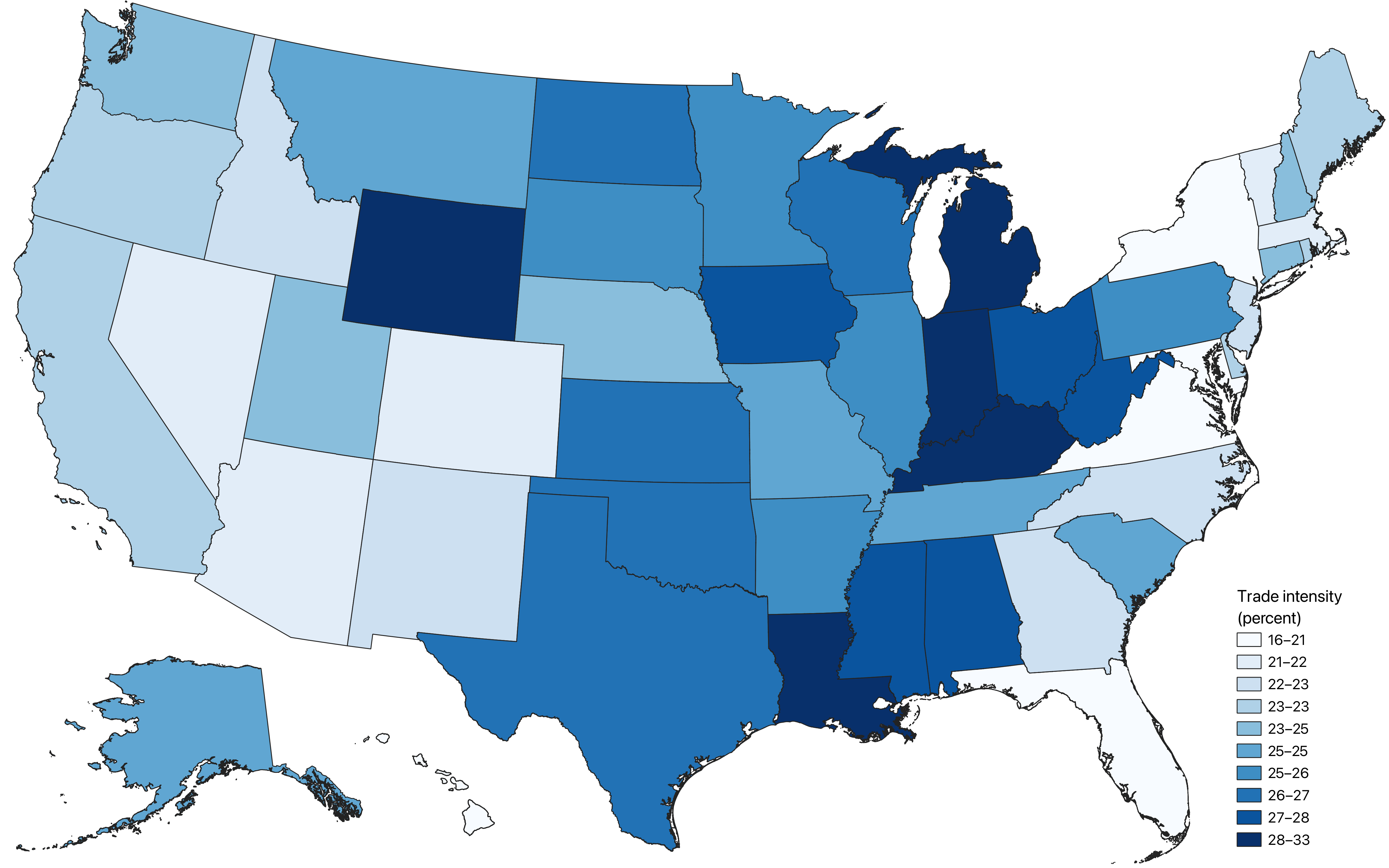
Sources: Authors’ calculations based on data from the Organisation for Economic Co-operation and Development (OECD), 2019 Inter-Country Input-Output (ICIO) tables; U.S. Census Bureau, 2019–23 American Community Surveys; and U.S. Bureau of Labor Statistics, 2019–23 Consumer Expenditure Surveys.
Trade intensity is driven by concentration in the manufacturing and natural resources and mining industries
Why does Michigan trade so much more than Florida? The answer comes down to differences in the states’ industrial compositions: Michigan is a manufacturing hub, while Florida specializes in services, particularly leisure and hospitality. The leisure and hospitality industry does import and export—for instance, when foreign visitors go to Disney World (a service export). But the leisure and hospitality industry does not engage in international trade to the extent manufacturing does, and the difference is meaningful. In figure 2, we show trade intensity by 11 top-level industries, including manufacturing and leisure and hospitality. At the industry level, we measure trade intensity as a share of the value added, which is the dollar value of an industry’s output minus the cost of its inputs, excluding payments to labor, capital, and owners. One way to define a country’s GDP is as the sum of the value added across all its industries; so, think of an industry’s value added as its contribution to GDP.
We sort the industries in figure 2 by trade intensity, and manufacturing is at the top. The value of imports by manufacturers is equivalent to 29.0% of the industry’s value added and the value of exports by manufacturers is equivalent to 34.7%, making manufacturing’s trade intensity 63.6%. Second in the list is the natural resources and mining industry, which includes agriculture and oil and gas extraction; this industry has a trade intensity of 45.4%. The remaining industries are in the service sector (except construction), and all have much lower trade intensities.
2. Manufacturing and natural resources and mining industries are the most trade intensive
| Import share of value added (percent) |
Export share of value added (percent) |
Trade intensity (percent, sum of shares) |
|
|---|---|---|---|
| Manufacturing | 29.0 | 34.7 | 63.6 |
| Natural resources and mining | 16.3 | 29.1 | 45.4 |
| Trade, transportation, and utilities | 6.4 | 16.7 | 23.1 |
| Information | 6.9 | 10.1 | 17.0 |
| Professional and business services | 5.1 | 9.9 | 15.0 |
| Leisure and hospitality | 5.0 | 8.7 | 13.7 |
| Construction | 12.7 | 0.0 | 12.7 |
| Government | 8.2 | 1.4 | 9.6 |
| Financial activities | 2.8 | 5.0 | 7.8 |
| Other services | 5.4 | 1.3 | 6.6 |
| Education and health services | 3.7 | 1.7 | 5.4 |
To see how important manufacturing is to a state’s overall trade-intensity measure, we plot the relationship between the manufacturing share of employment and trade intensity in figure 3. The manufacturing share explains 44% of the variation in trade intensity across states, and a 10 percentage point increase in manufacturing share predicts a 4.8 percentage point increase in trade intensity. There are some important outliers, though, particularly Louisiana, Wyoming, and other states where the oil and gas or mining industries are important.
3. Manufacturing share of employment strongly predicts trade intensity

Sources: Authors’ calculations based on data from the Organisation for Economic Co-operation and Development (OECD), 2019 Inter-Country Input-Output (ICIO) tables; U.S. Census Bureau, 2019–23 American Community Surveys (ACS); and U.S. Bureau of Labor Statistics, 2019–23 Consumer Expenditure Surveys.
Conclusion
We find that states in the middle of the country trade the most because they are concentrated in manufacturing or the natural resources and mining industry (or both). It is difficult to say how exactly changes to the U.S. economy caused by higher tariffs will play out, but we can expect that it will be the middle of the country that experiences the greatest change.
Notes
1 See, e.g., Horwich (2024).
2 Austin et al. (2018) note that differences in average incomes across states accounts for just 1.1% of differences in household income levels (see p. 153).
3 The most commonly used data on U.S. international trade come from the U.S. Census Bureau. Those data include information on the destination of U.S. imports and the origin of U.S. exports, but the Census Bureau cautions that the location information has limited accuracy and is often for the warehouse where imports go to upon arrival in the U.S. or the warehouse where exports go to before leaving the U.S. For example, agricultural exports that travel down the Mississippi River from Iowa are often identified as being exported from Louisiana. This article’s methodology is intended to provide greater location accuracy than the Census Bureau data do.
4 The OECD ICIO tables provide data by country and industry for imports and exports of intermediate inputs, i.e., inputs that are transformed as part of the production process. The tables also provide data on which industries export capital goods; however, while they provide data on capital goods imports, they do not specify which industries purchase the goods. So, we assign U.S. imports of capital goods to U.S. industries using the Investment in Fixed Assets data from the U.S. Bureau of Economic Analysis.
5 More specifically, to calculate total household expenditure by state, we combine data on household income with data on household expenditure by U.S. household income decile. For each state, we first calculate total household income among households in each U.S. income decile. We then calculate total expenditure for each decile by multiplying total income by the share of income that the decile devotes to expenditure (as opposed to saving). A state’s total expenditure is the sum of expenditure across income deciles.
6 For this article, we calculate GDP as the sum of the value added by a state’s industries according to the OECD ICIO tables, with industry value added being allocated based on a state’s share of employment in an industry.
7 Imports and exports as percent shares of state GDP may not total to a state’s trade-intensity measure because of rounding.


