Predicting the Unemployment Rate in a Time of Coronavirus
Summary
Economists forecast the unemployment rate all the time. Usually, though, they use data over the previous months and quarters to forecast the unemployment rate out several years. Since the relationships between the unemployment rate and things like GDP growth and employment are mostly stable over time, and since month-to-month movements in the unemployment rate are usually small, these forecasts usually work well.
The current Covid-19 crisis, however, has caused a rapid contraction in economic activity and a sharp deterioration in labor market conditions. Policymakers need a plausible estimate of what unemployment may look like over the next several months rather than the next few years. Generating such an estimate is not easy—there are limited data available to generate such a short-term estimate, and nearly all of the available data are for a time prior to many of the stay-at-home directives and moves to essential services that have led to the contraction.
In this blog, I present an unemployment projection exercise that uses the most up-to-date, frequent, and well-measured labor market data that are widely available: initial unemployment insurance (UI) claims. The U.S. Labor Department reports these data weekly and they represent the universe of all individuals that have applied for UI in the preceding week. The projection uses these data, in conjunction with the most recent data on payroll employment, real earnings, and transitions from employment to unemployment, to produce estimates of the unemployment rate over the next several months.1 The projection exercise relies on a series of assumptions based on my best guesses of how these labor market variables will evolve over the coming months; these guesses in turn rely heavily on past experiences during the height of the Great Recession. Moreover, the exercise currently only has two weeks of initial UI claims since the start of the stay-at-home directives, though I hope to update the exercise as more data become available. Given these caveats, the projection exercise is admittedly more ad hoc than a traditional unemployment rate forecast, and therefore subject to greater uncertainty. For example, the exact timing of the response is somewhat sensitive to particular assumptions on smoothing and other transformations of the data that are somewhat arbitrary but are needed to generate the unemployment estimates at the monthly frequency. The projection also cannot account for differences in how individuals are categorized as unemployed or out of the labor force during the crisis. Specifically, some individuals may be laid off yet not count as unemployed because they view actively looking for work—a requirement in most cases for one to count as unemployed—as pointless during the stay-at-home directives.2 The projection nevertheless gives us a disciplined picture of what we can expect the unemployment rate to do in the short-term given the available data.
Analysis
The unemployment rate projection exercise has two parts. The first part uses econometric techniques to estimate the relationship of the change in the unemployment rate with the UI initial claims and other labor market variables between February 1990 and March 2020. The second part then uses these estimated relationships, along with assumed paths for the key labor market variables, to forecast changes in the unemployment rate going forward.
A critical assumption in the exercise is the path of the UI take-up rate. Not all people who are eligible for UI apply for it. This is especially true when the economy is doing well. For example, if we measure job losers as those who transition from employment to unemployment in a given month, only about 60% of these job losers filed an initial UI claim over the 2017–19 period. Research shows, however, that as economic conditions worsen, this number quickly rises toward 100%.3
The key assumptions for the exercise are those concerning its labor market variable inputs from April 2020 forward, particularly the assumptions made for initial UI claims and the UI take-up rate. In general, the exercise uses the most recent available data, in conjunction with paths for UI take-up rates, payroll employment losses, and real earnings growth that mimic what occurred during the worst of the Great Recession (spring to summer 2009). Since the UI take-up rate is such an important part of the exercise, the estimation takes two approaches. The first uses a direct assumption that the take-up rate follows the same path as it did in early 2009. The second instead statistically predicts the take-up rate using its historical relationship with payroll employment growth and the job loss rate (as measured by employment-to-unemployment transitions).
Table 1 lists these assumptions for the baseline version of the exercise. The numbers in bold represent actual data available at the time of the exercise. The remainder are assumptions based on the worst we saw during the Great Recession. April initial UI claims (which cover mid-March through mid-April) use the initial 3.28 million spike in claims observed for the week of March 21, followed by the larger spike of 6.65 million claims the following week. In the baseline estimate, I assume that these spikes in claims gradually decline to levels comparable to their 2009-era levels by the middle of May 2020. I assume that the take-up rate almost immediately goes to 100% and rises slightly above this level in May—differences in how UI claims and employment-to-unemployment transitions measure job loss can cause the rate to go above 100%.4 Finally, I assume a drastic drop in employment growth, from an average of just over 1% annually during the first three months of 2020 to a –12.5% annual rate in April. I obtain this value by choosing the growth rate that matches the predicted rise in the April UI take-up rate as closely as possible to the take-up rates reported in the table below, given my assumption on the path of initial UI claims. The last column shows that this drop implies a net loss of 19.7 million payroll jobs between February and April, with an additional million jobs lost in the subsequent months.5
Table 1. Key assumptions of the unemployment rate forecast
| Month | Avg. weekly initial UI claims | UI take-up rate | 12-month employment growth (pct) | Implied payroll employment (millions) |
|---|---|---|---|---|
| January | 215,400 | 0.53 | 1.37 | 152.2 |
| February | 208,000 | 0.54 | 1.55 | 152.5 |
| March | 232,500 | 0.35 | 0.99 | 151.8 |
| April | 3,525,730 | 0.99 | –12.52 | 132.8 |
| May | 933,280 | 1.04 | –12.87 | 132.4 |
| June | 707,740 | 0.93 | –13.50 | 131.7 |
Results of the exercise
Table 2 reports the results for both versions of the unemployment rate projection model. Both versions predict a massive increase in the unemployment rate of 6.6 to 10.5 percentage points in April, a still-large increase of 3.1 to 4.0 percentage points in May, and a further increase of 0.2 to 1.2 percentage points in June. To put these changes into context, the monthly increases in the unemployment rate during the 1980–82 and 2008–09 recessions, among the sharpest in modern history, were 0.3 to 0.6 percentage points per month. The forecast I present here suggests that the unemployment rate could rise to 15.2% to 19.2% by June.
Table 2. Near-term unemployment forecasts
| Month | Using an assumed path for the UI take-up rate | Using a predicted path for the UI take-up rate |
|---|---|---|
| March* | 4.4% | 4.4% |
| April | 14.9% | 11.0% |
| May | 18.0% | 15.0% |
| June | 19.2% | 15.2% |
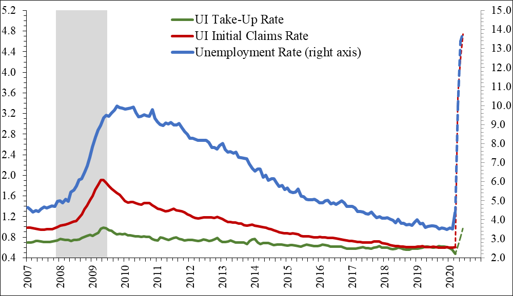
Figure 1 puts these sharp and drastic predicted increases in the unemployment rate into historical perspective. It shows the actual unemployment rate and the forecast from the predicted UI take-up rate from above, along with three-month moving averages of the actual and assumed UI take-up rate and initial UI claims rate (initial claims as a percentage of employment). Dashed lines represent the assumed or predicted values. As you can see, the rise in the unemployment rate is sharp and dramatic, even when compared with the rise observed during the Great Recession. The rise in initial claims is also sharp. They rise to record levels almost immediately, while initial UI claims during the Great Recession took months to reach their (much lower) peak. The UI take-up rate also rises almost immediately to one (i.e., 100% take-up), whereas it took several months to rise to that point during the Great Recession.
Figure 1. Actual and predicted unemployment rates, initial UI claims, and UI take-up rates
These results are based on what I consider to be a reasonable guess of how UI claims may evolve in the coming months. Alternative assumptions on their evolution will affect the results considerably. To see how much, I consider two alternative paths for UI claims going forward. The more pessimistic path assumes that the spike in claims observed in March remains more elevated than in the baseline and does not fall to levels comparable to 2009 until the end of May. It calibrates the predicted UI take-up rate to be the same as in the baseline scenario and adjusts the assumption of employment growth to be consistent with both this take-up rate and the new UI claims path. In this scenario, the exercise predicts a June unemployment rate of 18.2%, compared with 15.2% in the baseline, and job losses in April of 21.5 million jobs, compared with 19.7 million jobs in the baseline. The more optimistic path assumes that the spike in claims observed in March falls from its elevated level faster than the baseline, returning to levels comparable to 2009 by the end of April, and adjusts the remainder of the assumptions in a similar fashion. In this scenario, the exercise predicts a June unemployment rate of 13.8% and job losses in April of 18.5 million jobs.6
Table 3. Alternative unemployment predictions
| Month | June unemployment rate | Implied employment change (millions) |
|---|---|---|
| Baseline scenario | 15.2% | –19.7 |
| More pessimistic scenario | 18.2% | –21.5 |
| More optimistic scenario | 13.8% | –18.5 |
One caveat for this projection exercise is that the estimation uses a mix of moving averages and lags to smooth the monthly data used in the forecast. This may skew the timing of the unemployment rate increases.
Another caveat is that it is not clear how well the historical relationship between employment losses, UI claims, and the unemployment rate will hold up over the next several months. One issue is how an individual is classified as unemployed in the official government statistics—one must be out of work and actively searching for new work, or on temporary layoff (regardless of search efforts) to count as unemployed. Individuals on furlough will qualify under the temporary layoff definition. However, it is unclear how many job losers will qualify as actively searching for new work, as many states and localities have imposed stay-at-home restrictions that will make job search difficult. This will not only affect the official unemployment rate estimate that I am trying to predict, but also the measured UI take-up rate, since it may appear in the official statistics that there are fewer newly unemployed people eligible to claim benefits. Another is the simple issue that changes in labor market data, particularly initial UI claims, are so much larger than anything we have seen before, that past episodes may do a poor job of capturing their dynamics.
Overall, given the available data and the most recent numbers on the drastic increase in initial UI claims, this exercise predicts a sharp rise in the unemployment rate that would eclipse peak unemployment observed during the Great Recession in just a few months. This is true even if I assume the unprecedented million-plus levels of initial claims last only a few weeks. What happens to the unemployment rate, and the labor market more generally, after that is anyone’s guess. It will depend strongly on the spread of Covid-19, the government’s response, and the economy’s ability to return to normal operations.
Notes
1 Payroll employment and real earnings growth come from the establishment survey (Current Employment Statistics) of the monthly Bureau of Labor Statistics employment situation report, with nominal earnings transformed into real earnings using the Consumer Price Index. Transitions from employment to unemployment are derived from the household survey (Current Population Survey) of the employment situation report. Data on UI claims come from the Labor Department’s Employment and Training Administration.
2 The March BLS Employment Situation Report underscores this concern. The report notes that about 1% of the labor force reported themselves as employed but on leave rather than on temporary layoff (as BLS would have preferred to classify them), and nearly 0.8% of the labor force were individuals who transitioned from employment to out of the labor force rather than to unemployment.
3 For more on the UI take-up rate, see the article by Bart Hobijn and Aysegul Sahin, 2011, “Do initial claims overstate layoffs?,” Federal Reserve Bank of San Francisco, Economic Letter, 2011-04, available online.
4 Note that these measurement differences, especially when it comes to timing, can move in both directions. The implied take-up rate for March actually fell from 0.54 to 0.35 because the rise in initial UI claims through mid-March was nowhere near as high as the increase in employment-to-unemployment transitions for March. This exercise assumes those timing issues revert themselves by April.
5 These employment losses are comparable to a similar exercise produced by the Economic Policy Institute. See David Cooper and Julia Wolfe, 2020, “Nearly 20 million workers will likely be laid off or furloughed by July,” Economic Policy Institute, Working Economics Blog, April 1, available online.
6 If I were to use these alternative paths for initial UI claims but my assumed rather than predicted UI take-up rates, the pessimistic path would predict a June unemployment rate of 25.8% and the optimistic path would predict a June unemployment rate of 18.0%, compared with 19.2% in the baseline.


