

Introduction and summary
The initial waves of the Covid-19 pandemic disproportionately affected minority racial and ethnic population groups in the United States. Both Black and Hispanic Americans experienced higher infection rates, and in many regions Black Americans also experienced higher death rates. One hypothesis put forward during the early stages of the pandemic is that differences in types of work done by different racial and ethnic groups could account for some of the differences in infection rates. Different jobs have different levels of exposure to the disease, and workers from minority racial and ethnic groups disproportionately work in jobs that require being in close proximity to other people.1 In the early stages of the pandemic, lockdown rules delineated certain industries as “essential,” requiring many of their employees to continue working on site, while many workers in “nonessential” industries were able to work from home. Following the initial lockdown period, workers in nonessential industries saw their businesses reopen on site at different times and to differing degrees across the country. States varied considerably in terms of how closely reopening schedules were tied to infection rates.
In this article, we examine how race and ethnicity and type of work relate to Covid infection rates in the period from March 2020 through April 2021. Specifically, we estimate how much of the relationship between a location’s racial/ethnic composition and Covid infection rates over time persists after accounting for differences in the type of work done in each location. We conduct our analysis using two complementary samples. The first sample exploits zip code-level variation in demographics and employment composition for three cities (Chicago, New York, and Philadelphia), as well as geographic and time-series variation in Covid infection rates and testing rates, to estimate the joint relationship between racial/ethnic composition, employment composition, and infection rates over time. Data on testing rates allow us to control for time-series and geographic variation in identifying Covid cases and therefore control for variations in accurately measuring infection rates. The second sample exploits county-level variation in demographics and employment composition and geographic and time-series variation in Covid infection rates. Relative to the three-city sample, the county-level sample sacrifices neighborhood-level detail on our variables of interest, as well as access to a time series of testing data, to allow for a more representative analysis across the entire United States.
We show that there is a strong correlation, both within our three cities and across U.S. counties, between the share of a location’s population that is Black or Hispanic and the share of employment in “high social contact” jobs (that is, jobs that require a high degree of proximity to others). This is true for both essential and nonessential high social contact jobs. Locations with high shares of residents from minority racial and ethnic groups and high shares of high social contact jobs also tended to have high shares of Covid infection rates.
We examine the joint relationships of these variables by estimating the relationship of a location’s racial/ethnic composition to its Covid infection rates and the relationship of its employment composition to its Covid infection rates relative to the location’s peak infection rate period. Since most areas experienced multiple peak periods of Covid infections, we split our sample time frame to separately analyze peak events that occur before and after the beginning of September 2020.
We find large positive unconditional relationships between a location’s share of high social contact jobs and Covid infection rates and between a location’s share of Black or Hispanic residents and Covid infection rates. These population groups have disproportionately higher Covid infection rates during peak infection periods for all individuals in the area. In other words, rising infection rates adversely affect these communities more during the peak of each wave. This underscores the importance of examining these relations over the full horizon of Covid infections rather than just focusing on cross-sectional relationships. Controlling for testing rates and local demographics besides race and ethnicity dampens the amplification somewhat. When we jointly estimate the relationships of racial/ethnic and employment composition to infection rates, the amplification by type of work disappears and in some cases becomes negative (reflecting below-average infection rates for high social contact jobs after applying controls), but in many cases the amplification by racial and ethnic composition remains. The higher infection rates for locations with a high share of Hispanic residents around peak periods persist in nearly all specifications and robustness checks. Controls for geographic differences in educational attainment, age, household composition, the use of public transit, and language spoken at home do little to affect this result. The result is also comparable in both the three-city and county-level samples, despite the differences in the estimation advantages the two samples afford. Note that these results do not imply a causal relationship between race and ethnicity and Covid infection rates. Instead, they identify their conditional correlation with each other after controlling for other factors, including type of work. Nevertheless, we find a robust relationship between race and ethnicity and peak Covid infection rates after applying these controls in both samples.
We do obtain different results when we estimate the joint relationships for Covid infection rates relative to their peak for Covid waves after September 2020. In these later waves, the demographic groups that appeared most exposed to the virus in the earlier waves have either no difference or relatively lower infection rates, relative to other population groups, during peak infection periods. Explaining this change is outside the scope of our analysis here. We speculate that these results potentially reflect some combination of a behavioral response as people learned how to avoid catching the virus and greater immunity gained through previous exposure.
Our study is one of many recent studies to examine the relationship between economic activity and Covid infections. Several studies have examined the correlations between Covid outcomes (either infection rates or mortality rates) and local socioeconomic and demographic characteristics. These studies predominantly focus on county-level relationships between cumulative Covid outcomes and local characteristics in the cross section rather than the within-area-time-series variation we exploit here.2 Nevertheless, they consistently find racial and ethnic disparities in Covid outcomes. Benitez, Courtemanche, and Yelowitz (2020) relate zip code-level variation in Covid cases to a variety of local demographic and socioeconomic characteristics. Bertocchi and Dimico (2020) study Covid case rates and race in Chicago and link disparities to 1930s redlining. Like our study, they find that these characteristics can only partially account for racial disparities in Covid case rates, but they only examine these relationships in the cross section. Papageorge et al. (2021) show that socioeconomic conditions are strongly tied to one’s propensity to engage in social distancing and other protective behavior—those in worse-off socioeconomic conditions are less likely to engage in social distancing behavior. Glaeser, Gorback, and Redding (2022) have a study most similar to ours. They examine five U.S. cities and exploit zip code-level variation over time to estimate the relationship between mobility (based on cell phone data) and Covid infection rates, using local employment composition as an instrument. They find a strong relationship between mobility and infection rates, and similar to our study, find that the relationship is strongest during peak citywide infection rates.
In the next section, we describe our data and measurement and provide some summary evidence. Then we present our main evidence on the relationship between infection rates, race and ethnicity, and type of work.
Data and measurement
We draw upon three data sources to produce two analysis samples for our study. We obtain demographic and employment data at the zip code level from the 2014–18 American Community Survey (ACS). The ACS provides population totals by race or ethnicity, education, age, and other demographic characteristics, and aggregate estimates of employment in broad industry and occupation categories. We obtain data on Covid cases and tests for three cities: Chicago, New York, and Philadelphia. We chose these cities because they have the most comprehensive data on Covid cases and testing at the zip code level at a high frequency, with the data publicly available at each city’s respective public health department’s website.3 Finally, we obtain daily Covid case totals for all U.S. counties through the New York Times’ GitHub repository of Covid data.4
Our analysis focuses on the relationship between the racial and employment makeup of each location and Covid infection rates over time, controlling for local characteristics. For employment, we focus on a distinction between jobs that require a high degree of social contact with other people and those that do not. We do this because increased contact with others increases one’s chances of contracting Covid. We also distinguish between jobs that states classified as essential services and jobs states classified as nonessential during the initial lockdown periods in the spring of 2020. Those working in essential industries were exempt from stay-at-home orders throughout the pandemic and often were required to report to their place of work, while those working in nonessential industries either worked from home or were out of work. Those in nonessential industries also returned to work incrementally as lockdown orders were lifted. The lifting of lockdown orders happened at different times in different locations and was not necessarily correlated with decreases in Covid infection rates.
We classify jobs as either high or low social contact based on the social proximity index derived by Leibovici, Santacreu, and Famiglietti (2020).5 Their index uses job task information from the O*NET database of occupations to create an index of the degree of social contact individuals typically make while on the job. We interact their proximity index at the two-digit standard occupational classification (SOC) level with estimates of the fraction of each occupation’s workers that can plausibly work from home, as derived by Dingel and Neiman (2020). They also use job task information from O*NET to derive their estimates.6 This gives us an effective proximity index for each occupation. Letting PIj denote the proximity index for occupation j from Leibovici, Santacreu, and Famiglietti (2020) and WFHj denote the work-from-home share for occupation from Dingel and Neiman (2020), our effective proximity index equals PIj (1 – WFHj). The effective proximity index captures the fact that many individuals who have been able to work from home have done so during the crisis, mitigating their social contact on the job.
We then classify broader one-digit occupations as either high social contact or low social contact based on the effective proximity index estimates of their two-digit occupations. We must do this because the employment data in the ACS are only available for broad industry and occupation categories at the zip code level. As it turns out, nearly all broad occupation categories contain two-digit occupations that are all high social contact or all low social contact, as table 1 shows. There are a few notable exceptions. Health care practitioners are a high social contact occupation, but make up a small fraction of the management, business, science, and arts occupation category (which is otherwise a low social contact category) and are a minority of the group’s employment even within the education and health industry sector. Thus, we count the management, business, science, and arts occupation category as low social contact across all sectors. The farming, fishing, and forestry occupations are relatively low social contact, but the remainder of the natural resources, construction, and maintenance occupation category is high social contact. Again, this occupation makes up a minority of the broader category’s employment, so we classify the group as high social contact. The exception is within the mining and logging industry sector, where farming, fishing, and forestry occupations make up the majority of the group’s employment. For this sector, we classify the natural resources, construction, and maintenance occupation group as low social contact. In practice, this is not a relevant sector for our analysis since it makes up a small share of national employment and since our first sample focuses on large urban areas. Table 1 shows that, among the remaining occupation categories, service occupations (which include health care support, protective services, food- and serving-related jobs, maintenance jobs, and personal service jobs) and production and transportation-related jobs are the other high social contact occupation categories in our analysis.
Table 1. Proximity index values and classification by occupation
| Occupation | Proximity index | Effective proximity index | Classification |
| Management, business, science, and arts | |||
|---|---|---|---|
| Management | 48.9 | 7.8 | Low social contact |
| Business and financial operations | 49.7 | 10.9 | |
| Computer and mathematical | 46.1 | 2.3 | |
| Architecture and engineering | 50.6 | 25.3 | |
| Life, physical, and social science | 48.8 | 23.9 | |
| Community and social service | 62.1 | 39.1 | |
| Legal | 48.9 | 1.5 | |
| Education, training, and library | 59.0 | 10.6 | |
| Arts, design, entertainment, sports, and media | 58.7 | 15.8 | |
| Health care practitioners and technical | 84.7 | 80.4 | |
| Service occupations | |||
| Health care support | 84.7 | 83.0 | High social contact |
| Protective service | 70.4 | 66.2 | |
| Food preparation- and serving-related | 71.9 | 71.9 | |
| Building, grounds cleaning, and maintenance | 53.0 | 53.0 | |
| Personal care and service | 77.6 | 63.7 | |
| Sales and office | |||
| Sales and related | 59.1 | 42.6 | Low social contact |
| Office and administrative support | 57.5 | 20.1 | |
| Natural resources, construction, maintenance | |||
| Farming, fishing, and forestry | 44.5 | 44.0 | High social contact |
| Construction and extraction | 68.2 | 68.2 | |
| Installation, maintenance, and repair | 62.4 | 62.4 | |
| Production, transportation, and material moving | |||
| Production | 56.6 | 56.0 | High social contact |
| Transportation and material moving | 61.6 | 59.7 | |
Sources: Authors’ calculations based on proximity index values from Leibovici, Santacreu, and Famiglietti (2020) and work-from-home estimates from Dingel and Neiman (2020).
We classify jobs as essential or nonessential based on the share of employment in each broad industry sector identified as essential by Aaronson, Burkhardt, and Faberman (2020). They use a detailed listing from Massachusetts to impute an essential-worker employment share for each three-digit North American Industry Classification System (NAICS) industry. We calculate the employment-weighted average of their estimates for each broad industry sector observed in the ACS and report these estimates in table 2.7 We establish a cutoff that each broad industry sector has to have at least 80 percent of its employment deemed essential to count as an essential sector in our study. The six sectors that meet this criterion are: 1) construction; 2) manufacturing; 3) transportation, warehousing, and utilities; 4) finance, insurance, and real estate; 5) education and health; and 6) public administration. For reference, table 2 also reports the (employment-weighted) average effective proximity index for each industry sector. There is little relation between the average index value and whether or not an industry sector is essential, underscoring our need to account for both industry and occupation variation in employment across locations. In our analysis, we focus on the location-specific employment shares of three groups of workers: essential workers in high social contact occupations, nonessential workers in high social contact occupations, and all workers in low social contact occupations, regardless of whether their jobs are considered essential.
Table 2. Essential service employment shares by industry
| Industry | Essential services share | Effective proximity index | Classification |
| Mining and logging | 0.296 | 47.4 | Nonessential |
| Construction | 1.000 | 37.5 | Essential |
| Manufacturing | 0.817 | 53.6 | Essential |
| Wholesale trade | 0.747 | 43.8 | Nonessential |
| Retail trade | 0.665 | 36.7 | Nonessential |
| Transportation, warehousing, and utilities | 0.994 | 42.1 | Essential |
| Information | 0.670 | 20.8 | Nonessential |
| Finance, insurance, and real estate | 0.760 | 23.3 | Essential |
| Professional and business services | 0.699 | 28.8 | Nonessential |
| Education and health | 0.983 | 51.1 | Essential |
| Leisure and hospitality | 0.628 | 61.9 | Nonessential |
| Other services | 0.669 | 38.0 | Nonessential |
| Public administration | 0.980 | 36.2 | Essential |
Sources: Authors’ calculations based on essential service estimates from Aaronson, Burkhardt, and Faberman (2020), proximity index values from Leibovici, Santacreu, and Famiglietti (2020), and work-from-home estimates from Dingel and Neiman (2020).
We obtain demographic data for each location from the ACS. From these data, we generate the population shares of each location by race, age, educational attainment, and household composition. We also have additional demographic data that we use in our robustness checks. We generate employment shares by broad industry × occupation sector from the ACS and use these shares to calculate the fraction of local employment in essential versus nonessential and high social contact versus low social contact jobs. These employment shares are based on workers’ location of residence rather than location of work, which is necessary for us since Covid infection rates are recorded by one’s place of residence. All of our demographic and employment data from the ACS are at the zip code level. We tabulate county-level statistics from the zip code-level data.
In both our zip code-level and county-level samples, we measure Covid infection rates as the weekly number of cases per 100,000 population. In the zip code-level sample, we measure Covid test rates as the weekly number of tests per 100,000 population. Some of our data only report cumulative Covid cases. For these data, we estimate the weekly number of Covid cases and Covid tests as the difference between the reported cumulative totals at the end of each week. Our zip code-level data start between March 21, 2020 (New York), and May 2, 2020 (Philadelphia), though we have citywide aggregate data that go back to March 21 for all three cities. Our county-level data vary similarly in their start dates, though we truncate our analysis in both samples to start the week of March 21, 2020. Both samples end the week of April 24, 2021. This excludes most of the cases due to the Delta Covid variant and all of the cases due to the Omicron variant.
Figure 1 shows the patterns of weekly Covid infection rates for our pooled three-city sample and for the United States. Our zip code-level, three-city sample has a much earlier and sharper spike in Covid infections, peaking in early April 2020. Much of this spike is driven by cases within New York City. The zip code-level sample has a second increase in its case rate that is relatively high throughout the fall and winter of 2020–21 and peaks in January 2021. Case rates fall thereafter but are still elevated relative to the summer of 2020. The county-level, national sample has two relatively smaller peaks in April and July of 2020. These peaks are much smaller than the sharp rise in case rates at the national level in the fall and winter of 2020–21. They also reflect differential timing of rising case rates across the United States. This second wave in the county-level sample has notably higher infection rates than the zip code-level sample, though infection rates in the two samples become comparable from February 2021 forward. The timing differences in infection rates within and between the two samples provide us with ample variation to study the relationships between race and ethnicity, type of work, and Covid infection rates.
Figure 1. Weekly infection rates, U.S. and pooled city sample
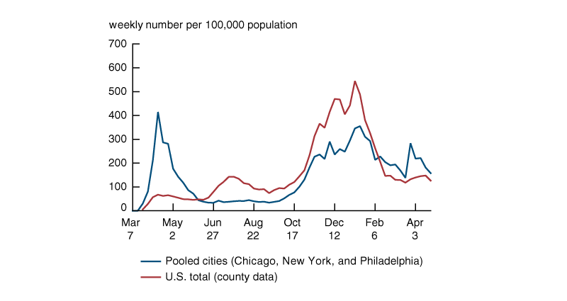
Sources: Authors’ calculations based on data from the Chicago Department of Health and Human Services, New York City Department of Health and Mental Hygiene, City of Philadelphia Department of Public Health, and the New York Times Co., New York Times Coronavirus (Covid-19) Data in the United States.
Motivating evidence
We begin our analysis with some motivating evidence for jointly studying race/ethnicity and employment as they relate to the Covid-19 pandemic. Table 3 reports the cross-sectional relationships between race and ethnicity, type of work, and (cumulative) Covid infection rates. The top panel shows the correlations between race and ethnicity (each location’s share of Black or Hispanic residents) and type of work (each location’s share of residents employed in essential or nonessential high social contact jobs), while the bottom panel shows the correlations between both of those measures and Covid infection rates. The race/ethnicity and employment data come from the ACS, while the cumulative Covid infection rates are through the week of February 20, 2021 (about the end of the 2020–21 fall/winter peak in most parts of the United States) and come from our city or national county sources. We estimate the correlations between race and ethnicity and type of work for all zip codes in our three-city sample, all zip codes in the United States, and all counties in the United States. We measure the correlations of these variables with Covid case rates across the zip codes in our three-city sample and across U.S. counties, but do not have zip code-level Covid case rate data for the entire United States. All correlations are weighted by population.
Table 3. Across-area correlations of employment, race, and infection rates
| Pooled city sample | U.S. zip codes | U.S. counties | |
| I. Correlations between racial shares and employment shares | |||
| Corr (% Black, % essential high contact workers) | .452 (.000) | .193 (.000) | –.024 (.181) |
| Corr (% Black, % nonessential high contact workers) | .059 (.329) | .185 (.000) | .027 (.137) |
| Corr (% Hispanic, % essential high contact workers) | .419 (.000) | .180 (.000) | –.140 (.000) |
| Corr (% Hispanic, % nonessential high contact workers) | .721 (.000) | .446 (.000) | .374 (.000) |
|
II. Correlations with infection rates (cumulative cases per 100,000 population through February 20, 2021) |
|||
| % Essential high contact workers | .602 (.000) | --- | .249 (.000) |
| % Nonessential high contact workers | .513 (.000) | --- | .167 (.000) |
| % Black | –.099 (.099) | --- | .016 (.372) |
| % Hispanic | .484 (.000) | --- | .351 (.000) |
| N (no. of locations) | 280 | 32,396 | 3,126 |
Sources: Authors’ calculations based on data from the U.S. Census Bureau, American Community Survey (ACS), Chicago Department of Health and Human Services, New York City Department of Health and Mental Hygiene, City of Philadelphia Department of Public Health, and the New York Times Co., New York Times Coronavirus (Covid-19) Data in the United States.
Table 3 shows that in the cross section, zip codes with the highest shares of high social contact workers also have the highest shares of Black or Hispanic residents. The correlations are generally stronger for our three-city sample than for all U.S. zip codes and are especially strong for Hispanic workers and workers in nonessential high social contact jobs. The correlations are notably weaker at the county level, suggesting that the co-location of Black and Hispanic workers and high social contact jobs is a neighborhood-level phenomenon that is masked by aggregating to the county level. Notably, though, there remains a strong, positive correlation between the Hispanic population share and the share of workers in nonessential high social contact jobs at the county level. The bottom panel of table 3 reports the correlations of the racial/ethnic and employment shares with Covid infection rates for our two analysis samples. There are strong positive correlations between employment shares in all high social contact jobs and infection rates in our three-city sample, and positive, though weaker correlations across U.S. counties. There is little relationship between the Black population share and Covid infection rates in either sample, but a strong, positive correlation between the Hispanic population share and Covid infection rate in both samples.
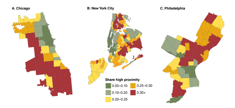
Figure 2 shows the geographic distribution of type of work in our three-city sample. For each city, it maps the share of each zip code’s residents who work in high social contact jobs (in both essential and nonessential businesses).8 The key implication from the figure is the stark geographic dispersion of workers by their type of job within each city. Those who live in the central business districts of each city are disproportionately in low social contact jobs. These include the downtown and Loop areas in Chicago, Manhattan and parts of Brooklyn in New York City, and Center City in Philadelphia. In contrast, those who live farther from the downtown areas are disproportionately in high social contact jobs. If these jobs are located in the central business districts at least as much as they are located throughout the remainder of each city, it would suggest that workers who reside outside of the central business district are more likely to use public transit to get to work, and therefore have even higher rates of contact with others than their job duties imply.
Figure 2. Shares of workers in high social contact jobs by zip code
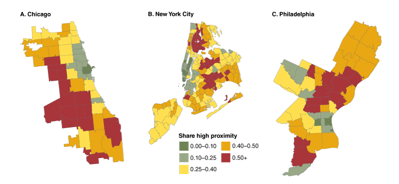
Sources: Authors’ calculations based on data from the U.S. Census Bureau, American Community Survey (ACS).
Thus, in the cross section of zip codes within our three sample cities, and to a lesser extent across all U.S. counties, there are strong, positive joint relationships between the racial/ethnic composition of the area, the type of work individuals do, and Covid infection rates. Black and Hispanic Americans disproportionately work in jobs that require high social contact with others and live in neighborhoods where workers in these types of jobs are overrepresented. These tend to be neighborhoods with the highest (cumulative) Covid infection rates, and these workers tend to live farther than others from their city’s central business districts.
Regression analysis methodology
The correlations in table 3 suggest at least a cursory relationship between race and ethnicity, type of work, and Covid infection rates, but they also highlight the complexity in disentangling what drives these relationships. We deal with this by estimating how Covid case rates evolve over time and normalize case rates across locations based on the timing of their peak Covid infection rates. We then estimate the relationship between the racial/ethnic and employment composition of each location and its time-varying Covid infection rates, controlling for other factors. In our three-city sample, we exploit zip code-level variation in our data to estimate these relationships, and we have data on Covid testing rates that allow us to control for differences in Covid case reporting over time and across areas. This is especially important early in the pandemic, when testing availability was more limited and varied widely geographically. We apply the same approach using our U.S. county panel, with the key differences being the lack of testing data and the muted geographic variation in race and ethnicity and type of work due to the aggregation to the county level.
Note that our estimates do not reflect causal effects on infection rates. Instead, they are the conditional correlations with infection rates, controlling for all other factors in our regression model. Our full, “baseline” regression specification is
\[1)\,{{C}_{ijt}}={{\unicode{x03B1} }_{jt}}+\unicode{x03B7} {{T}_{ijt}}+\unicode{x03B2} _{t}^{E}EH{{C}_{ij}}+\unicode{x03B2} _{t}^{N}NH{{C}_{ij}}+\unicode{x03B3} _{t}^{B}{{B}_{ij}}+\unicode{x03B3} _{t}^{H}{{H}_{i}}_{j}+{{X}_{ij}}{{\unicode{x03B4} }_{t}}+{{\unicode{x003B5} }_{ijt}},\]
where the weekly Covid infection rate for location i in area j in week t is Cijt. We identify each week relative to the location’s peak Covid case rate, which occurs in week t = 0 under our normalization. In our three-city sample, each location is a zip code and the areas are the three cities. In our U.S. county sample, each location is a county and the areas are U.S. states. The area-specific week effects, \({{\unicode{x03B1} }_{jt}}\) account for the broader trends in Covid infection rates, so that the interactions with race and ethnicity and type of work shares capture changes in their case rates relative to the excluded groups (that is, other racial/ethnic groups and workers in low social contact jobs). The three-city sample controls for the weekly Covid testing rate within each zip code Tijt. The first set of coefficients of interest, $\unicode{x03B2} _{t}^{E}$ and $\unicode{x03B2} _{t}^{N},$ are estimates of the week-specific relationships of the share of workers in location i in area j in essential high social contact jobs EHCij and nonessential high social contact jobs NHCij, respectively. We obtain these estimates by interacting each share with week fixed effects. The second set of coefficients of interest, $\unicode{x03B3} _{t}^{B}$ and $\unicode{x03B3} _{t}^{H},$ are estimates of the week-specific relationship of the share of residents in location i in area j that are Black people Bij or Hispanic people Hij, respectively. We also obtain these estimates by interacting each share with week fixed effects. We include additional location-specific demographic controls Xij. These come from the ACS data and include the share of the location’s population within three age groups, two educational attainment groups, and three groups for the number of workers in each household.9 These controls account for potential differences in virus exposure and risk by age, education, and household composition. We also experiment with additional controls as a robustness check. We cluster standard errors by zip code in the three-city sample and by state in the U.S. county sample, and weight each regression by each location’s population.
We estimate equation 1 over two periods for each sample: a “first wave” that identifies peak Covid infection rates prior to the start of September 2020, and a “second wave” that identifies peak Covid infection rates after the start of September 2020. Each subsample identifies the week of the highest-recorded Covid case rate for each city or each county as t = 0. We truncate our event window to between ten weeks prior and 18 weeks after each identified peak infection rate to limit how much peaks may overlap within each event horizon. Figure 1 illustrates the two distinct rises in Covid case rates within the two samples. Our three cities incurred a large, sharp spike in Covid cases early in the first wave, while most U.S. counties had a much smaller increase (if any) in Covid cases during the same time and a moderate rise in cases in the summer of 2020. Both samples had high Covid case rates throughout the fall and winter of 2020, which falls within the second wave we identify in both samples.
Estimates for the three-city sample
The first Covid wave
We begin with our results for our pooled, three-city sample and start with an analysis of the first wave of Covid cases. Figure 1 shows that this was a period of very high Covid rates, followed by a relatively sharp decline following stringent lockdown orders within each city. We present the estimated relationships with type of work and race and ethnicity for four different specifications in figure 3. We estimate the full specification for equation 1, as well as intermediate specifications that omit certain controls. Our “unconditional” specification estimates the relationships between either type of work or race and ethnicity separately, only controlling for area-week trends in Covid infection rates. These estimates provide a reference point to evaluate how much the additional controls, including when we jointly estimate the relationships of type of work and race and ethnicity to Covid infection rates, affect our estimates of the raw relationships we observe in the data (that is, the correlations reported in table 3). We also estimate an intermediate specification where we add our demographic controls (excluding race and ethnicity) and weekly testing rates. We then estimate the full model in equation 1 as our “baseline” specification, which jointly estimates the relationships between type of work, race and ethnicity, and Covid infection rates. Finally, we estimate a version with additional controls in Xij as a robustness check.
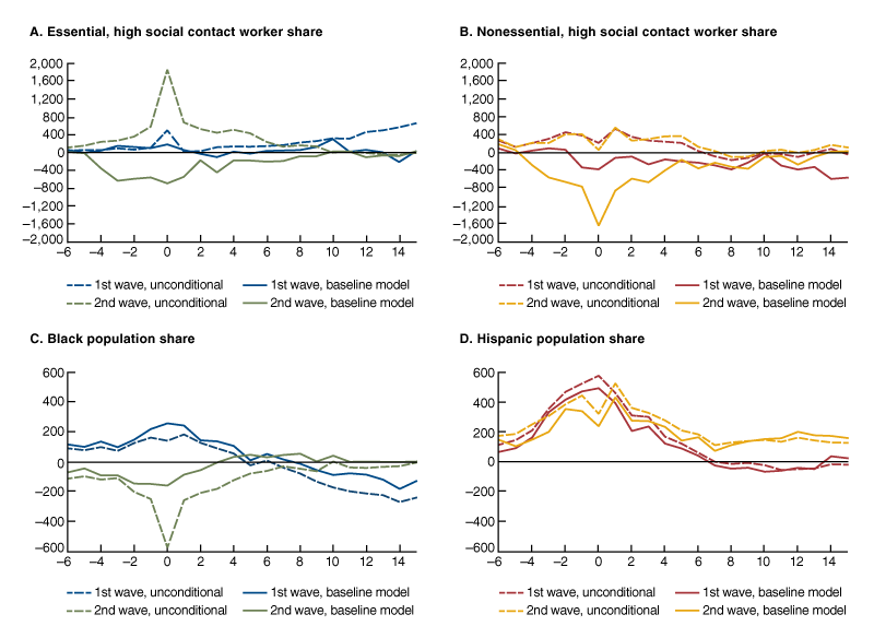
Figure 3. Estimated relations between type of work, race/ethnicity, and Covid infection rates, pooled city sample, first wave
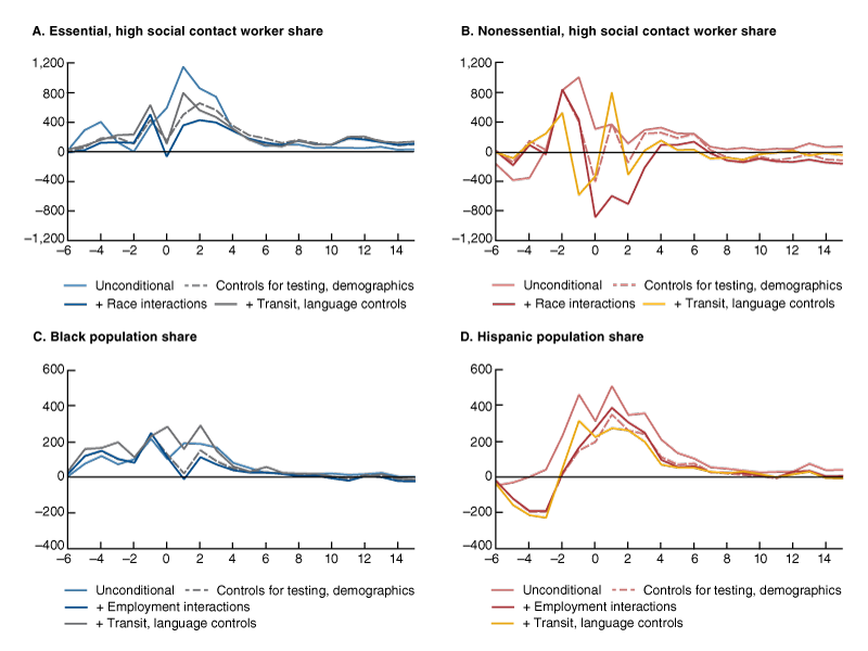
Sources: Authors’ calculations based on data from the Chicago Department of Health and Human Services, New York City Department of Health and Mental Hygiene, City of Philadelphia Department of Public Health, and the U.S. Census Bureau, American Community Survey (ACS).
Figure 3 presents the coefficient estimates for $\unicode{x03B2} _{t}^{E},\unicode{x03B2} _{t}^{N},\unicode{x03B3} _{t}^{B},\ \text{and}\ \unicode{x03B3} _{t}^{H}$ from equation 1 for each of these specifications in separate panels for each set of coefficients.10 The estimates come from six different regressions: two unconditional regressions that estimate the relationships between the type of work variables and Covid infection rates or race and ethnicity variables and Covid infection rates, respectively; two intermediate regressions that estimate the relationships between the type of work variables and Covid infection rates or race and ethnicity variables and Covid infection rates, respectively; a single baseline regression that includes all four variables as in equation 1; and a single robustness regression that adds additional controls to Xij. One should interpret each coefficient estimate as how much higher (or lower) Covid infection rates were for a given zip code, relative to the Covid infection rates for the remaining population, in relation to it having a 1 percentage point higher share of the given type of employment or racial/ethnic population share. For example, a coefficient value of 500 on the Black population share at event week two would imply that a 100-percentage point increase in this share is associated with 500 more Covid cases per 100,000 population (0.5 percentage points more) than the rest of the population two weeks following peak infection rates in their city.
The top panels (A and B) of figure 3 show that, unconditionally, zip codes with higher shares of both essential and nonessential high social contact workers had disproportionately higher Covid infection rates relative to areas with higher shares of low social contact workers (thin solid lines). These relatively higher infection rates are concentrated around the time Covid infection rates spike for everyone in our three sample cities. In other words, the incidence of Covid is amplified for these groups when case rates peak. The unconditional increase is most pronounced for areas with a higher share of essential high social contact workers, who have an infection rate that is 1,145 cases per 100,000 population higher than the rest of the population in the week after the citywide peak in Covid cases. This is not surprising since these workers were required to remain on the job throughout the early lockdown periods. Zip codes with higher shares of nonessential high social contact workers also have a large unconditional increase around the peak in Covid cases, with case rates rising up to 1,000 cases per 100,000 higher than the rest of the population in the week before the citywide peak.
The bottom panels of figure 3 (C and D) show that zip codes with higher shares of Black or Hispanic residents also have relatively higher infection rates around the times of the citywide peak. The unconditional estimates show that zip codes with a higher Black population share have infection rates that are about 200 per 100,000 population higher than other zip codes. Their infection rates are elevated for several weeks before and several weeks after citywide peak infection rates. Zip codes with a higher Hispanic population share exhibit a similar pattern but with relatively higher infection rates (up to 500 per 100,000 population) around the citywide peak. In appendix figure A3 we show that while the estimates for racial/ethnic shares are smaller in magnitude, they are much more precisely estimated, and as figure 3 shows, they are more persistent than the estimates for type of work.
When we add controls for testing rates, age, education, and the worker composition of households (dashed lines), the relationships between Covid infection rates and each of our type of work and race and ethnicity variables weaken.11 Keep in mind that testing rates were relatively low in the early months of the first wave, and access to Covid tests was unevenly distributed, with lower-income neighborhoods often lacking access to adequate testing. The large coefficients on the share of essential high social contact workers are reduced by about 40 percent, while the coefficients on the share of nonessential high social contact workers are reduced by about one-third just prior to the citywide peak and are essentially zero afterwards, implying infection rates that are about the same as the rest of the population. Controlling for testing and demographics has essentially no effect on the relatively higher coefficients on the Black population shares prior to the week of citywide peak infection rates but reduces the coefficients by about one-half in the weeks thereafter. Controlling for testing and demographics reduces the coefficient estimates on Hispanic population shares in the weeks before and after citywide peak infection rates by about 45 percent, on average.
When we estimate the full baseline specification—which involves adding in the week × race interactions to the work regressions and the week × type of work interactions to the race and ethnicity regressions—the coefficients on type of work are weakened further (thick solid lines). Zip codes with higher shares of essential high social contact workers still have relatively higher infection rates for several weeks after the citywide peak infection rate, but the coefficients are about half their values from the unconditional estimates. Zip codes with higher shares of nonessential high social contact workers have relatively higher infection rates prior to the citywide peak rate, with similar coefficients to the unconditional estimates, but now have lower infection rates relative to other zip codes in the weeks following the citywide peak. This is consistent with the notion that workers in these zip codes faced relatively higher exposure to the virus prior to the lockdowns that followed the citywide peaks, but relatively lower exposure to the virus during the lockdown periods.
Interestingly, additionally controlling for the shares of workers in high social contact jobs does almost nothing to the relationships between Covid infection rates and the racial/ethnic shares of each zip code. Zip codes with higher Hispanic shares have infection rates that are up to 390 cases per 100,000 population higher than other zip codes in the weeks following the citywide peak rates, even after applying all controls. Thus we find that after controlling for the other demographic characteristics of their neighborhoods, additionally controlling for racial and ethnic composition eliminates the positive relationship between peak Covid infection rates and the share of a zip code’s population working in high social contact jobs.
Figure 3 also reports the results of a robustness exercise where we add further demographic controls to our baseline specification when estimating it for each Covid wave (thin dark lines). These controls include interactions of event week dummies with the share of each zip code’s residents that use public transit and the share of zip code households where languages other than English are spoken.12 Figure 2 shows that most high social contact workers reside far from each city’s central business district. If these workers are more likely to take mass transit to work because of these distances, this generates additional exposure to the virus that may drive some of our results. Our language controls account for the fact that individuals who do not speak English as their first language may miss out on important information on how to protect themselves against the virus, which would imply greater exposure as well. This is a particular concern for the Hispanic community. Despite all of these concerns, figure 3 shows that these additional controls do little to account for our estimated relationships between Covid infection rates and type of work and, if anything, slightly increase the estimated relative infection rates somewhat in most cases. Thus, while not exhaustive, these factors cannot account for our estimated relationships to Covid infection rates.
Comparing the first and second Covid waves
Next, we compare estimates for type of work and race and ethnicity for the first and second waves of Covid infections within our three-city sample. Remember that the first-wave sample identifies its t = 0 week as the citywide peak infection rate that occurs between March and the beginning of September 2020, while the second-wave sample identifies its t = 0 week as the citywide peak event that occurs between the beginning of September 2020 and April 2021. We estimate equation 1 separately for each sample period and report our baseline specification’s estimates for each wave in figure 4. For reference, estimates for the first wave in figure 4 are identical to the baseline estimates in figure 3.
Figure 4. Estimated relations between type of work, race/ethnicity, and Covid infection rates, pooled city sample, first versus second waves
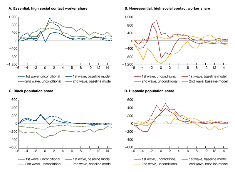
Sources: Authors’ calculations based on data from the Chicago Department of Health and Human Services, New York City Department of Health and Mental Hygiene, City of Philadelphia Department of Public Health, and the U.S. Census Bureau, American Community Survey (ACS).
Figure 4 shows that zip codes with higher shares of essential high social contact workers had higher Covid infection rates than other zip codes during the second Covid wave (and after applying all controls, including race and ethnicity). The higher infection rates occur throughout most of the estimation period, though they are highest immediately after the citywide peak infection rate. This contrasts with the results for nonessential high social contact workers, Black residents, and Hispanic residents. Zip codes with higher shares of all three of these groups had lower infection rates, relative to the rest of the population, during the second wave. Zip codes with higher shares of nonessential high social contact workers or higher Black population shares had their lowest infection rates, relative to the rest of the population, around citywide peak infection rates, while zip codes with higher Hispanic population shares had infection rates that were essentially similar to the rest of the population throughout the estimation period. These differences, particularly those for racial/ethnic composition, contrast with the patterns observed during the first wave. It is not clear why essential high social contact workers face relatively higher Covid rates during the second wave. One explanation may be that the nature of their work combined with the lack of any lockdown orders led to their having greater exposure to the virus. We can only speculate whether this is the case, though. Our results for the other three groups suggest these individuals were more exposed to the virus than the rest of the population during the first wave but not during the second wave.
Estimates for U.S. counties
Next, we replicate our analysis using all U.S. counties. In using the county-level data, we lose a good deal of the neighborhood-level heterogeneity in employment and racial/ethnic composition that provided us with a powerful source of identification in the three-city sample. The data also lack information on Covid testing rates. At the same time, the sample represents all of the United States, so it allays concerns that our results for the three-city sample are not representative of the country as a whole. Furthermore, there are notable and more varied timing differences in the county-level peak infection rates. This provides a richer source of time-series variation that we do not have with the three-city sample.
Figure 5 presents four sets of results for our county-level sample in a comparable manner to figure 4. As before, we estimate some version of equation 1 to get the reduced-form relationships between county-level Covid infection rates and either type of work or racial/ethnic composition. For each Covid wave, we present the unconditional results, which only control for state-by-week fixed effects, and the baseline results, which include all of our controls and jointly estimate the relationships of Covid infection rates to type of work and racial/ethnic composition.13 The first-wave sample period for the county-level data extends from March 2020 through early January 2021, since some counties did not experience their first peak Covid rates until the end of the summer (the later months represent the weeks following these peak rates). There is similar variation in the timing of peak rates across counties during the second Covid wave as well. Some counties experienced their highest rates in the fall of 2020 while others experienced their highest rates early in 2021.14
Figure 5. Estimated relations between type of work, race/ethnicity, and Covid infection rates, U.S. counties, first versus second waves
Sources: Authors’ calculations based on data from the New York Times Co., New York Times Coronavirus (Covid-19) Data in the United States and the U.S. Census Bureau, American Community Survey (ACS).
Figure 5 shows several patterns by race and ethnicity that are generally consistent with what we find using the three-city sample in figures 3 and 4, but patterns by type of work that are quite different. Unconditionally within the county sample, Covid infection rates are relatively higher for counties with higher shares of essential high social contact workers during the county’s first identified Covid peak, but the magnitude is much smaller than what we find with the three-city sample. We find somewhat higher infection rates for counties with higher shares of nonessential high social contact workers around the time of the first Covid wave’s peak infection rates. The relatively higher rates disappear entirely in both cases once we add the controls of our baseline model. Counties with high Black or Hispanic population shares have higher infection rates around the time of the first Covid peak, with somewhat stronger results than what we find with the zip code-level data. As before, adding the controls from our baseline specification leads to little change in the estimated relationships between Covid infection rates and race and ethnicity.
In the national county-level data, our baseline controls have stronger effects on the estimated relationships between Covid infection rates and all types of work and racial and ethnic groups except Hispanic population shares during the second Covid wave. The exception is for counties with a higher Hispanic population share, which have relatively high Covid infection rates during and after the countywide peak. Notably, our baseline specification shows that the estimated relationships are all lower in the second wave compared to the first wave.
Thus both the three-city and national county-level evidence suggest that those who had greater exposure to the virus during the first Covid waves were less affected (relative to the rest of the population) during later waves. This may reflect a behavioral response to greater exposure early on—that is, these individuals may have been better prepared to avoid getting sick during later waves. Alternatively, it may reflect greater immunity among those who contracted the virus and survived. Our evidence does not speak to which is the more likely scenario.
Conclusion
In this article, we examine the relationship between race and ethnicity, type of work, and Covid infection rates. Black and Hispanic communities have been disproportionately affected by the Covid-19 pandemic. One potential reason is that many of these individuals tend to work in essential and high social contact jobs, and therefore face greater exposure to the virus. We find strong heterogeneity in the residential distribution of workers in these types of jobs, with many of them living far from each city’s central business district. We also find that people who work in these jobs are disproportionately located in neighborhoods with high Black or Hispanic population shares and high Covid infection rates. We exploit weekly variation in Covid infection rates across zip codes in three U.S. cities and across counties for the entire United States to estimate their relationship to a location’s employment and racial/ethnic composition. We find that, unconditionally, locations with high shares of workers in high social contact jobs and with high Black or Hispanic population shares tended to have disproportionately higher infection rates around the times when local infection rates peaked in our sample. This was especially true around the time of each location’s first peak Covid infection rate, implying an amplification of infection rates for these groups when Covid case rates were rising overall. Areas with high Hispanic population shares were especially affected. Controlling for geographic differences in weekly testing rates and other demographic characteristics can account for up to half of the observed higher rates, with significant differences remaining. Moreover, when we jointly estimate the weekly relationships between Covid infection rates and type of work and Covid infection rates and racial/ethnic composition, we find that the relatively higher Covid rates in areas with high Black or Hispanic population shares persist while the relatively higher rates by type of work essentially disappear. The results are generally similar for our three-city and U.S. county samples. Thus we find little support for the notion that type of work drove high Covid case rates among Black and Hispanic people.
We also find notable differences in relative infection rates by type of work and race and ethnicity between the first and second Covid waves of an area. In general, workers in high social contact jobs, Black workers, and Hispanic workers faced relatively higher infection rates during the first waves, but about the same or relatively lower infection rates during the second waves. It is not clear to what extent the differences between waves reflect a behavioral response, as people learned how to avoid contracting the virus, or built-up immunity from the relatively high infection rates during the first wave.
Two key findings come out of our analysis. First, individuals tended to incur higher Covid infection rates based on their race or ethnicity and type of work, but differences in type of work cannot explain persistent racial/ethnic differences in Covid infection rates. This suggests that other, unobserved differences by race and ethnicity account for the relatively high infection rates, particularly among Hispanic communities. Second, greater exposure early on is associated with reduced infection rates, relative to the rest of the population, in subsequent Covid waves.
Notes
1 See Mongey, Pilossoph, and Weinberg (2021) for evidence on the demographic characteristics of individuals in jobs that require a high degree of in-person contact and low propensity to work from home.
2 These studies include Brown and Ravallion (2020), Chen and Krieger (2020), Knittel and Ozaltun (2020), and McLaren (2021).
3 Our data for Chicago are from the City of Chicago Department of Health and Human Services and cover the city limits within Cook County. Our data for New York City come from the New York City Department of Health and Mental Hygiene and cover the five boroughs (Manhattan, Bronx, Brooklyn, Queens, and Staten Island). Our data for Philadelphia come from the City of Philadelphia Department of Public Health and cover the city of Philadelphia.
4 The data are available online.
5 We thank Fernando Leibovici for generously providing us with their proximity estimates.
6 The estimates of social proximity from Leibovici, Santacreu, and Famiglietti (2020) are very similar to those generated by Mongey, Pilossoph, and Weinberg (2021). Several studies also find similar work-from-home estimates to Dingel and Neiman (2020). These include Aaronson, Burkhardt, and Faberman (2020), Bartik et al. (2020), and Brynjolfsson et al. (2020).
7 We use employment estimates from the February 2020 Current Employment Statistics survey to generate the sectoral-level essential worker shares and employment estimates from the 2019 Occupational Employment and Wage Statistics Survey to generate the sectoral-level effective proximity index estimates. We also note that although there were variations in what counted as essential businesses across states, most of these differences occur well below the one-digit industry categorization we use in our analysis.
8 We report the shares of workers in essential and nonessential high social contact jobs by zip code separately in appendix figures A1 and A2, respectively.
9 Specifically, we include controls for the share of the population age 18 to 39, age 40 to 64, and age 65 or more; the share of the population with a high school diploma or less, or with some college; and the share of the population with one worker, two workers, or three or more workers in the household. We also experimented with using the number of household members rather than the number of workers, but the latter had a stronger relationship to infection rates in all of our regression estimates.
10 We only report the coefficients up to six weeks before and 12 weeks after each Covid case rate spike. The precision of the estimates declines considerably outside of this window. Later weeks in the first wave (and earlier weeks in the second wave) also have the concern of overlapping with a rise in case rates in the subsequent (prior) sample period.
11 Among our controls, weekly Covid testing rates have a significant and positive relationship to Covid infection rates throughout. Among the demographic variables, age and education have the strongest, and statistically significant, relationships to Covid infection rates. Locations with higher shares of younger adults (age 18–39) and adults with no more than a high school education also have disproportionately higher Covid infection rates around the time of local peak rates, with high school graduates having persistently higher case rates following the peak in most specifications.
12 For languages, we include the share of households that speak only limited English at home and the share that speak a language other than English at home.
13 We replicate our baseline results with 95 percent confidence intervals in appendix figure A4.
14 Once the Covid vaccines began to be widely distributed starting in February 2021, Covid case rates fell precipitously in nearly all counties. Thus the end of our sample at the end of April captures most of the post-event behavior of Covid infection rates prior to the onset of the Delta variant for all U.S. counties.
Appendix
This appendix reports additional results for our analysis. Figures A1 and A2 report each city’s zip code-level shares in essential and nonessential high social contact work, respectively. These figures separate out the shares of workers in high social contact jobs reported in figure 2 of the main text. The figures show that the spatial disparities in these shares persist for work in both essential and nonessential businesses, though the disparities are somewhat stronger for jobs in essential businesses.
Source: Authors’ calculations based on 2014–18 industry × occupation employment data at the zip code level from the U.S. Census Bureau, American Community Survey (ACS).
Figure A2. Shares of employment in nonessential high social contact jobs by zip code
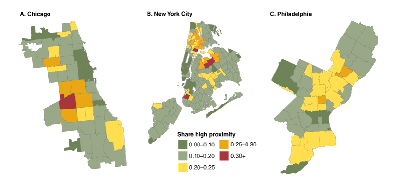
Source: Authors’ calculations based on 2014–18 industry × occupation employment data at the zip code level from the U.S. Census Bureau, American Community Survey (ACS).
Figure A3 reports the estimates of the weekly relationships of type of work (top panels) and racial composition (bottom panels) from our “baseline” specification in figure 4 of the main text with their 95 percent confidence intervals included. The figure shows that standard errors on our estimates for type of work are relatively large during the first Covid wave. During the second wave, neighborhoods with high shares of essential high social contact workers had significantly higher Covid infection rates and neighborhoods with high shares of nonessential high social contact workers had significantly lower Covid infection rates around citywide peak periods. Neighborhoods with high shares of both Black and Hispanic residents have significantly higher Covid infection rates around citywide peak periods during the first Covid wave. During the second Covid wave, neighborhoods with high Black population shares have significantly lower Covid infection rates, while neighborhoods with high Hispanic population shares have Covid infection rates that are essentially the same as the rest of the population.
Figure A3. Baseline estimates for type of work, race/ethnicity, and Covid infection rates, pooled city sample, first versus second waves

Sources: Authors’ calculations based on data from the Chicago Department of Health and Human Services, New York City Department of Health and Mental Hygiene, City of Philadelphia Department of Public Health, and the U.S. Census Bureau, American Community Survey (ACS).
Figure A4 reports the estimates of the weekly relationships of type of work (top panels) and racial composition (bottom panels) from the “baseline” specification using the U.S. county sample from figure 5 of the main text with their 95 percent confidence intervals included. The figure shows more precise estimates on our relationships between type of work and Covid infection rates relative to the three-city sample during the first wave, though these estimates are not significantly different from zero throughout the event horizon. The relationships of a county’s share of essential and nonessential high social contact workers to Covid infection rates are marginally significantly lower than the rest of the population around peak periods during the second Covid wave. Relative to the three-city sample, the county sample shows stronger and more precise positive relationships between a county’s population share that is Black or Hispanic and Covid infection rates peak periods during the first Covid wave. During the second Covid wave, neighborhoods with high Black population shares have slightly lower and mostly insignificant differences in their Covid infection rates relative to the rest of the population, while neighborhoods with high Hispanic population shares continue to have significantly higher Covid infection rates than the rest of the population.
Figure A4. Baseline estimates for type of work, race/ethnicity, and Covid infection rates, U.S. county sample, first versus second waves
Sources: Authors’ calculations based on data from the New York Times Co., New York Times Coronavirus (Covid-19) Data in the United States and the U.S. Census Bureau, American Community Survey (ACS).
References
Aaronson, Daniel, Helen Burkhardt, and R. Jason Faberman, 2020, “Potential jobs impacted by Covid-19,” Chicago Fed Insights, Federal Reserve Bank of Chicago, blog, April 1, available online.
Bartik, Alexander W., Marianne Bertrand, Zoë B. Cullen, Edward L. Glaeser, Michael Luca, and Christopher T. Stanton, 2020, “The impact of COVID-19 on small business outcomes and expectations,” Proceedings of the Natural Academy of Sciences, Vol. 117, No. 30, July 28, pp. 17656-17666. Crossref
Benitez, Joseph, Charles Courtemanche, and Aaron Yelowitz, 2020, “Racial and ethnic disparities in COVID-19: Evidence from six large cities,” Journal of Economics, Race, and Policy, Vol. 3, No. 4, December, pp. 243–261. Crossref
Bertocchi, Graziella, and Arcangelo Dimico, 2020, “COVID-19, race, and redlining,” Covid Economics: Vetted and Real-Time Papers, No. 38, July 16, pp. 129–195, available online.
Brown, Caitlin S., and Martin Ravallion, 2020, “Inequality and the coronavirus: Socioeconomic covariates of behavioral responses and viral outcomes across US counties,” National Bureau of Economic Research, working paper, No. 27549, July. Crossref
Brynjolfsson, Erik, John J. Horton, Adam Ozimek, Daniel Rock, Garima Sharma, and Hong-Yi TuYe, 2020, “COVID-19 and remote work: An early look at US data,” National Bureau of Economic Research, working paper, No. 27344, June. Crossref
Chen, Jarvis T., and Nancy Krieger, 2020, “Revealing the unequal burden of COVID-19 by income, race/ethnicity, and household crowding: US county vs. ZIP code analyses,” Harvard Center for Population and Development Studies Working Paper Series, Harvard University, Vol. 19, No. 1, April 21, available online.
Dingel, Jonathan I., and Brent Neiman, 2020, “How many jobs can be done at home?,” Journal of Public Economics, Vol. 189, article 104235, September. Crossref
Glaeser, Edward L., Caitlin Gorback, and Stephen J. Redding, 2022, “JUE Insight: How much does COVID-19 increase with mobility? Evidence from New York and four other U.S. cities,” Journal of Urban Economics, Vol. 127, article 103292, January. Crossref
Knittel, Christopher R., and Bora Ozaltun, 2020, “What does and does not correlate with COVID-19 death rates,” National Bureau of Economic Research, working paper, No. 27391, June. Crossref
Leibovici, Fernando, Ana Maria Santacreu, and Matthew Famiglietti, 2020, “Social distancing and contact-intensive occupations,” On the Economy Blog, Federal Reserve Bank of St. Louis, March 24, available online.
McLaren, John, 2021, “Racial disparity in COVID-19 deaths: Seeking economic roots with Census data,” B.E. Journal of Economic Analysis & Policy, Vol. 21, No. 3, July, pp. 897–919. Crossref
Mongey, Simon, Laura Pilossoph, and Alexander Weinberg, 2021, “Which workers bear the burden of social distancing policies?,” Journal of Economic Inequality, Vol. 19, No. 3, September, pp. 509–526. Crossref
Papageorge, Nicholas W., Matthew V. Zahn, Michèle Belot, Eline van den Broek-Altenburg, Syngjoo Choi, Julian C. Jamison, and Egon Tripodi, 2021, “Socio-demographic factors associated with self-protecting behavior during the Covid-19 pandemic,” Journal of Population Economics, Vol. 34, No. 2, April, pp. 691–738. Crossref


