

Following recent releases of Consumer Price Index (CPI) data, some commentators have noted that inflation in the Chicago metropolitan area has been higher than in the rest of the nation.1 In this article, I investigate that finding further.
The five key results from my close examination of the CPI data are as follows:
- Recent annual inflation readings show that inflation in Chicago has been higher than overall U.S. inflation and among the highest of the urban places for which the U.S. Bureau of Labor Statistics (BLS) reports CPI data.
- Higher Chicago inflation is a relatively recent phenomenon; over a longer time horizon, Chicago inflation has been in line with U.S. inflation and ranked close to the median across places for which the BLS reports CPI data.
- In recent months, the higher inflation readings for Chicago relative to those for the entire nation are primarily due to higher price increases for housing and transportation—with little contribution to the inflation gap coming from differing expenditure patterns between Chicago and the U.S.
- Within housing, the primary contribution to Chicago’s higher inflation reading has been from shelter costs, such as rents, rather than from purchases of furnishings and household operations expenses that are also included in the BLS’s housing category.
- Within transportation, the largest contribution to Chicago’s higher inflation reading has been from motor vehicle expenses—which reflect costs for vehicle parts, repairs, and auto insurance, plus related fees (such as parking fees and road tolls), but not vehicle purchases and motor fuel costs.
In the rest of this article, I describe how Chicago inflation compares with U.S. inflation, as well as inflation in other U.S. metro areas, and discuss the sources of relatively higher inflation in Chicago.
Recently, inflation in Chicago has been higher than in the nation overall
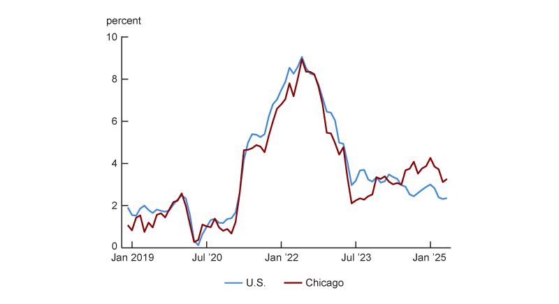
In addition to the national CPI, which is used to calculate the annual rate of inflation for U.S. urban consumers, the BLS releases inflation measures for individual urban areas (e.g., the Chicago metropolitan area), sets of urban areas (e.g., small Midwest cities, each with a population of 2,500,000 or less), and the urban areas of regions (e.g., the urban Midwest).2 Based on the CPI data, I observe that inflation in Chicago has been higher than in the nation recently. Figure 1 presents annual inflation for the overall U.S. and for the Chicago metropolitan area since December 2018.3 For the 12 months ending in May 2025, CPI inflation was 2.4% for the U.S. and 3.3% for Chicago (a gap of 0.9 percentage points). Figure 1 also shows that the Chicago inflation rate has consistently been above the overall U.S. inflation rate since the middle of 2024. With that said, I also observe that in the majority of months since December 2018, Chicago’s inflation rate has been below that of the nation.
1. Chicago and U.S. annual Consumer Price Index inflation
Recent Chicago inflation has been higher than in most other metro areas
Recent Chicago inflation can also be compared with that of other places for which the BLS reports CPI data. These data are reported for the four Census regions and nine Census divisions, plus 27 metro areas—23 large metro areas (including Chicago) and four collections of smaller cities (one in each Census region). A map of these places (i.e., CPI primary sampling units, or PSUs), established in 2018, is available online.4
To determine how much higher (or lower) Chicago inflation is relative to inflation in most urban places, I compare inflation in Chicago and 26 other metro areas (or collections of metro areas) the BLS reports CPI data for. Of these 27 places, seven are reported each and every month (the top three metro areas by population as of the 2010 U.S. Census—New York, Los Angeles, and Chicago—and the small-city collections within each of the four Census regions), 11 in only even months (February, April, and so on), and nine in only odd months (January, March, and so on). I refer to the 18 areas observed in even months as “even-month-reporting places” and the 16 areas observed in odd months as “odd-month-reporting places.”
The BLS publishes inflation data. It does not publish data on the level of prices across places. Data that compares the price levels across places is released annually by the U.S. Bureau of Economic Analysis (BEA). The most recent BEA data release comparing price levels across places is for a vast set of places throughout the U.S. in 2023.
Figure 2 shows Chicago’s percentile rank for annual inflation (with higher ranks equating to higher inflation) relative to the 26 other areas over time in three ways. First, it compares Chicago with the 15 other odd-month-reporting places. Second, it compares Chicago with the 17 other even-month-reporting places. Third, it compares Chicago with all 26 other metro areas. To make this third comparison, I interpolate price indexes between available months and drop the last month of data. More specifically, as of June 2025, I have May CPI data. However, for May 2025, I do not have data for the even-month-reporting places. So I end this sample in April 2025, given that I already have April data for even-month-reporting places and can linearly interpolate April data for the odd-month-reporting places based on the March and May data.