The United States is entering a new demographic era driven by population aging. Understanding the landscape of elder care is central to anticipating the economic consequences of that shift. This is part 2 of a three-part series on this topic.
In our previous article (part 1), we documented heterogeneity in living arrangements for the aging population, reflecting differences in health, income, family structure, cultural norms, and local care markets. In this article, we examine how the cost and quality of elder care vary across different types of living arrangements and across U.S. states. We proceed in four steps. First, we document the cost of elder care across the three types of residential settings examined in part 1. Second, we examine how relative prices differ within states, comparing in-home and facility-based care. Third, we combine price and quality measures to construct a state-level index of value in nursing home care. Finally, we examine how these price and quality measures correlate with broader elder care market indicators.
Note that throughout this article, we use cost and price interchangeably to refer to the market rate faced by consumers for a given type of elder care. This is distinct from the cost of providing this care, which refers to providers’ underlying expenses, such as those for labor, facilities, and supplies. Genworth’s CareScout data set, which is a primary data source for this analysis, reports state-level median market rates, not average prices paid by individuals. As a result, these estimates should be interpreted as the midpoint of reported market rates within each state, rather than the expected out-of-pocket cost for any particular person. Actual payments may differ for a variety of reasons, including care intensity, provider choice, Medicaid eligibility/availability, or other insurance coverage options.
Costs across elder care settings
We begin by comparing costs across the three residential settings introduced in part 1: community living, assisted living, and nursing homes. Cost data are drawn from the Cost of Care Survey 2024 from Genworth’s CareScout unit,1 which reports state-level median rates for each type of elder care—namely, in-home care (i.e., home health aides and homemaker services) for people still in community-based living arrangements, assisted living facilities, and nursing home care (both semiprivate and private room costs).
To facilitate a comparison of elder care types, we convert all rates as reported in CareScout’s Cost of Care Survey to monthly equivalents. Assisted living is already reported at a monthly rate. For nursing home care, we take the average of semiprivate and private room daily rates and multiply that by 30 days per month. And for in-home care, we first take the average of home health aide and homemaker service hourly rates, then multiply that by 28 hours of care per week for four weeks a month (consistent with typical coverage limits under Medicare). Thus, the in-home care rate reflects a moderate level of home-based assistance rather than full-time care.
At the national level, the median costs per month for the three types of elder care are as follows: $3,752 for in-home care, $5,900 for assisted living, and $9,825 for nursing home care.
These differences in cost reflect substantial variation in service intensity. Nursing home care (generally requiring the most intense level of service) includes housing, meals, and continuous supervision, while in-home care (generally requiring the least intense level) is typically delivered on an hourly basis and may not include skilled medical services. Assisted living falls between these extremes, typically providing apartments with meals, social activities, and help with daily self-care tasks. The actual out-of-pocket costs for a given person will vary based on a variety of factors, such as income, insurance coverage, and the intensity of care provided.
Geographic variation in costs
Costs vary widely across states. To account for differences in economic conditions, we scale costs by state median household income relative to the national median household income, using 2019–23 five-year American Community Survey (ACS) estimates from the U.S. Census Bureau. This adjustment reflects the affordability of elder care relative to typical household earnings in each state. For example, unadjusted for income, the median monthly in-home care cost for Maryland is $3,920, placing it in the top half of states for the cost of such care. However, since the median household income in Maryland is about 30% higher than the national average, adjusted for income, home care in Maryland is much more affordable.
Figure 1 reports the minimum, mean, standard deviation, and maximum cost of each type of elder care across states (and the District of Columbia). Panel A reports the unadjusted costs for the three types of care, while panel B reports the state-median-income-adjusted costs for them.
1. Summary statistics of state median monthly rates, by type of elder care, 2024
| Minimum | Mean | Standard deviation |
Maximum | |
| A. Unadjusted costs | ||||
| In-home care | $2,352 (LA) | $3,865 | $594 | $4,928 (SD) |
| Assisted living | $4,350 (SD) | $6,299 | $1,593 | $11,311 (HI) |
| Nursing home | $6,195 (TX) | $11,128 | $3,685 | $29,940 (AK) |
| B. State-income-adjusted costs | ||||
| In-home care | $3,029 (MD) | $3,923 | $553 | $5,344 (SD) |
| Assisted living | $4,010 (UT) | $6,321 | $1,068 | $9,036 (HI) |
| Nursing home | $6,377 (TX) | $11,177 | $3,011 | $26,321 (AK) |
Sources: Authors’ calculations based on data from Genworth’s CareScout, Cost of Care Survey 2024, and U.S. Census Bureau, 2019–23 American Community Survey, five-year estimates, from IPUMS USA.
As noted before, the costs are highest for nursing home care, followed by assisted living and then in-home care. However, even within a type of care setting, variation in costs across states is substantial. Notably, nursing home costs exhibit particularly large dispersion, ranging from an income-adjusted monthly cost of over $6,000 in Texas to over $26,000 in Alaska (see panel B of figure 1). Hawaii and Alaska tend to be the states with the highest-priced facility-based (assisted living and nursing home) care even after adjusting for state incomes, plausibly reflecting rural or island topography and access and labor shortages. Alaska is especially an outlier for nursing home care costs; excluding Alaska from figure 1’s statistics reduces the mean and standard deviation of adjusted nursing home costs to $10,875 and $2,117, respectively, according to our analysis. Even after excluding this outlier, it is still the case that costs for nursing home care exhibit greater dispersion than those for assisted living or in-home care.
Such variation plausibly reflects differences in labor markets, local demand conditions, and state-specific regulatory environments. For example, because Medicaid is a primary payer for nursing home care, nursing home prices are more exposed to state Medicaid policy than assisted living or in-home care, and a MACPAC analysis documents substantial state-level variation in both Medicaid payment rates and facility costs for nursing homes. States also vary in their use of certificate-of-need laws, which regulate the creation or expansion of health care facilities, including nursing homes, and have been shown to have varying effects on health care markets (Mitchell, 2025).
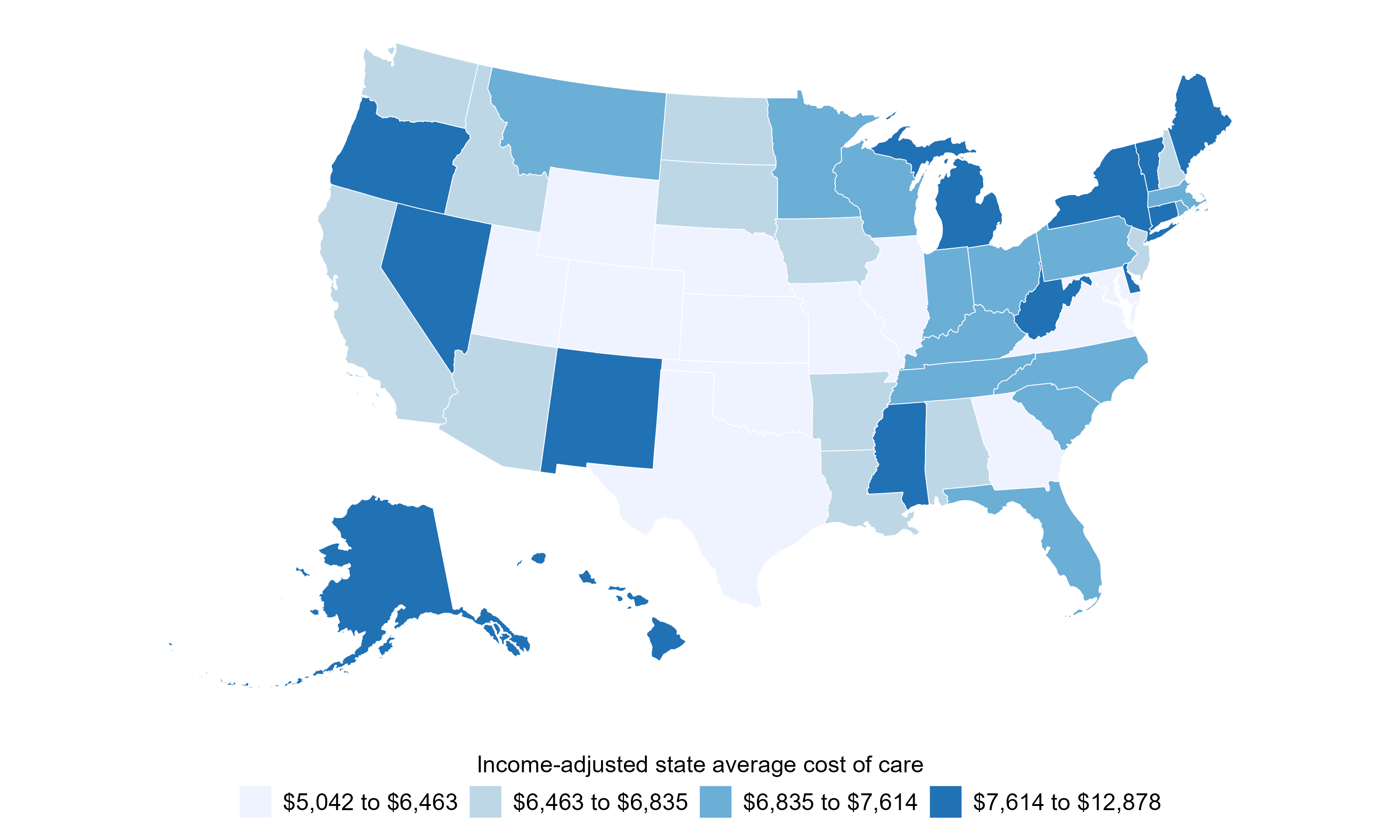
To further summarize geographic variation in the cost of elder care, we assign a single cost to each state. To do so, we take the within-state average cost of care across the three types (i.e., in-home care, assisted living, and nursing home care). We then adjust that average of elder care costs by the relative state median income as explained previously. Finally, we group states into quartiles, from low to high relative monthly cost of elder care (see the legend in figure 2 for the cost ranges for the quartiles). Figure 2 maps this cost variation across the U.S., highlighting regions where elder care is relatively more or less expensive.
2. Monthly elder care cost, by state, 2024
Sources: Authors’ calculations based on data from Genworth’s CareScout, Cost of Care Survey 2024, and U.S. Census Bureau, 2019–23 American Community Survey, five-year estimates, from IPUMS USA.
Income-adjusted costs are highest in northern New England, Appalachia, parts of the Mountain West, and the noncontiguous states (i.e., Alaska and Hawaii). Conversely, elder care is relatively less expensive in the middle of the country. One possible explanation for the low prices in this area of the country is a more favorable balance of elder care demand and direct-care worker supply. These states tend to have younger age structures and, as we showed in part 1 of this series, lower elderly dependency ratios2 than the high-cost Northeast and Appalachia. Because elder care is highly labor-intensive, with wages making up the majority of operating costs, this likely translates into the prices that consumers pay; the central states tend to pay relatively lower wages both to in-home care workers and nursing facility staff than coastal states (see, e.g., Robertson et al., 2022). Other contributing factors likely include Medicaid reimbursement rates, certificate-of-need restrictions on facility supply, state minimum-wage levels, immigrant population and share of elder care labor force, and climate-related facility operating costs, all of which covary regionally.
In-home versus facility-based care costs
Figure 2 shows geographic variation in the average cost of elder care after grouping together the costs for different types of elder care. However, the cost of care can vary across types, even within the same state. For example, South Dakota has the highest cost of in-home care in the nation (see figure 1), but it’s among the lowest in terms of assisted living and nursing home costs.
We next examine how the relative cost of elder care differs within states by comparing in-home care costs (i.e., those for home health aides and homemaker services) with facility-based care costs (i.e., those for assisted living and nursing home care).
Although assisted living and nursing home care costs are available separately, we combine them, by taking their average, into a single facility-based elder care measure because these two categories are strongly correlated across states, whereas in-home care costs are largely uncorrelated with facility-based care costs.
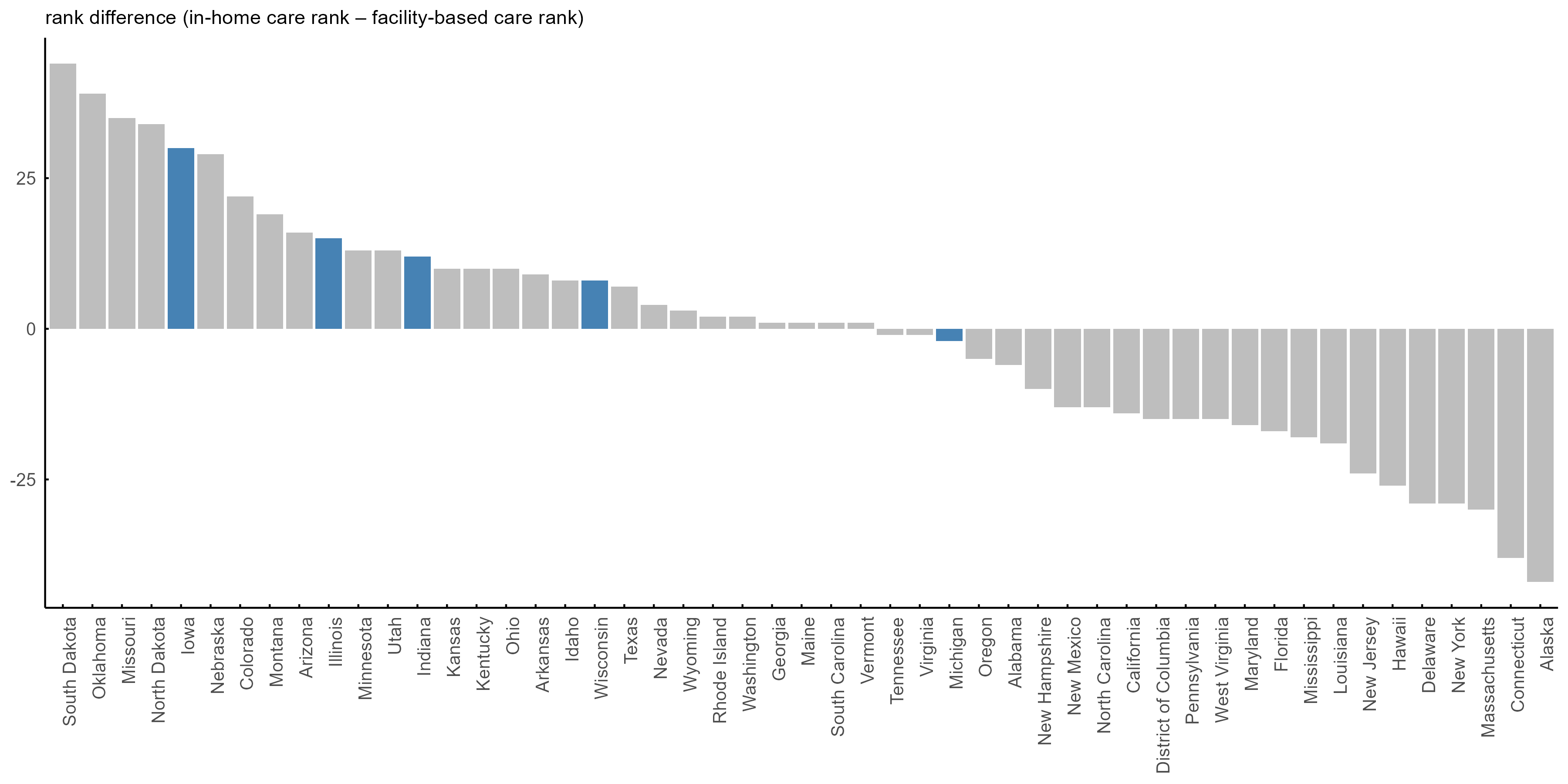
As before, we adjust the elder care costs based on the state’s median income (relative to the nation’s) to ensure measures are comparable across states. We then assign a state two different rankings. The first is where the state ranks based on its relative cost of in-home care, with 1 being the least expensive and 51 being the most (the District of Columbia is included in our analysis). Then we do the same for facility-based care costs.
Figure 3 displays the rank difference between in-home and facility-based elder care costs for each state. States on the left (positive price rank difference) are those where in-home care is relatively expensive compared with facility-based care. Conversely, states on the right (negative price rank difference) exhibit the opposite pattern. The states in blue are those that are in the Seventh Federal Reserve District, which is served by the Chicago Fed. Apart from Michigan, where in-home care and facility-based care are similarly ranked in price, most of the Seventh District states have notably expensive in-home care relative to facility-based care. Two related mechanisms plausibly contribute to this. First, the Seventh District states tend to have lower immigrant shares than the rest of the country. This matters because long-term elder care workers, particularly those providing in-home care, are more likely to be immigrants (Chidambaram et al., 2024; and Chidambaram and Pillai, 2025), and research finds that higher local immigrant labor supply tends to lower prices in immigrant-intensive industries (Cortes, 2008). Second, in-home care is travel-intensive as workers often drive to one client at a time and providers may price that travel into their rates, whereas facility-based care concentrates residents in a single location and avoids that cost. The Seventh District states have lower population densities or substantial rural expanses outside of their main metro areas. The marginal cost of delivering in-home care relative to facility-based care therefore rises in these states compared with more-urban states with higher population density (e.g., New Jersey).
3. Rank difference between in-home and facility-based elder care costs for U.S. states, 2024
Sources: Authors’ calculations based on data from Genworth’s CareScout, Cost of Care Survey 2024, and U.S. Census Bureau, 2019–23 American Community Survey, five-year estimates, from IPUMS USA.
Importantly, because price differences across states may reflect variation in both the demand for and the supply of elder care, they do not necessarily indicate differences in the underlying quality of care providers. In the next section, we incorporate a new source of publicly available data—the star rating data from the Centers for Medicare & Medicaid Services (CMS)—to examine how the quality of nursing home care compares with its median price.
Nursing home quality
We next turn to quality of care in nursing homes, for which there are standardized nationwide data.
We use facility-level data from CMS’s nursing homes including rehab services archived data snapshots—specifically the data snapshot dated January 31, 2024. From this data snapshot, we use the nursing home provider file (NH_ProviderInfo_Jan2024.csv), which covers over 14,000 Medicare-certified skilled nursing facilities. We use the following ratings data for those facilities based on the CMS Five-Star Quality Rating System:
- Health inspection (HI) rating. This gets a score of 1–5 indicating the number and severity of inspection “deficiencies” (5 is the best rating assigned to facilities with minimal deficiencies and/or least severe ones).
- Quality measure (QM) rating. This is essentially a health quality measure for the nursing home residents, with a score of 1–5 indicating the share of residents with falls, injuries, mobility issues, and rehospitalizations (5 is the best rating assigned to facilities with healthier patients).
- Staffing rating. This gets a score of 1–5 indicating the staff turnover rate and the number of staff hours per resident (5 is the best rating assigned to facilities with lower turnover and higher staff hours per resident).
- Overall rating. This is a composite measure of the previous three ratings that reflects the facility’s overall quality or performance.3
Figure 4 presents summary statistics for the CMS ratings at the national level and for each region of the country. The values represent weighted averages of facility ratings, where each facility’s weight corresponds to its number of beds. We construct these bed-size-weighted average facility ratings to give larger facilities more weight in our calculations of the regional and national averages. As figure 4 shows, the West tends to have the highest ratings and the South the lowest, with the exception of health inspection ratings, which are more similar across regions.
4. Bed-size-weighted average nursing facility star ratings, by region, 2024
| National | Midwest | Northeast | South | West | |
|---|---|---|---|---|---|
| Overall rating | 2.70 | 2.70 | 2.78 | 2.57 | 2.96 |
| HI rating | 2.63 | 2.64 | 2.63 | 2.66 | 2.58 |
| QM rating | 3.50 | 3.45 | 3.68 | 3.23 | 4.10 |
| Staff rating | 2.56 | 2.57 | 2.61 | 2.32 | 3.11 |
Sources: Authors’ calculations based on data from the Centers for Medicare & Medicaid Services, nursing homes including rehab services archived data snapshot dated 01/31/2024, nursing home provider file (NH_ProviderInfo_Jan2024.csv).
A value-based measure of nursing home care
To assess the value of nursing home care, we combine the price and overall rating for such care into a single metric at the state level. This metric is based on the following two state-level ratios:
-
This is the bed-size-weighted average overall rating of nursing facilities
in
statei
divided by the nationwide average overall rating. States with a quality
ratio
greater than 1 have overall ratings above the national average, whereas
those
with a quality ratio less than 1 have ratings below the national
average.
- This is the median nursing home price in state i (adjusted for state median household income following the methodology explained earlier), divided by the national average median nursing home price. As with the quality ratio, states with a price ratio greater than 1 have prices above the national average, whereas those with a price ratio less than 1 have prices below the national average.
We construct a nursing home value index by dividing the quality ratio by the price ratio. This index measures whether the quality-to-price ratio in a state is higher or lower relative to the national quality-to-price ratio. Index values greater than 1 indicate that the state quality-to-price ratio is higher than the nationwide quality-to-price ratio, while index values below 1 indicate the opposite.4 For example, a state with a nursing home value index equal to 1.3 is approximately 30% better value than the national average. Here, “better value” can represent a relatively higher overall rating, a relatively lower price, or both.
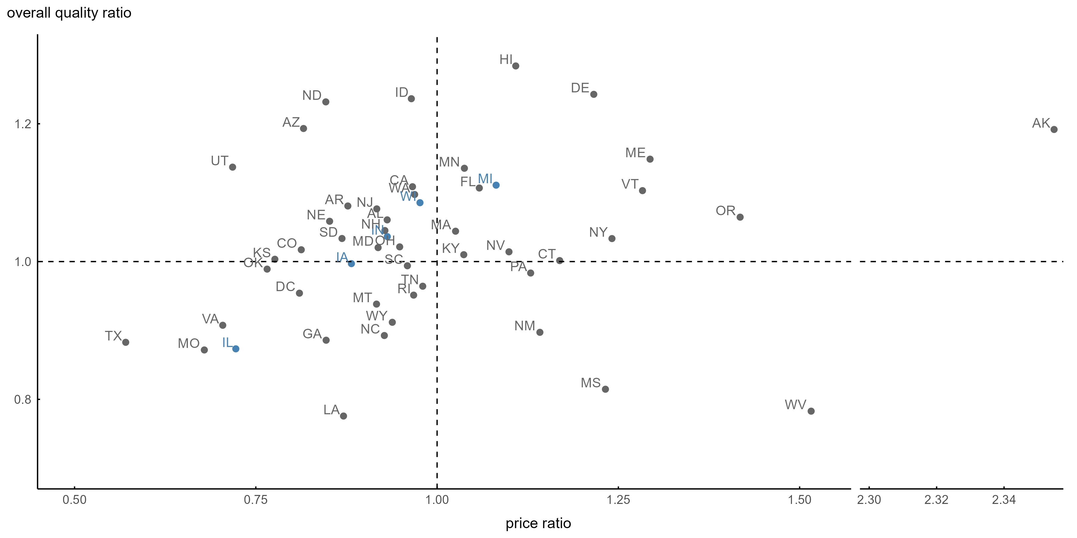
Figure 5 plots U.S. states by their quality and price ratios for elder care. The top left quadrant reflects states with above-average quality and below-average price and thus greater value per dollar of care. At the other extreme, states in the bottom right quadrant have below-average quality yet above-average price of care. States in blue are those in the Seventh District. Illinois falls in the bottom left quadrant, indicating a below-average quality of nursing home care at a below-average price. At the other end, Michigan falls in the top right quadrant, with an above-average quality of nursing home care at an above-average price. Two of the Seventh District states fall in the top left quadrant: Both Indiana and Wisconsin have an above-average quality of nursing home care at a below-average price. Finally, Iowa sits on the horizontal dashed line, but somewhat left of the vertical dashed line, indicating it has a quality of nursing home care that’s pretty much on par with the national average, though at a cost that’s slightly below the U.S. average.
5. Relative quality versus relative price of nursing home care across U.S. states, 2024
Sources: Authors’ calculations based on data from Genworth’s CareScout, Cost of Care Survey 2024; U.S. Census Bureau, 2019–23 American Community Survey, five-year estimates, from IPUMS USA; and Centers for Medicare & Medicaid Services, nursing homes including rehab services archived data snapshot dated 01/31/2024, nursing home provider file (NH_ProviderInfo_Jan2024.csv).
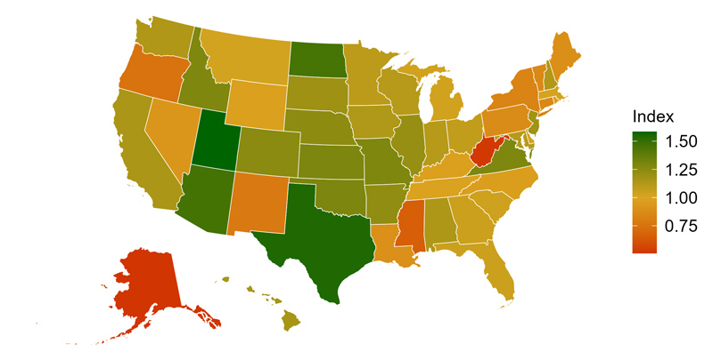
Figure 6 shows the single measure of our nursing home value index across the nation. States in green have better value per dollar for nursing home care, and states in red have worse value. Comparing figure 6 with figure 2, we note that the broad geography in both maps of the U.S. is similar: The states with the highest costs for elder care (in dark blue in figure 2) tend to be the states with the worst value per dollar for nursing home care (in red and orange in figure 6),5 while many of the lowest-cost states (in light blue in figure 2) tend to be the highest-value states (in green in figure 6). These overlaps in figures 2 and 6 are to be expected because price is one of the two components of our nursing home value index. Several states, however, diverge from the pattern in ways that demonstrate why the quality aspect matters. For example, Hawaii, Delaware, and Michigan all fall in the highest-cost quartile in figure 2 (and have above-average price ratios in figure 5), yet their nursing home value index readings sit near the national average rather than in the low-value red zone because their above-average quality ratings substantially offset their high prices. The reverse is also true. For instance, Georgia and Louisiana have lower costs in figure 2 (and below-average price ratios in figure 5), but they have nursing home value index readings near the national average as their below-average overall ratings for the quality of nursing home care offset the benefit of their low prices for elder care.
6. Nursing home value index, by state, 2024
Sources: Authors’ calculations based on data from Genworth’s CareScout, Cost of Care Survey 2024; U.S. Census Bureau, 2019–23 American Community Survey, five-year estimates, from IPUMS USA; and Centers for Medicare & Medicaid Services, nursing homes including rehab services archived data snapshot dated 01/31/2024, nursing home provider file (NH_ProviderInfo_Jan2024.csv).
Correlates of price, quality, and value
Finally, we examine how these measures relate to five core elder care market indicators at the state level: nursing home beds per population age 80 and older, nursing home employees per population age 80 and older, average nursing home occupancy, share of population age 80 and older, and share of adult population (age 18 and older) reporting poor health.6 We compute Spearman correlations between these elder care market indicators and the state-level price ratio and quality ratio. Spearman correlations measure the strength and direction of the rank-based association between two variables; values range from −1 (perfectly inversely related) to +1 (perfectly positively related), with 0 indicating no consistent monotonic relationship. Figure 7 reports these correlations.7
7. Spearman correlations between state-level price ratio, quality ratio, and elder care market indicators, 2024
| Correlation with price ratio | Correlation with quality ratio | |
|---|---|---|
| Nursing home beds per population age 80 and older | –0.44*** | –0.51*** |
| Nursing home employees per population age 80 and older | –0.34*** | –0.29** |
| Average nursing home occupancy | 0.42*** | 0.08 |
| Share of population age 80 and older | 0.42*** | 0.23 |
| Share of adult population (age 18 and older) reporting poor health | 0.07 | —0.36*** |
*** p < 0.01
Notes: The asterisks indicate the level at which the correlation is statistically significantly different from zero; three asterisks denote statistical significance at the 1% level and two asterisks, at the 5% level (i.e., the greater the number of asterisks, the higher the statistical significance). Correlations without asterisks are not statistically significantly different from zero. A definition of a p-value is available online. For a definition of a Spearman correlation and details on the price ratio and quality ratio for nursing home care, see the text. NAICS (mentioned with one of the sources) stands for North American Industry Classification System.
Sources: Authors’ calculations based on data from Genworth’s CareScout, Cost of Care Survey 2024; U.S. Census Bureau, 2019–23 American Community Survey, five-year estimates, from IPUMS USA; Centers for Medicare & Medicaid Services, nursing homes including rehab services archived data snapshot dated 01/31/2024, nursing home provider file (NH_ProviderInfo_Jan2024.csv); U.S. Bureau of Labor Statistics, 2024 Quarterly Census of Employment and Wages (QCEW), annual average employment in NAICS 6231; and KFF, Adult Self-Reported Health Status, analysis of the U.S. Centers for Disease Control and Prevention's (CDC) 2013–24 Behavioral Risk Factor Surveillance System (BRFSS).
Several patterns emerge. First, states with greater nursing home capacity, in terms of beds and workers per population age 80 and older, tend to have lower relative prices. However, these capacity measures are also associated with lower quality of nursing home care.
Related to nursing facility utilization, we find that higher nursing facility occupancy is associated with higher prices with no detectable relationship with quality. Associations with demographic and health variables are mixed. While the share of population age 80 and older is positively correlated with price and weakly with quality, the share of the adult population reporting poor health status has no relationship with price and a negative relationship with quality.
We emphasize that these associations are not causal. For example, the negative correlation between the adult population reporting poor health status and quality of nursing home care could reflect poor health impacting nursing home quality or vice versa, namely, low nursing home quality impacting the reported health status. More broadly, these cross-sectional state-level patterns are joint outcomes of supply, demand, utilization, and access that operate together in each state’s elder care market. These associations highlight the complexity of interpreting price and quality differences across states, as various factors play important roles.
Conclusion
In this article, we documented significant variation in the cost and quality of elder care across the United States. We first showed that care costs rise substantially with the intensity of services provided—from roughly $3,800 per month for in-home care to roughly $9,800 for nursing home care at the national median. These costs vary widely across states even after adjusting for local income levels, with costs for nursing home care exhibiting the greatest dispersion. We further showed that the relative cost of in-home versus facility-based (assisted living and nursing home) care differs markedly by state, suggesting that geographic factors shape not only the level of elder care costs but also the trade-offs families face when choosing among the types of care.
Turning to quality, we used CMS Five-Star Quality Rating System data to document meaningful regional variation in nursing home performance. With these data, we created state-level price ratios and quality ratios, showing in terms of both measures where each state stood relative to the national average. We then combined price and quality data into a state-level nursing home value index for each state. Combining the two matters because price and quality each tell only part of the story. For example, a high-cost state could deliver either superior care or merely expensive care. The nursing home value index makes this trade-off between quality and price explicit by showing how much quality a state delivers per U.S. dollar of cost, which is ultimately what matters for household welfare and the efficiency of public spending on long-term elder care.
Finally, we showed that nursing home capacity, occupancy, and population health are each associated with state-level prices and quality ratings. However, we noted that these correlations reflect the complex interactions of supply, demand, and utilization rather than any single causal factor. As the population continues to age, the nation will face growing pressure to ensure that elder care is both affordable and high quality across all settings and geographies. The patterns documented here point to the importance of market structure in shaping outcomes. In part 3 of this series, we conclude with an economic analysis of nursing home market concentration, plus how it is associated with price and quality at a more local level.
Details for Kelli Marquardt and Aryan Safi are available on their Chicago Fed online profiles (accessed by clicking their respective names in the byline). Anthony Lo Sasso is the Robert F. and Sylvia T. Wagner Professor of Public Affairs in the La Follette School of Public Affairs at the University of Wisconsin–Madison.
Notes
1 We rely on data from the Cost of Care Survey 2024’s Median Cost Data Tables and CareScout Cost of Care Calculator webpage.
2 The elderly dependency ratio is the total number of persons age 65 and older divided by the total number of persons age 15–64, multiplied by 100.
3 The information about the CMS rating system we provide here is based on the technical users’ guide and brief explanation of the five-star rating methodology from the CMS.
4 Specifically, the nursing home value index is defined as5 Note that the price measures differ across figures. Figure 2 reflects the average cost of care across all three types of elder care (in-home care, assisted living, and nursing home care), whereas figure 6 is restricted to the price and quality of nursing home care. The horizontal axis of figure 5—which is used in constructing the nursing home value index whose results are reported in figure 6—shows where each state falls in terms of nursing home price relative to the national average.
6 Population age 80 and older comes from the 2019–23 five-year ACS. Number of nursing home employees comes from the U.S. Bureau of Labor Statistics’ 2024 Quarterly Census of Employment and Wages (QCEW) data, annual average employment in NAICS 6231 (NAICS stands for North American Industry Classification System). The share of adults reporting fair or poor health comes from KFF’s Adult Self-Reported Health Status, which is analysis of the Centers for Disease Control and Prevention (CDC)'s 2013–24 Behavioral Risk Factor Surveillance System (BRFSS). Nursing home occupancy is constructed using the CMS’s nursing homes including rehab services archived data snapshot dated 01/31/2024 (specifically, the nursing home provider file named NH_ProviderInfo_Jan2024.csv) and is the facility-level average daily resident count per bed, aggregated to the state level using bed-size-weighted averages.
7 A more detailed definition of a Spearman correlation is available online.