Chicago neighborhoods vary widely in economic opportunity and well-being, and trends in population change reflect these disparities. According to census data, the city added about 50,000 residents between 2010 and 2020, but patterns differed considerably by neighborhood type. Some census tracts bore the largest burden of population loss, continuing a multi-decade period of decline, while several others saw rapid growth exceeding 10% per year.
Many studies have documented these changes, proposing various narratives around who leaves, why they leave and, especially, where they go. In this Chicago Fed Letter, we extend the analysis of population change to the question of how domestic migration contributes to uneven growth across the city. We describe which Chicago census tracts (which we use to represent neighborhoods) have experienced gains and losses from domestic moves in the past decade, teasing out neighborhood inflows and outflows as well as tracking geographic origins and destinations. The patterns we observe suggest that in-move rates, rather than out-move rates, are a decisive factor in explaining population change, particularly between neighborhoods with higher and lower median incomes.
Data and methods
The primary innovation of this analysis is our use of the panel structure of the Federal Reserve Bank of New York’s Consumer Credit Panel/Equifax data (CCP). The CCP covers an anonymized, randomly selected sample of 5% of consumers of personal credit, with selection into the data set based on scrambled social security numbers. In addition to information on an individual’s credit history, the data set captures a person’s residential history on a quarterly basis and includes an “address” flag that allows us to identify moves even within a given census block.1 In our analysis, we include individuals who move within the city, individuals who live outside of Chicago and move to the city, and individuals who leave Chicago for the suburbs or more distant locations. Our data set includes residents (age 18 and older) who appear in the data for at least two quarterly periods from 2010 through 2020 and have an address in Chicago for at least one of those observations.
We note that the CCP data exclude individuals who lack a credit history; comparison of CCP consumer counts with American Community Survey (ACS) data from the U.S. Census suggests that the CCP data set covers about 80% of Chicago adults.2 The data likely underrepresent residents who do not use traditional lenders (such as credit card companies and affiliated banks, most mortgage lenders, and most auto lenders). Other likely underrepresented groups include college-aged adults whose parents are still handling their finances and noncitizens. To make our conclusions more robust to measurement error, which might occur due to the data’s varying coverage rates, sampling noise, and possibly inexact or delayed address identification,3 we reference geographic areas that include multiple census tracts. Specifically, we aggregate tracts into low- and moderate-income (LMI) and middle- and upper-income (non-LMI) categories, which in this study corresponds to tracts in the Chicago metropolitan statistical area (MSA) with median incomes below or above about $62,000, respectively, at the time of the 2010 Census.4 The LMI designation is also relevant in the context of the Community Reinvestment Act (CRA), which established responsibility for banks to meet the credit needs of LMI census tracts in a manner consistent with safety and soundness.5
In our findings we refer to “moves,” “in-moves,” and “out-moves.” We identify moves by finding consumers who are located at one address in a given quarter and who have a new address in the next quarter for which that consumer is observed, or who have had a new census tract identified by Equifax that does not correspond to a Chicago location (even if the address flag is unchanged). About 98% of moves are identified by the change in the address flag, with 2% identified by a change of census tract. If a move is identified via a change in address, then the consumer’s census tract may be the same both before and after the move. “Out-moves” are moves where the first address and census tract are in our geography of interest (like the city of Chicago, or all LMI tracts in Chicago). “In-moves” are moves where the subsequent address and census tract are in the geography of interest. In turn we calculate an “exit rate” and “entry rate” for the city and other geographies by dividing the number of out-moves or in-moves by the number of residents we observe in that geography in the initial quarter.
We also refer to “net domestic migration,” “net out-migration,” and “net in-migration.” Net domestic migration is simply the difference between total in-moves and total out-moves; if out-moves exceed in-moves we have net out-migration, and the opposite relationship results in net in-migration. These estimates differ from changes in population as reported in ACS data because our data sample does not contain all adults, it does not capture moves that begin or end outside of the United States, and we only observe a move if both the first and subsequent address appear in the data. We do not count a move when an individual obtains a credit history for the first time or appears in the data without any subsequent observations.
Findings
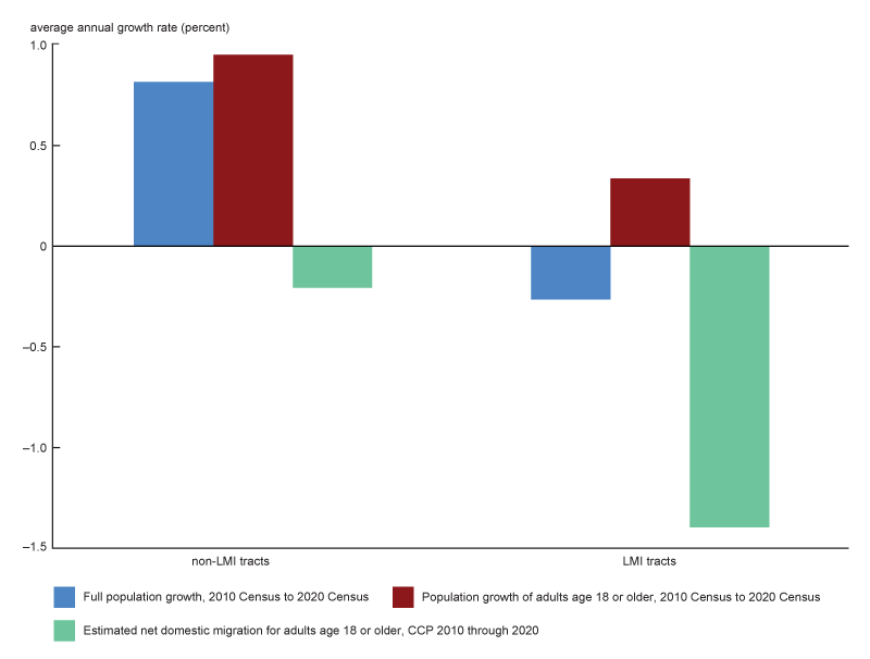
Higher-income census tracts of Chicago were more likely to realize net gains from movers. Most neighborhoods of Chicago experienced net out-migration during the decade, and across all income levels, there were both tracts with net out-migration and tracts with net in-migration. Yet, overall, tracts that began with higher median family incomes in 2010 were less likely to experience net-outmigration in the following decade, compared with lower income tracts. Looking at net changes from in-moves and out-moves for the age 18 or older population, we see annualized net out-migration of 1.4% across all LMI tracts versus 0.2% across all non-LMI tracts, based on the population included in the CCP at the start of the decade (figure 1).6 Combining all non-LMI tracts in Chicago, we observe 98 in-moves for every 100 out-moves. Combining all LMI tracts in Chicago, we observe 81 in-moves for every 100 out-moves. If in-moves matched out-moves in LMI tracts as closely as in non-LMI tracts, the data suggest that Chicago’s LMI areas would have nearly 150,000 more adult residents. The implication is that the scale of domestic migration is large enough to tip the balance of growth between LMI and non-LMI tracts.
1. Change in population of Chicago census tracts, by census tract income

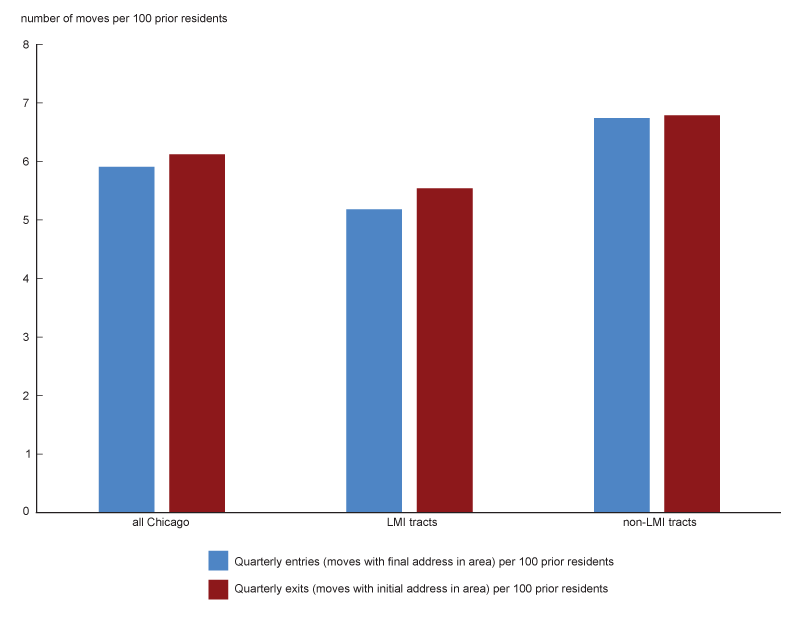
Population loss in LMI tracts tends to result from lower rates of entry rather than higher rates of exit. Despite greater net out-migration, LMI census tracts tend to have lower exit rates than non-LMI census tracts. As figure 2 shows, an average of 5.5% of residents moved from an address within an LMI tract in a given quarter over the period of analysis, compared to an average of 6.8% of residents who moved from an address within a non-LMI tract. However, LMI neighborhoods also tended to have lower rates of entry, where an entry counts as an arrival into a new address, regardless of the census tract income of the origin address. This larger gap between entries and exits, on average, accounted for the bigger loss in moves from LMI neighborhoods. By contrast, the average exit rate for non-LMI neighborhoods was nearly equal to the average entry rate.
2. Quarterly rates of in-moves (entries) and out-moves (exits), by LMI status

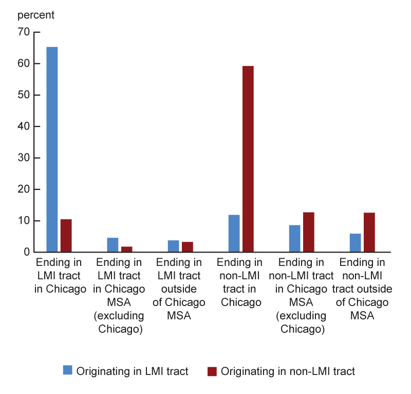
Movers tend to relocate into census tracts of the same income classification as their original neighborhood, particularly when moving within Chicago. Residents moving from addresses in LMI tracts tend to live in other LMI tracts in the subsequent period, just as most residents moving from addresses in non-LMI tracts go to other non-LMI tracts in the subsequent period. This is explained in part by the fact that many moves for both LMI and non-LMI residents are between addresses located in the same census tract. However, we see some differences in this pattern between LMI and non-LMI tracts. About 26% of LMI out-moves are to non-LMI places, while 15% of exits from non-LMI tracts are to LMI places (see figure 3, panel A). Furthermore, people who live in an LMI tract are more likely to move to a middle- or upper-income tract when they move out of the city versus when they move within the city. Almost 90% of LMI-to-LMI moves result in the mover staying in Chicago compared to 45% of LMI-to-non-LMI moves.
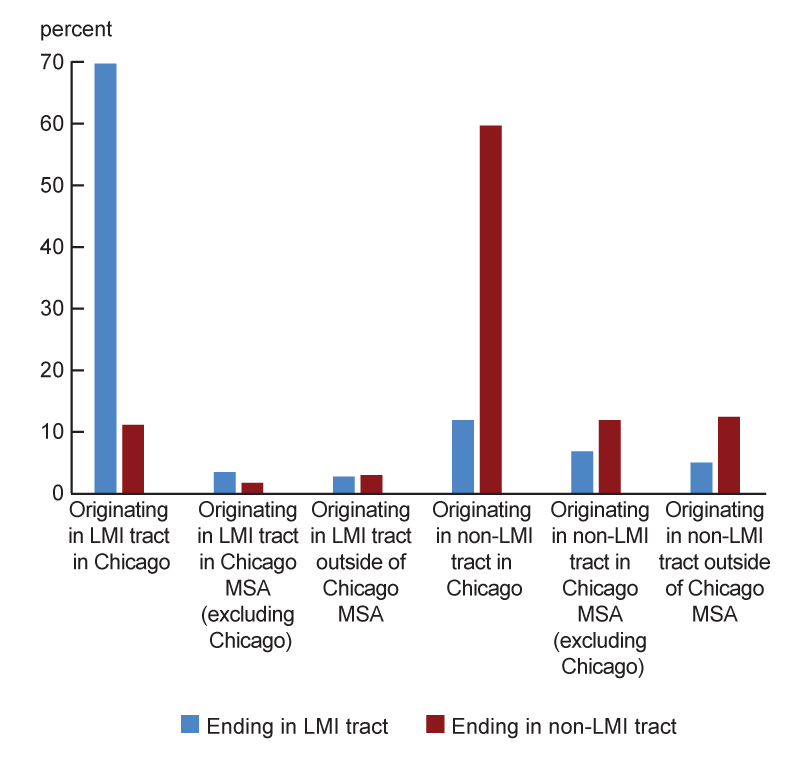
3. Origins and destinations for Chicago moves
A. Moves originating in Chicago

B. Moves ending in Chicago

Residents of non-LMI tracts are more likely to migrate to and from outside of the city than residents of LMI tracts. About 30% of moves from an address in a non-LMI census tract were to an address outside of Chicago, compared to about 23% of moves from an address in an LMI neighborhood. And in terms of all out-moves from the city with a non-Chicago destination, 59% were from a non-LMI tract. About 9% of non-LMI out-moves were to elsewhere in Cook County, including about 5% specifically to the northern suburbs of Cook County. Out-of-city moves from LMI tracts during the decade were similarly likely to end up in the Chicago suburbs (9%); but a higher share went to the southern suburbs instead of the northern suburbs (4% versus 2%). Approximately 15% of moves from non-LMI tracts were to outside of the Chicago MSA (see figure 3, panel A), and among those who left the state entirely, California was the most common destination for moves that began in non-LMI tracts. Nine percent of moves from LMI tracts ended up outside of the Chicago MSA (including outside of Illinois); and for those ending up outside of Illinois, Indiana was the most common destination state during the decade.
Almost two-thirds of in-moves to Chicago from outside the city went to non-LMI tracts. Non-LMI tracts received nearly 30% of their in-mover population from outside of Chicago: 14% from elsewhere in the Chicago MSA and 16% from beyond the metropolitan area (see figure 3, panel B). LMI tracts received 18% of in-mover population from outside of the city: 10% from elsewhere in the Chicago MSA and 8% from outside of the MSA. For non-LMI tracts in Chicago, we observe 95 in-moves from outside of the city for every 100 out-moves leaving Chicago. For LMI tracts in Chicago, we observe 75 in-moves from outside of the city for every 100 out-moves leaving Chicago.
A net increase in moves tends to be associated with places that have higher human capital, though the relationship between many neighborhood characteristics and population growth varies across neighborhood type. Finally, we consider the relationship between neighborhood characteristics and moves. Figure 4 summarizes some neighborhood attributes for Chicago census tracts that gained or lost population from domestic migration over the decade. Using census tract-level population characteristics found in ACS five-year estimates and the CCP’s risk score variable,7 we see that areas with population growth were associated with higher human capital. Tracts that gained population had higher educational attainment both at the beginning and end periods—for both LMI and non-LMI tracts. Median household income was also higher in both LMI and non-LMI tracts that gained population; and in the course of the decade, the differences in median household incomes grew between tracts that would go on to gain population and those that did not. Median credit scores (risk scores from CCP data) were also higher in population-growth tracts, especially in lower-income areas, though many people with prime scores lived in LMI tracts and many with subprime scores lived in non-LMI tracts. In terms of jobs, an increase in jobs in tracts was associated with population growth in both LMI and non-LMI neighborhoods.
4. Neighborhood characteristics and population changes from domestic migration
| All LMI tracts | LMI tracts gaining from migration | LMI tracts with no migration gain | All non-LMI tracts | Non-LMI tracts gaining from migration | Non-LMI tracts with no migration gain | |
|---|---|---|---|---|---|---|
| Residents in LMI areas (2012 LMI definition, 2006–10 five-year ACS counts) | 100.0% | 100.0% | 100.0% | 0.0% | 0.0% | 0.0% |
| Adults 25 or older with bachelor’s degree or equivalent, 2006–10 five-year ACS | 17.1% | 24.1% | 15.4% | 50.2% | 51.1% | 49.7% |
| Adults 25 or older with bachelor’s degree or equivalent, 2017–21 five-year ACS | 23.1% | 31.2% | 21.0% | 57.7% | 60.6% | 55.8% |
| Median household income, 2006–10 five-year ACS | $35,214 | $36,255 | $34,937 | $67,644 | $68,324 | $67,204 |
| Median household income, 2017–21 five-year ACS | $42,840 | $45,229 | $42,181 | $89,649 | $92,472 | $87,683 |
| Median risk score, 2010:Q1 | 627 | 649 | 624 | 728 | 733 | 725 |
| Median risk score, 2020:Q4 | 676 | 691 | 672 | 762 | 764 | 761 |
| Average annual change in primary jobs, 2010–20 | –1.9% | 15.2% | –6.0% | –0.6% | 10.0% | –21.7% |
| Median monthly housing costs, 2006–10 five-year ACS estimate | $938 | $915 | $945 | $1,371 | $1,408 | $1,348 |
| Median monthly housing costs, 2017–21 five-year ACS estimate | $1,044 | $1,073 | $1,037 | $1,632 | $1,694 | $1,589 |
| Average annual homicides per 100,000 residents (number) | 31.6 | 21.8 | 35.0 | 5.7 | 5.7 | 5.5 |
For other neighborhood characteristics, the relationship with growth varied according to LMI or non-LMI status. For example, non-LMI tracts that gained population from migration had higher housing costs at the both the beginning and end of the decade, whereas median housing costs in LMI growth areas were slightly lower than in population-loss tracts. And for non-LMI tracts, there was little difference in the homicide rate between tracts that gained population and tracts that did not. For LMI tracts, this difference was large, with tracts that gained population roughly matching the citywide frequency of homicides at 21.8 per 100,000 residents, while LMI tracts that lost population had a homicide rate of 35 per 100,000 residents.8
Conclusion
In this article, we examine the dynamics of population change at the census tract level in Chicago. Various narratives have formed around who leaves the city and where they go, and the CCP data set allows us to observe additional detail around moves at the neighborhood level. We find that domestic migration reduced the overall (mover) population across both low- to moderate-income tracts and middle- to upper-income tracts in Chicago, but net migration played an even larger role in population loss in LMI tracts. Population losses in LMI neighborhoods were often a consequence of lower entries rather than higher exits relative to non-LMI tracts. People tended to stay local when they moved. A higher share of exits from the city originated from middle- to upper-income tracts; but when people moved to the city from outside of Chicago, a notably higher share moved to non-LMI tracts. Net in-migration is associated with a handful of neighborhood factors, notably higher human capital, though the characteristics associated with net population growth are not associated with all neighborhoods. Therefore, policies to attract households in specific neighborhoods, such as affordable rents, home purchase incentives, or job creation programs, could potentially be tailored to local circumstances.
Notes
1 The address flag in the CCP is a scrambled number that represents a unique identification code for each address. This field is populated for all quarters of the data set. Our sample drops post office boxes and addresses identified as nonresidential, which represent 0.2% of observations.
2 Comparing the Equifax counts of adults (age 18 and older) in the U.S. with the 2020 Census, we get about 95% coverage nationwide, making coverage in Chicago somewhat lower. In addition, the Consumer Financial Protection Bureau notes about one in ten Americans can be considered credit invisible because they do not have any credit record.
3 For a comprehensive review of how the CCP performs as a data panel for examining migration, see DeWaard, Johnson, and Whitaker (2019).
4 LMI designation is published by the Federal Financial Institutions Examination Council (FFIEC) using the tract boundaries calculated for the 2010 Decennial Census.
5 Congress passed the CRA in 1977 at a time when many banks and other financial institutions refused to invest in low-income or minority communities or extend credit to their residents, a practice which had decades-long consequences in terms of reducing homeownership rates and house values while increasing inequality.
6 For the bulk of this article, we use only the initial LMI status of tracts based upon Federal Financial Institutions Examination Council (FFIEC) designations using 2010 Census data. However, if we examine updated LMI tract designations for 2021, we find that tracts that shifted from LMI to non-LMI and tracts that shifted from non-LMI to LMI over the period each had net migration figures similar to those for consistently non-LMI tracts.
7 The “risk score” variable in the Consumer Credit Panel data set behaves similarly to a traditional credit score measure, ranging from 280 to 850.
8 We see some similarities and differences if we compare tracts by racial/ethnic group rather than by LMI/non-LMI status. Higher human capital is associated with population growth in neighborhoods that are majority Black, Hispanic, and non-Hispanic White. An increase in neighborhood jobs is associated with population growth only in neighborhoods that are majority non-Hispanic White. Higher housing costs are associated with population growth in majority Hispanic neighborhoods. Homicide rates are the same in both growth and no-growth majority non-Hispanic White neighborhoods. In majority Black and majority Hispanic neighborhoods, population growth is associated with lower homicide rates.


