The conflict in the Middle East that erupted on February 28, 2026, has disrupted the supply of oil and other key commodities and left substantial damage to oil infrastructure in Iran and beyond. By March 6, the inflation-adjusted price of oil had risen about 50% from its level before the conflict, and until the memorandum of understanding (MOU) between the U.S. and Iran that was announced on June 14, it generally hovered between $90 and $110 per barrel.1 Subsequently, by late June the price had fallen to near levels that preceded the conflict as the MOU led to at least a partial reopening of the Strait of Hormuz. But the situation remains tenuous. Such large oil price movements are not uncommon. The U.S. economy has been repeatedly hit by oil shocks since the early 1970s, with the most recent shock before 2026 having occurred when Russia began its full-scale invasion of Ukraine in 2022. These shocks typically lead to lower output growth and higher inflation. How large might the effects be this time around?
To answer this question, we consider the impact on the U.S. economy of various scenarios for the price of oil. We do this using a standard medium-scale macroeconomic model augmented with an energy sector. We analyze several scenarios that involve alternative assumptions for the actual and expected duration of the disruption to the supply of oil. Depending on the scenario, the model predicts the impact could shave 81 to 166 basis points (bps) off economic growth in 2026, followed by a boost of 9 to 18 bps to growth in 2027 as the economy reverts to its prior trend. According to the model, even if the disruption is short-lived, its effects could persist for some time. In all the scenarios we consider, inflation rises, leading to higher interest rates. Finally, we use our model to assess the magnitude of the effects from the 2026 oil shock in comparison with those from the 1979–80 oil shock. We find that the magnitude of the 2026 oil shock’s economic effects is much smaller than that of the 1979–80 shock’s.
Backdrop
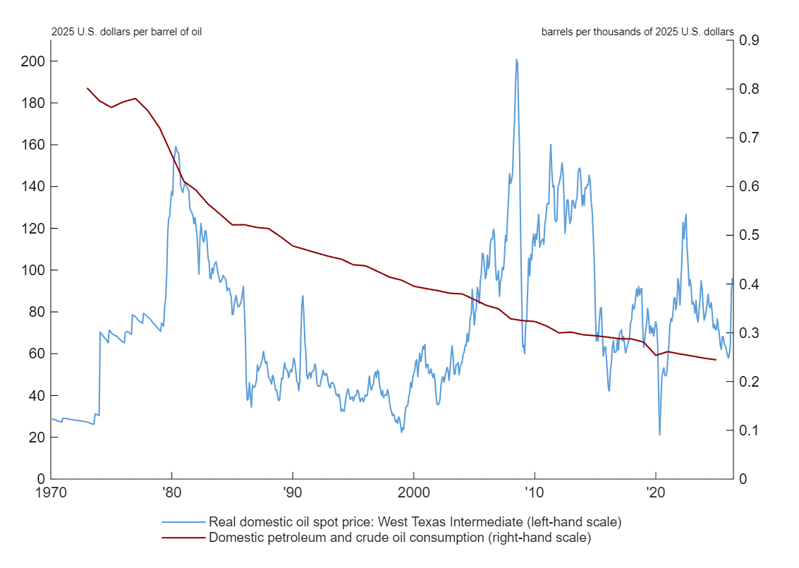
Figure 1 shows barrels of oil consumed per unit of real gross domestic product (GDP) in red and the price of a barrel of West Texas Intermediate (WTI) crude oil deflated by the Consumer Price Index with base year 2025 in blue. Clearly the U.S. economy has become much more oil efficient than it used to be—much less oil is needed now to produce $1,000 (in 2025 U.S. dollars) of GDP. This increase in efficiency is usually attributed to higher fuel economy standards, a sectoral shift from high-energy-intensity manufacturing to low-energy-intensity services, and substitution away from oil in electricity generation. The decline in the use of oil for electricity generation is particularly striking (not shown). In the early 1970s, oil contributed about 15% to the electricity supply; by contrast, in 2025, this share was about 0.7%.
1. Oil consumption and the real price of oil, 1970–2026
Sources: Authors’ calculations based on oil spot price data from the Chicago Mercantile Exchange from Haver Analytics and gross domestic product data from the U.S. Bureau of Economic Analysis from FRED.
While the economy has become more oil-efficient, the inflation-adjusted price of oil is higher than it used to be. Before the 1973–74 oil embargo, the oil price per barrel was about $28 (in 2025 U.S. dollars). Before the latest oil shock, its price per barrel was $60 (in 2025 U.S. dollars). These changes help explain why expenditure on oil as a fraction of nominal GDP is about the same in 2025 as it was before the 1970s oil embargoes.2 Note that the inflation-adjusted oil price in the current episode is not particularly high historically. It is 30% lower than in the early 2010s, during a period of sluggish growth, and 20% lower than the peak price following Russia’s full-scale invasion of Ukraine.3
The model and its calibration
We simulate a standard medium-scale New Keynesian dynamic stochastic general equilibrium model augmented with an energy sector. The model features sticky prices and wages, adjustment costs in investment, and habit persistence in household preferences.4 This means firms struggle to quickly change investment patterns, and households have a strong preference to smooth their consumption over time. The short-term interest rate is assumed to follow an inertial Taylor rule, which depends on the lagged interest rate, the deviation of inflation from the central bank’s target, and the output gap—i.e., the deviation of output from its level in the flexible-price version of the model economy. Output depends on labor and the proportion of capital that is utilized, where the utilization rate depends on the amount of energy consumed as in Leduc and Sill (2004).5 Energy is a constant elasticity of substitution function of oil and an unspecified alternative energy source. This is a flexible way to control the degree of substitutability between oil and its alternative. We assume the prices of oil and its alternative are exogenous, but otherwise we study the general equilibrium where all other prices and quantities are determined endogenously.6 Finally, we also include an oil export revenue channel where net export revenues vary proportionally with oil prices, consistent with the U.S.’s current status as a net oil exporter.
We choose parameters of the nonenergy block of the model to be consistent with the literature.7 The energy block is calibrated to match three numerical targets conditional on an assumption for the elasticity of substitution between oil and its alternative: the oil expenditure share of GDP, the total energy share of GDP, and net oil revenues relative to GDP. We assume an oil share of 2.5% based on the calculation described in note 2. We set the total energy share of GDP to 5.6% based on U.S. Energy Information Administration (EIA) data. Net oil revenues as a share of nominal GDP are estimated as net petroleum exports as a share of nominal GDP in 2024, which was about 0.15 percent, according to our calculations using U.S. Bureau of Economic Analysis (BEA) data.
The elasticity of substitution between oil and the alternative in energy production is a crucial parameter. The lower the elasticity, the more costly it is to substitute away from oil. This raises the cost of utilization by more and encourages a greater substitution away from capital services in the production function.8 Oil is generally considered to have a low substitutability (elasticity less than one) with other energy sources, such as natural gas and renewables. We set our baseline elasticity of substitution at 0.5.9 This value is on the high side of estimates, which biases our results toward finding smaller effects.
Some macroeconomic scenarios
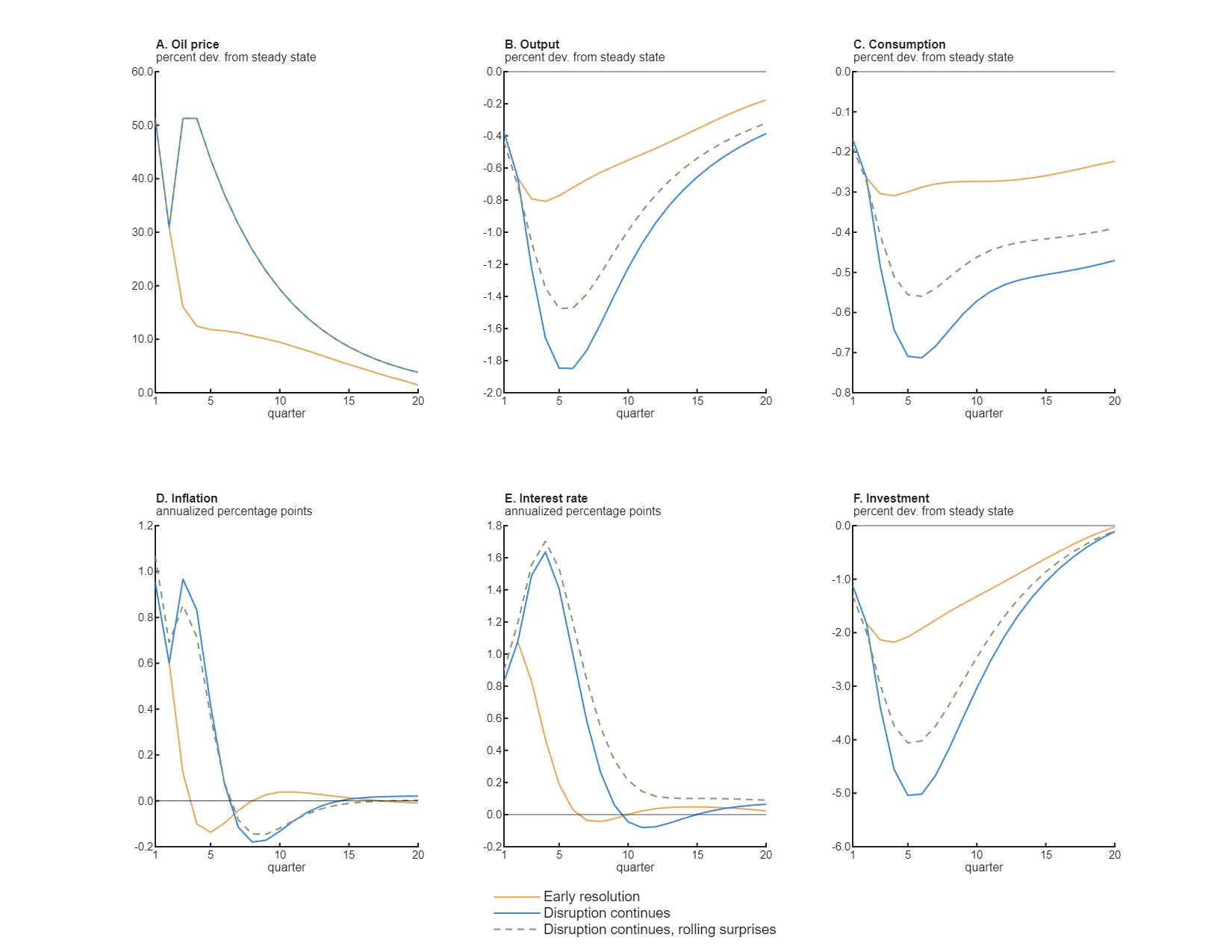
Figure 2 displays the model’s predictions under three scenarios for the dynamics of the oil price after the initial oil shock in the first quarter of 2026.
2. Immediate versus delayed transition of oil prices to preshock levels
Sources: Authors’ calculations; and oil spot and futures price data from the Chicago Mercantile Exchange from Bloomberg PerSecurity.
Panel A of figure 2 outlines our assumptions about prices in each scenario, with quarter 1 in the model representing the first quarter of 2026. The first scenario, shown as a solid yellow line, assumes that oil prices continue falling through the end of 2030 in alignment with market futures as of June 22, 2026; we label this scenario “early resolution.” In panel A, the yellow line follows realized oil spot prices (for West Texas Intermediate crude oil) through the first two quarters of 2026 and thereafter follows the June oil price futures. Futures prices are a good indicator for market expectations of spot prices in the future;10 as panel A shows, oil futures prices in June indicated that markets expected the spot price of oil to moderate significantly over the next year but fall more slowly in 2027 and beyond. After five years the spot oil price is expected to be close to its preconflict level. Consistent with the fact that through June, oil price expectations did not change substantially since the end of March, we assume that agents have perfect foresight over the entire path of prices in this scenario.
The second scenario, shown as a solid blue line, considers the possibility that events prolong the disruption of oil that transits through the Strait of Hormuz. In this scenario, which we label “disruption continues,” the conflict unexpectedly resumes in the third quarter of 2026 and oil prices move back up to their level in the first quarter. At that time agents expect oil prices to gradually return to the steady state. Agents are surprised again in the fourth quarter but correctly foresee that prices decline toward the previous steady state afterward. Note that the rate of decline is constant in this scenario but after five years ends up near the early resolution path of oil prices.
The third scenario, shown as a dashed green line, is similar to the second scenario in that the realized oil price follows the trajectory of the solid blue line in panel A. In each period, agents expect the oil price to quickly revert to its preconflict level. In the first quarter of 2027 (quarter 5 in figure 2, panel A) and beyond, agents continue to expect a quick reversion to steady state and keep being surprised that the realized path of the price is as indicated by the solid blue line. Hence, we call the third scenario “disruption continues, rolling surprises.”
The paths of output, consumption, inflation, the interest rate, and investment corresponding to these scenarios are shown in the other five plots (panels B–F of figure 2). Consider the early resolution scenario first, indicated by the solid yellow lines in all the panels. Here we see output (panel B) declines by about 81 basis points (bps) over the first year relative to where it would have been had there not been an oil shock, shaving that amount off of growth in 2026. With output returning to its steady state (preshock trend), the shock contributes about 18 bps to economic growth in 2027. The drop in output is primarily due to a fall in investment (panel F): After a year investment is over 2% lower than it would have been without the shock. As capital is more costly to utilize and will be for quite some time, firms invest less. Consumption (panel C) falls because households feel poorer, but falls by much less than investment, since they prefer to smooth consumption. Even as the oil price normalizes, the capital stock remains below its prior trend for a considerable period (not shown) because of the persistently lower investment. This implies that even after five years (20 quarters) output and consumption are not back to where they would have been in the absence of the shock, even though investment ends up close to its steady-state value. The qualitative dynamics in the disruption continues scenario (solid blue line) are similar, but quantitatively much larger. For instance, the shock reduces output growth in 2026 by about 166 bps, with a positive correction of about 9 bps in 2027 as the oil price begins to normalize. The third scenario, where agents expect the oil price to quickly revert but keep being surprised it does not, generally lies between the two other scenarios. While the path of oil prices is the same in this scenario as in the disruption continues scenario, the effects on output, consumption, and investment are smaller because agents do not expect prices to stay as high as they actually do and agents are forward-looking. Inflation (panel D) is boosted by 95 bps or more initially in all three scenarios. Inflation begins to fall when the oil price does, and the model’s policy rule implies interest rates rise to combat inflation. Interest rates (panel E) rise further in the two disruption continues scenarios as inflation stays elevated for longer.
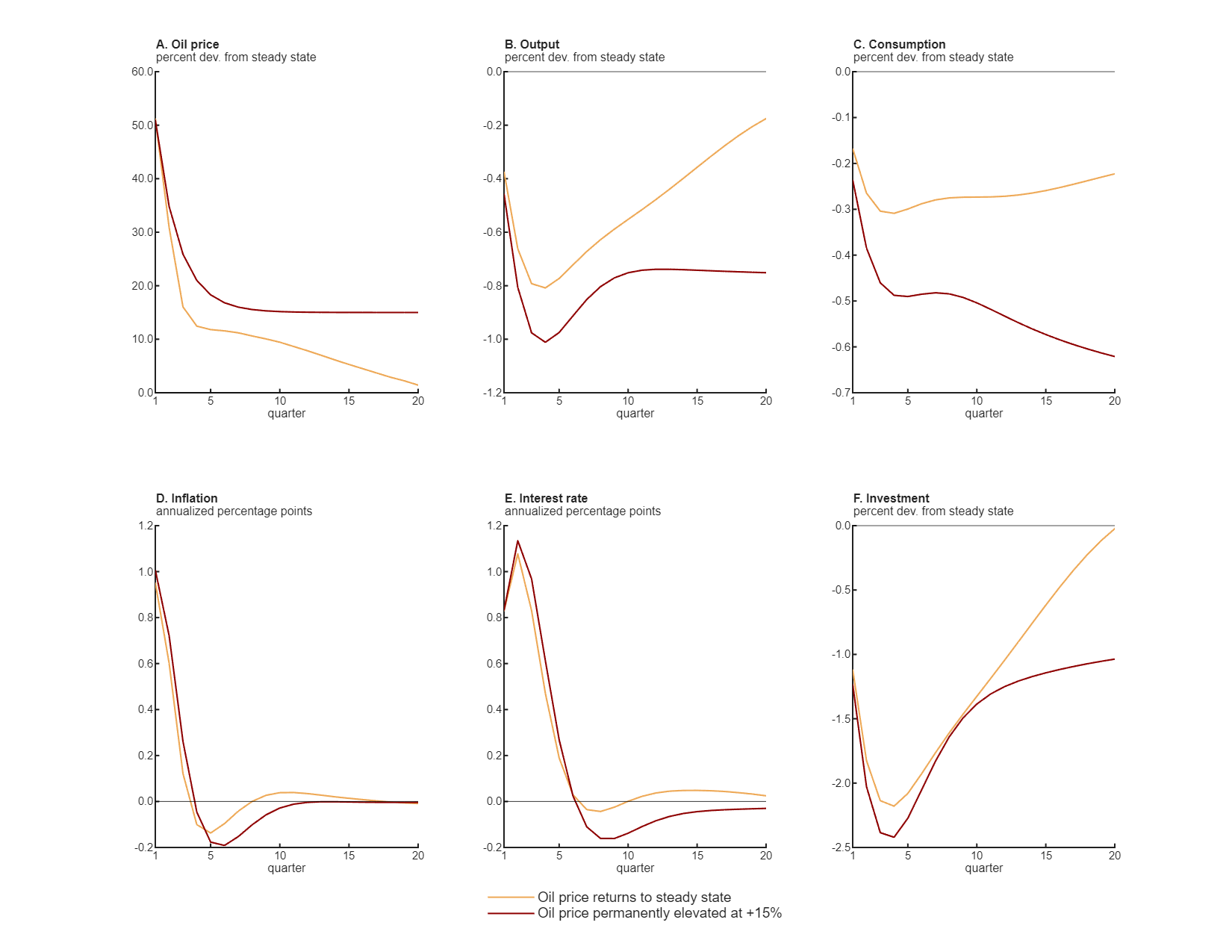
In figure 3, we again assume perfect foresight and compare the early resolution scenario from figure 2 with one where the oil price ends up permanently 15% higher than its preconflict level (shown as a red line). The key takeaway is that the anticipation of permanently higher prices has a large impact on the near-term dynamics. If the oil price is expected to be permanently 15% higher than before the conflict, consumption (panel C) is over 50% lower after one year than if the oil price is expected to revert back to the preconflict level. The two scenarios in figure 3 involve fairly similar paths for inflation and the interest rate (see panels D and E, respectively).
3. Delayed versus incomplete return of oil prices to preshock levels
Sources: Authors’ calculations; and oil spot and futures price data from the Chicago Mercantile Exchange from Bloomberg PerSecurity.
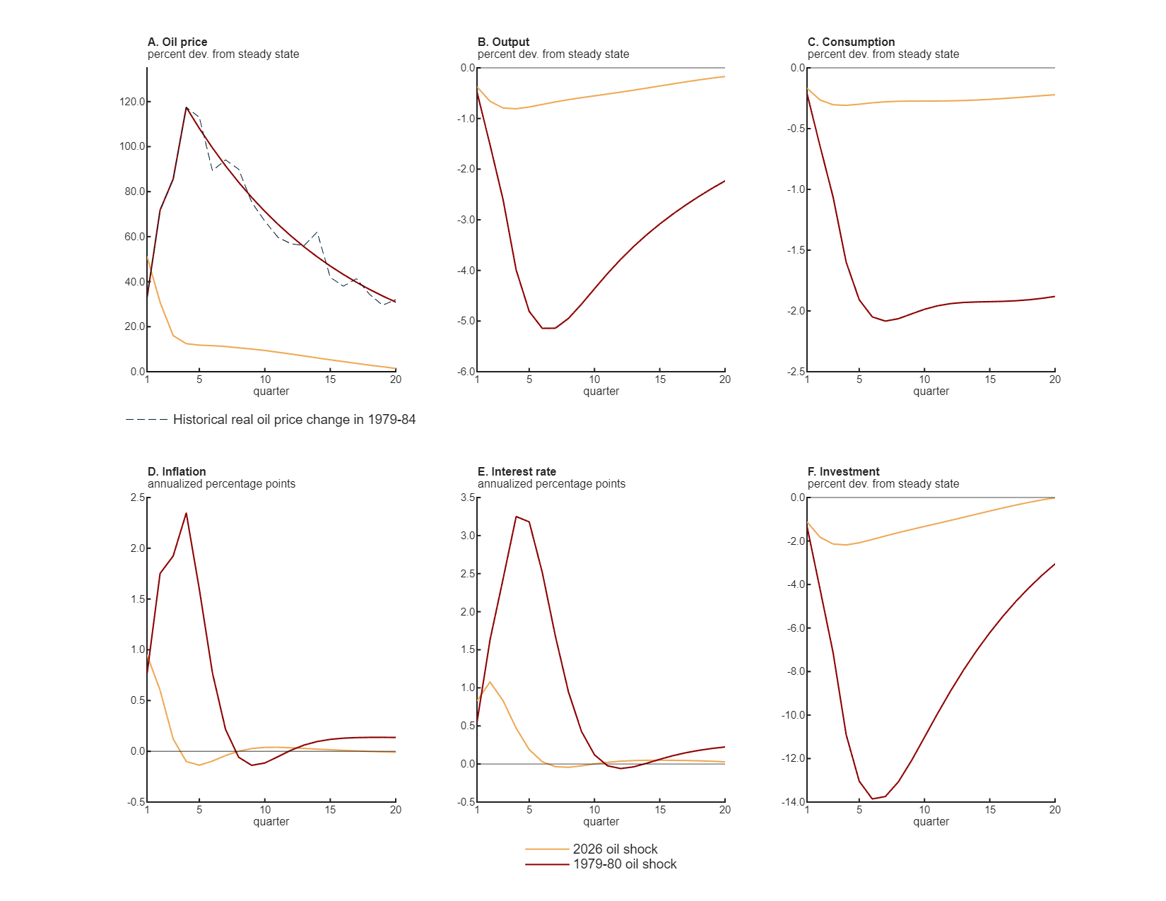
The last experiment, the results of which are shown in figure 4, compares the early resolution scenario for the 2026 oil shock (from figure 2) with the 1979–80 oil shock (shown as a red line) brought on by the Iranian revolution. This helps us gauge the magnitude of the effects we are finding for the 2026 shock. The 1979–80 shock involved different dynamics. We assume that quarter 1 for the 1979–80 shock scenario corresponds to the second quarter of 1979. As shown in figure 4, the inflation-adjusted oil price did not reach its peak immediately after it initially shot up in May 1979 (quarter 1 in panel A) as evolving circumstances kept it rising for four quarters until it hit its peak in April 1980 (quarter 5 in panel A). For the 1979–80 shock scenario, we assume that the first four quarters of price increases are surprises, with agents always expecting the price to fall gradually beginning in the subsequent quarter. Once the price peaks, we assume that the oil price path is fully anticipated to follow a path similar to that of actual inflation-adjusted oil prices (dashed navy blue line). The peak price of oil following the 1979–80 shock is more than twice as high as that following the 2026 shock, so it is not surprising that the effects are much larger in the 1979–80 shock scenario. The effects are disproportionately larger: The output, consumption, and investment responses are five to six times larger than those in the 2026 shock scenario.11 This amplification arises because the period that prices are anticipated to remain elevated is much longer in the 1979–80 shock scenario than in the 2026 one. This lowers the demand for capital and therefore potential output.
4. The 2026 oil shock versus the 1979–80 oil shock
Sources: Authors’ calculations; and oil spot and futures price data from the Chicago Mercantile Exchange from Haver Analytics and Bloomberg PerSecurity.
Conclusion
We have used a standard macroeconomic model with an energy sector to consider various scenarios for how the oil price will evolve following the 2026 oil shock. Depending on the scenario, the model predicts the shock could shave 81 to 166 bps off economic growth in 2026, followed by a boost of 9 to 18 bps to growth in 2027 as the economy reverts to its prior trend. According to the model, even if the disruption to the supply of oil is short-lived, its effects could persist for some time. In all the scenarios we consider, inflation rises, leading to higher interest rates. We used our model to compare what we are experiencing today with the effects of the 1979–80 oil shock. While the effects of the 2026 oil shock are large, they pale in comparison to those of the earlier episode.
Our analysis has made several simplifying assumptions. We have assumed that households do not consume oil directly; for instance, they do not use gasoline.12 We have also not considered the potential supply chain effects of the higher oil prices and diminished supply of other commodities affected by the closing of the Strait of Hormuz. Including these features would increase the effects we find. We have also assumed that the long-run elasticity of substitution between oil and other energy sources is the same as the short-run elasticity. The long-run elasticity is likely higher as it’s more feasible to change energy sources over longer horizons. Allowing the short- and long-run elasticity to differ would complicate the model substantially but would likely not affect the near-term effects we have concentrated on.13
Notes
1 Authors’ calculations based on West Texas Intermediate crude oil price data from the Chicago Mercantile Exchange and the Consumer Price Index from the U.S. Bureau of Labor Statistics from Haver Analytics.
2 This is not shown in figure 1 but is based on calculating gross domestic absorption of oil as a fraction of nominal GDP, otherwise known as the “domestic absorption ratio of oil” or “oil share.” This is the relevant share to assess the potential impact of the oil shock on domestic output. Gross domestic absorption of oil is defined as gross output of the petroleum and coal products industry from the Use of Commodities by Industries tables in the U.S. Bureau of Economic Analysis's (BEA) Input-Output Accounts, plus imports of petroleum and goods less exports of the same also from this BEA source. See David and Krane (2026).
3 Authors’ calculations based on West Texas Intermediate crude oil price data from the Chicago Mercantile Exchange from Haver Analytics.
4 The model builds on Campbell et al. (2023) and is described in the technical appendix.
5 The energy sector is from Leduc and Sill (2004) except that we have added an alternative energy source; in their model, energy is generated using oil only.
6 In principle the prices of the alternatives to oil should change as well. We do not take this into account in our analysis. Presumably these prices will be higher than otherwise, which would amplify the effects of the oil shock in our model.
7 The parameters are described in the technical appendix.
8 Mathematically, as the elasticity goes to zero the two energy inputs are impossible to substitute. In economics this case is called a Leontief production function.
9 The literature does not provide direct estimates of the elasticity of interest. Instead, the estimates usually focus on electricity generation or transportation. Generally, elasticity estimates are higher in electricity production than transportation. Some elasticity estimates for electricity are available online from the EIA. The elasticity of substitution in transportation is generally considered lower than the elasticity of substitution in electricity generation.
10 Futures prices include a risk premium, so they are not direct measures of expected future spot prices. The risk premium may have risen as upside risks to oil prices have increased.
11 Blanchard and Galí (2010) emphasize three reasons why the 1970s oil shocks had larger effects than those in the 2000s (holding the price increase constant): Wages are less rigid, the oil expenditure share of GDP is lower, and the monetary policy reaction function has changed. Our measure of the oil share declines by far less than they assume. A larger oil share in 1979 would amplify the effects we find. Making wages less rigid and modifying the Taylor rule to be less responsive to inflation would make the effects even stronger in the 1979–80 case.
12 This could fit within our framework if we assume consumer durables are part of the aggregate capital stock and consumption includes the service flow from consumer durables, such as furniture and light vehicles.
13 The long run is likely five to ten years as it takes a long time to build the infrastructure that would be involved in substituting substantially away from petroleum liquids. Knowing that you will be able to substitute in the future does not help in the near term when you are stuck with the technology you have today.