Covid Cases and Deaths Across Chicago Zip Codes
The Covid-19 pandemic has affected people differently, depending on their location, access to health care, job status, and socioeconomic status. In this blog post, we compare Covid case and death rates in each wave of the pandemic with poverty rates across Chicago zip codes to investigate the different impacts on Chicago’s communities. What we discover is a distinct relationship between case rates and poverty for each wave of the pandemic and evidence that Covid-19 death rates have been consistently higher in high-poverty neighborhoods.1 This time-changing relationship between Covid rates and poverty could be ascribed, in part, to differences in exposure during the early months of the pandemic between essential workers and those able to work from home.
Covid-19 waves in Chicago
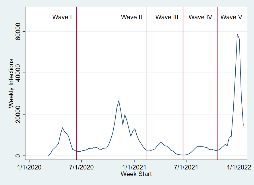
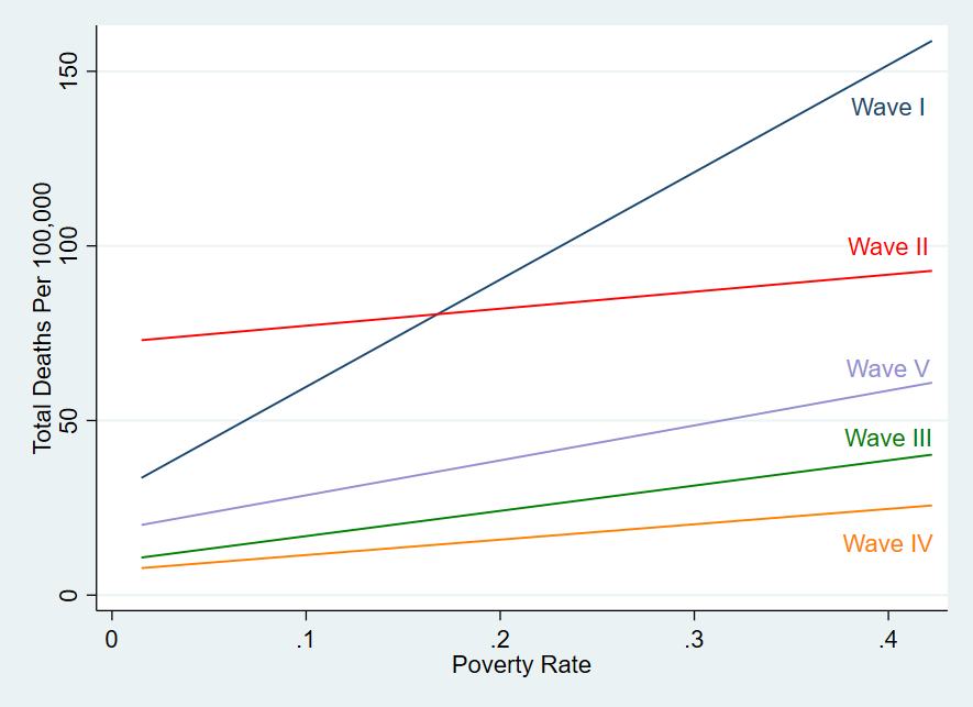
The Covid-19 pandemic has affected Chicago and other locations in a series of waves. We break the pandemic into different waves as shown in figure 1 below. These date breaks (June 22, 2020; February 19, 2021; June 23, 2021; and October 21, 2021) represent the week of a local minimum in case rates for each valley of the pandemic. There are five waves of the pandemic in Chicago, the latest subsiding rapidly as of January 22, 2022, our latest pull of the data.
1. Waves of the pandemic in Chicago
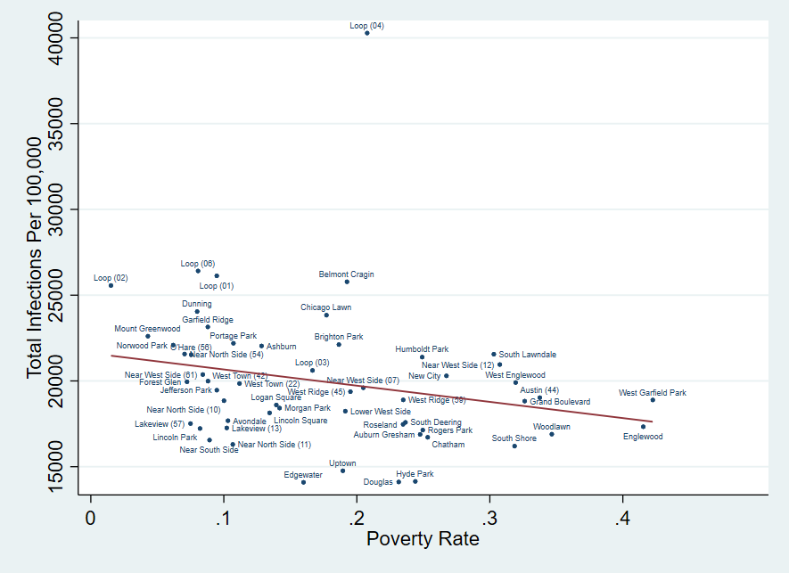
In order to understand how Covid-19 has affected Chicago communities according to their socioeconomic position, we plot Covid-19 case rates against poverty rates in Chicago zip codes. We attribute each zip code to a more recognizable neighborhood zone and apply a line of best fit. Figure 2 shows the relationship between Covid-19 case rates and poverty rates for March 2020 through January 22, 2022. The line of best fit illustrates a negative relationship between case rates and poverty rates for the entire period. Over the course of the pandemic in 2020, 2021, and early 2022, areas with relatively low rates of poverty, such as Mount Greenwood and Portage Park, had higher case rates than areas with relatively high rates of poverty, such as Rogers Park, Englewood, and Woodlawn.
2. Overall infections and poverty rates
3. Relationship between poverty and cases by wave
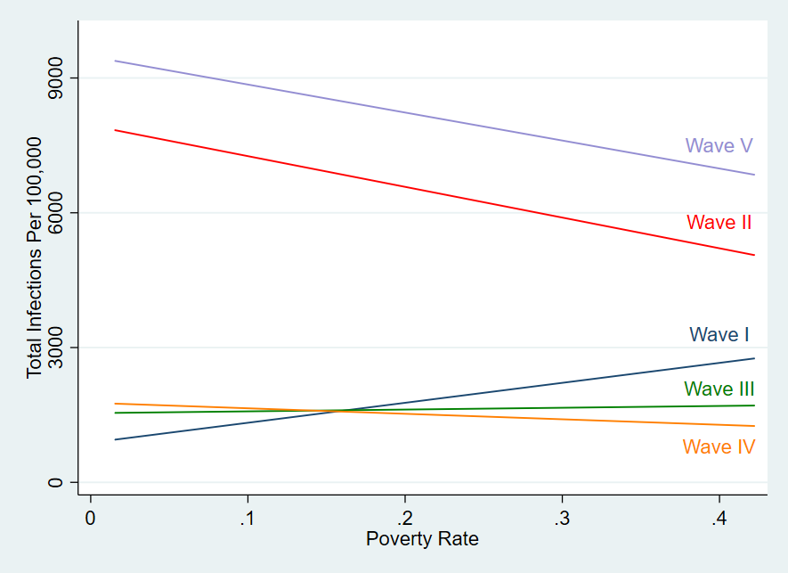
In figure 3, we display the relationship between case rates and poverty rates for each wave separately; and we can see here that this cumulative negative relationship is not representative of all waves of the pandemic. Each wave of Covid-19 shows a different relationship between poverty rate and Covid cases in Chicago, suggesting a change in behavior or effect over time. In fact, the relationship appears to “see-saw” and is neither consistently negative nor positive.
The first wave of the pandemic shows a strong positive relationship between Covid-19 case rates and poverty rates in Chicago communities, possibly due to the number of essential workers exposed to the virus in the early days of the pandemic. There is evidence to show that essential workers with high Covid-19 exposure risk are more likely to be at the low end of the earnings spectrum and reside in low-income neighborhoods. Zip codes with higher poverty rates at the start of the pandemic were more likely to have higher case rates than those with lower poverty rates. By the second wave, this pattern reverses, with low-poverty zip codes seeing higher case rates and high-poverty zip codes seeing lower case rates.
The lines for the third and fourth waves of the pandemic are nearly flat, while the fifth wave parallels the second wave. The second wave and the fifth wave have noticeably similar slopes and are so large that they dominate the pattern shown in figure 2. It is also worth noting that both waves two and five happened in the winter, when Covid-19 cases have generally been high and it is harder for people to engage in outdoor or distanced activities.
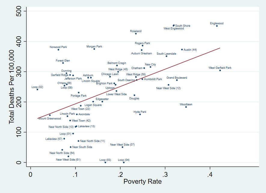
Cases are not the only relevant measure of the impact of Covid across populations. Death rates are a crucial measure of the pandemic’s consequences. In figures 4 and 5, we plot the relationship between Covid-19 death rates and poverty rates in Chicago zip codes overall and for each wave of the pandemic so far. Contrary to case rates, the death rates have a consistently positive relationship with poverty rates in Chicago. The most drastic difference between death rates in low-poverty areas and death rates in high-poverty areas was in wave one. This pattern weakened considerably between the first and second waves and remained weaker for waves three through five. In addition, death rates themselves decreased with each wave of the pandemic until the fifth wave, when they increased again but remained substantially below the levels of the first two waves.
4. Overall deaths and poverty rates
5. Relationship between deaths and cases by wave
The positive relationship between deaths and poverty and negative relationship between cases and poverty indicate that there is a positive relationship between deaths per case and area poverty. In other words, among all individuals who contracted Covid-19, those from high-poverty areas were more likely to die of the virus than those from low-poverty areas. There could be a number of reasons for this pattern. For example, residents of high-poverty neighborhoods may lack adequate access to health care, have relatively high rates of pre-existing conditions that exacerbate Covid-19 effects, or have lower levels of vaccination. It might also be the case that individuals in high-poverty areas are less likely to have access to testing, so mild and asymptomatic cases are less likely to be counted in the data.
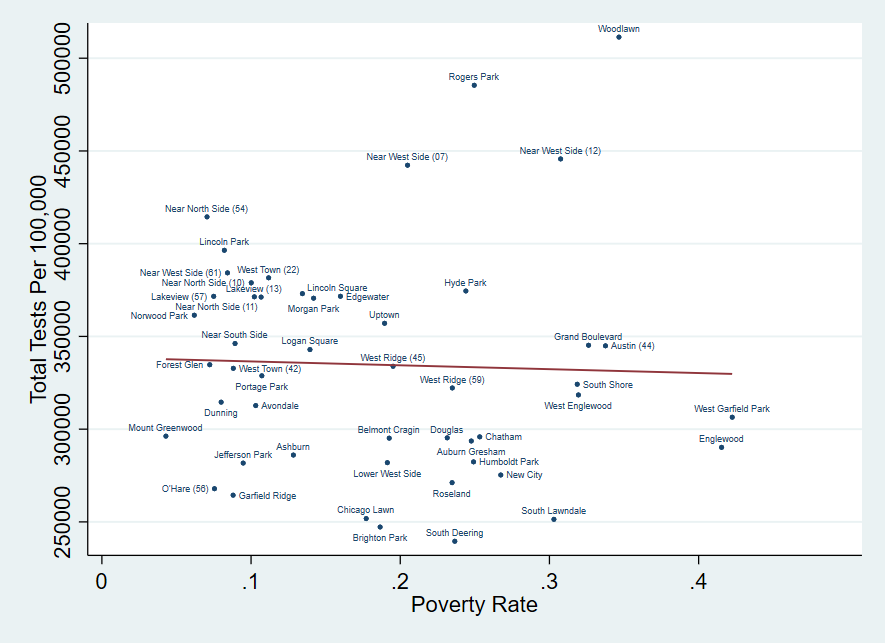
We look into these explanations by plotting test rates and vaccination rates by poverty rates for each zip code. We can see in figure 6 that there is a weak negative relationship between testing rates and poverty rates in Chicago zip codes. We also notice a higher incidence of testing in high-traffic and high-density zip codes. We omit the Loop zip codes from the figure because they have exceedingly high testing rates that both distort the scale and suggest that some individuals who reside outside the Loop and were tested in the Loop may be recorded incorrectly in the Loop zip codes. Overall, we are concerned that the testing data may not be fully accurate, a concern that is shared by the City of Chicago.2 However, based on the available data, testing rates in the non-Loop zip codes vary dramatically but have no strong systematic relationship with poverty rates.
6. Overall tests and poverty rates
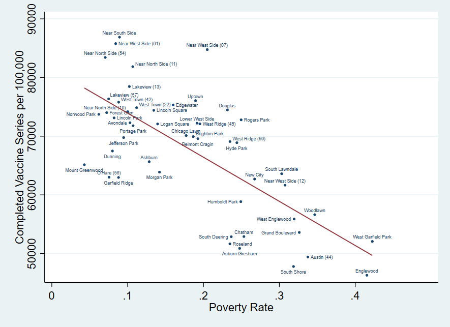
In figure 7, we display the relationship between poverty rates and vaccinations, where we measure vaccination as having completed the one- or two-dose initial series. Note that these are relative to the entire 2019 American Community Survey 5-year estimate zip code population, not the vaccine eligible population (aged five and up). We see a negative relationship between vaccinations and poverty rates in zip codes. Residents in high-poverty areas are less likely to have a completed vaccine series, while residents in low-poverty areas are more likely to have a completed vaccine series. The Loop zip codes continue to be outliers and report vaccination rates over 100%, so we omit them from the figure. This is another indication that some reporting may be by provider rather than recipient’s residential location. There are many potential explanations for this pattern, including access to vaccination or transportation and share of the population under five, as well as willingness to get vaccinated.3
7. Completed vaccinations and poverty rates
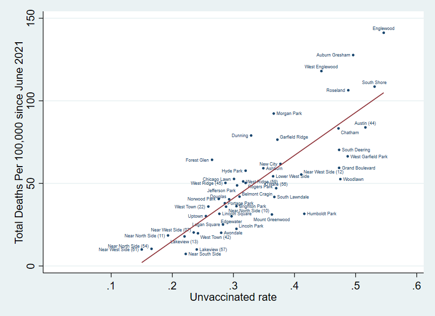
As further evidence of the link between low vaccination rates and higher death rates, figure 8 shows the relationship between Covid-19 death rates and the share of unvaccinated individuals in Chicago zip codes since the start of the fourth wave, a period when vaccine availability had improved. There is a clear positive correlation between death rates and unvaccinated status during this period.
8. Cumulative deaths since June 23, 2021 and unvaccinated rate as of January 22, 2022
Conclusion
Although the relationship between Covid-19 case rates and poverty rates varies across the waves of the pandemic, death rates have had an exclusively positive relationship with poverty rates in Chicago zip codes. During the first wave of the pandemic, March until late June 2020, the positive relationship between case rates and poverty rates was at its strongest. The positive relationship between death rates and poverty rates was also at its strongest, indicating a substantial impact of the first wave on communities with high rates of poverty during this first wave. The negative relationship between vaccination rates and poverty rates might hold some information for the pattern of death rates across zip codes in the city in the later waves of the pandemic.
Notes
1 The average poverty rate for Chicago zip codes is around 18%. The median is around 17%. We use the term “high poverty” in this post to refer to zip codes where the poverty rate is above 18%. We use the term “low poverty” to refer to zip codes where the poverty rate is below 18%.
The Covid-19 data are from the City of Chicago Data Portal. The data are at a weekly frequency, split up by the home zip code of Chicagoans. The City provides data for the 59 zip codes fully or partially in Chicago rather than for the 77 community areas that are the more recognizable divisions of the city. For the sake of displaying the zip code data in the graphs in an accessible way, we map it to community area names. This is not a straightforward process. Most zip codes contain parts of more than one community area and most community areas contain parts of more than one zip code. If more than one zip code is mapped to the same community area, we include the last two digits of the zip code in the display name. We remove four zip codes that either have significant populations that reside outside of the City, or with no population (O’Hare). We provide more information on the mapping process in the appendix.
Numbers for cases, deaths, and tests per 100,000 are from the City’s data portal. Numbers for vaccinations per 100,000 are calculated by the authors using the American Community Survey 2015-2019 5-Year Data Release (census.gov).
The data on poverty and population in Chicago zip codes are from the American Community Survey 2015-2019 5-Year Data Release (census.gov), table S1701.
2 The City of Chicago Data Portal notes that test counts and testing rates are likely underestimated.
3 See City Bureau’s reporting on interviews with residents of Englewood and South Austin and article on health experts’ views on vaccination trends in Englewood.
Appendix
Mapping Between Zip Codes and Community Areas
The Covid data from the city of Chicago are available for the 59 zip codes fully or partially in Chicago rather than for the 77 community areas that are the more recognizable divisions of the city. For the sake of displaying the zip code data in the graphs in an accessible way, we map it to community area names. The mapping is displayed in table A. This is not a straightforward process. Most zip codes contain parts of more than one community area, and most community areas contain parts of more than one zip code.
We do this mapping in three steps based on information provided by the Chicago Tribune on the community areas partially or fully in each zip code, Chicago communities - Chicago Tribune, and based on the City of Chicago’s community area and zip code map, ChicagoCommunityAreaandZipcodeMap.pdf
Our goal is to label each zip code with one community area name from the newpaper’s list.
- If there is only one community area in a zip code, we choose that community area name.
- If there are more than one community area in a zip code, we choose the community area that makes up the largest part of a zip code.
- If the zip code is evenly split among more than one community area, we pick the community area where the community area makes up more of the zip code.
Note that some community areas are associated with more than one zip code. In these cases, we augment the display name with the last two digits of the zip code for clarity.
Finally, there are some zip codes that are partially inside and partially outside the City of Chicago. This is problematic for our analysis because the Covid data only include information (cases, deaths, tests, vaccinations) for zip code residents who are also residents of the city, while ACS population data and other demographics are for the entire zip code, including the part outside the city limits. These are labeled in the table as “partially outside the city” and are deleted from our analysis if they also contain at least one school that is outside the city according to www.unitedstateszipcodes.org. There are three zip codes that we exclude for this reason—60633, 60707 and 60827. We also drop zip code 60666, an O’Hare airport zip code that contains no resident population.
A. Mapping between zip codes and community areas
| Zip Code | Community Areas Within Zip Code | Display Name | Partially Outside City? |
|---|---|---|---|
| 60601 | Loop | Loop (01) | no |
| 60602 | Loop | Loop (02) | no |
| 60603 | Loop | Loop (03) | no |
| 60604 | Loop | Loop (04) | no |
| 60605 | Loop, Near South Side | Near South Side | no |
| 60606 | Loop, Near West Side | Loop (06) | no |
| 60607 | Loop, Near West Side, Near South Side | Near West Side (07) | no |
| 60608 | Bridgeport, Lower West Side (Pilsen), McKinley Park, Near West Side, North Lawndale, South Lawndale | Lower West Side | no |
| 60609 | Armour Square, Bridgeport, Douglas, Fuller Park, Gage Park, Grand Boulevard, McKinley Park, New City, Washington Park | New City | no |
| 60610 | Near North Side, Near West Side | Near North Side (10) | no |
| 60611 | Near North Side | Near North Side (11) | no |
| 60612 | Near West Side, West Town | Near West Side (12) | no |
| 60613 | Lakeview, North Center, Uptown | Lakeview (13) | no |
| 60614 | Lincoln Park, Logan Square | Lincoln Park | no |
| 60615 | Grand Boulevard, Hyde Park, Kenwood, Washington Park | Hyde Park | no |
| 60616 | Armour Square, Bridgeport, Douglas, Lower West Side (Pilsen), Near South Side | Douglas | no |
| 60617 | Avalon Park, Calumet Heights, East Side, South Chicago, South Deering | South Deering | no |
| 60618 | Avondale, Irving Park, North Center | Avondale | no |
| 60619 | Avalon Park, Burnside, Calumet Heights, Chatham, Greater Grand Crossing, Roseland, South Shore | Chatham | no |
| 60620 | Auburn Gresham, Beverly, Chatham, Greater Grand Crossing, Roseland, Washington Heights | Auburn Gresham | no |
| 60621 | Englewood, Greater Grand Crossing, Washington Park | Englewood | no |
| 60622 | Humboldt Park, Logan Square, Near North Side, West Town | West Town (22) | no |
| 60623 | North Lawndale, South Lawndale | South Lawndale | no |
| 60624 | East Garfield Park, Humboldt Park, North Lawndale, West Garfield Park | West Garfield Park | no |
| 60625 | Albany Park, Lincoln Square, North Park | Lincoln Square | no |
| 60626 | Rogers Park | Rogers Park | no |
| 60628 | Pullman, Roseland, Washington Heights, West Pullman | Roseland | no |
| 60629 | Chicago Lawn, Clearing, Gage Park, Garfield Ridge, West Elsdon, West Lawn | Chicago Lawn | no |
| 60630 | Albany Park, Forest Glen, Irving Park, Jefferson Park, Portage Park | Jefferson Park | no |
| 60631 | Edison Park, Norwood Park | Norwood Park | no |
| 60632 | Archer Heights, Brighton Park, Gage Park, Garfield Ridge, West Elsdon | Brighton Park | no |
| 60633 | Hegewisch, South Deering | Hegewisch | yes (Burnham, IL) |
| 60634 | Belmont Cragin, Dunning, Montclare, Portage Park | Dunning | no |
| 60636 | Chicago Lawn, Gage Park, West Englewood | West Englewood | no |
| 60637 | Greater Grand Crossing, Hyde Park, South Shore, Washington Park, Woodlawn | Woodlawn | no |
| 60638 | Clearing, Garfield Ridge | Garfield Ridge | don't drop (Bedford Park, no school) |
| 60639 | Austin, Belmont Cragin, Hermosa, Humboldt Park, Logan Square | Belmont Cragin | no |
| 60640 | Edgewater, Lincoln Square, Uptown | Uptown | no |
| 60641 | Avondale, Belmont Cragin, Hermosa, Irving Park, Portage Park | Portage Park | no |
| 60642 | West Town | West Town (42) | no |
| 60643 | Beverly, Morgan Park, Washington Heights, West Pullman | Morgan Park | don't drop (Calumet Park, no school) |
| 60644 | Austin | Austin (44) | no |
| 60645 | West Ridge | West Ridge (45) | no |
| 60646 | Forest Glen, Jefferson Park, North Park, Norwood Park | Forest Glen | no |
| 60647 | Hermosa, Humboldt Park, Logan Square, West Town | Logan Square | no |
| 60649 | South Shore | South Shore | no |
| 60651 | Austin, Humboldt Park | Humboldt Park | no |
| 60652 | Ashburn | Ashburn | no |
| 60653 | Douglas, Grand Boulevard, Kenwood, Oakland | Grand Boulevard | no |
| 60654 | Near North Side | Near North Side (54) | no |
| 60655 | Beverly, Morgan Park, Mount Greenwood | Mount Greenwood | no |
| 60656 | O’Hare | O’Hare (56) | no |
| 60657 | Lakeview, North Center | Lakeview (57) | no |
| 60659 | North Park, West Ridge | West Ridge (59) | no |
| 60660 | Edgewater | Edgewater | no |
| 60661 | Loop, Near West Side | Near West Side (61) | no |
| 60666 | O’Hare | O’Hare (66) | no people (can drop) |
| 60707 | Austin, Belmont Cragin, Montclare | Austin (07) | yes (Elmwood Park,IL) |
| 60827 | Riverdale Chicago | Riverdale Chicago | yes (Riverdale, IL) |


