A Seventh District Labor Market Dashboard
In March 2013, Federal Reserve Board Chair Janet Yellen (then Vice Chair) gave a speech where she discussed the centrality of labor market conditions in the Fed’s decision-making process. The most often discussed indicator of labor market conditions is the unemployment rate, but in this speech and others since,1 Chair Yellen has said that she tracks a number of other labor market indicators as well. This broader set of indicators is now widely referred to as Chair Yellen’s Labor Market Dashboard. The dashboard serves to show that while the unemployment rate has been improving steadily since the depths of the Great Recession, many other labor market indicators have made less progress, and few have returned to where they were prior to the Great Recession.
In this blog post, I look at indicators on Chair Yellen’s dashboard, with a focus on how they measure the Midwest economy. The set of indicators I’ve compiled tell a story quite similar for the Midwest to that for the United States as a whole. While conditions in the Midwest have steadily improved since the depths of the Great Recession, things are not back to normal yet.
Household Survey Measures
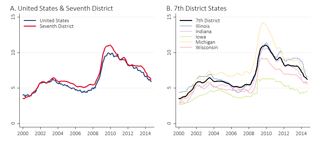
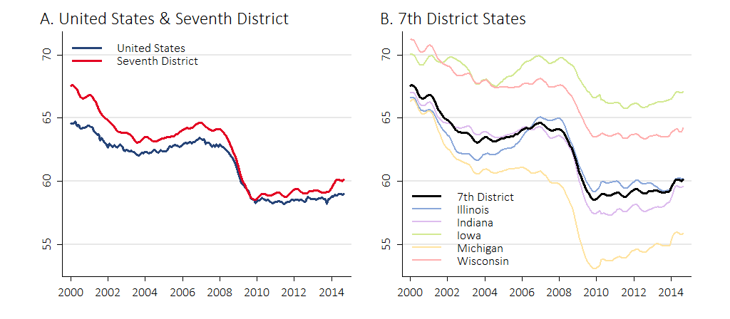
Figure 1, panel A shows the unemployment rates for the United States and the Seventh Federal Reserve District2 since 2000. The two rates track each other closely, though there are some notable differences. First, the unemployment rate was somewhat higher in the District before the recession that hit in 2008. Figure 1, panel B shows that the unemployment rate in Michigan was particularly high during this period, largely because of struggles in the auto industry. Second, in terms of unemployment, the District did worse than the nation during the depths of the recession, though it caught up by 2011 as manufacturing recovered. Finally, the District’s unemployment rate again diverged from the nation’s in 2012, but by now it has nearly closed the gap.
1. Unemployment rates
A key feature of the unemployment rate is that to be counted as unemployed, an individual without a job must be actively looking for work. Those who report that they are not working and not actively looking for work in the U.S. Bureau of Labor Statistics’ (BLS) Current Population Survey, or the household survey as it’s commonly called, are not considered unemployed. Thus, the unemployment rate can decrease because people give up looking for work, not because they find a job. For this reason (and to provide greater detail), the BLS publishes what it calls alternative measures of labor market underutilization. I take these alternative measures and break them down into five comparable rates.3 Each rate is a percentage of the labor force plus marginally attached workers. The rates are as follows:
- Short-term unemployed: people unemployed for fewer than 15 weeks.
- Long-term unemployed: people unemployed for 15 weeks or more.
- Marginally attached: people who want to work and have looked for work in the last 12 months, but not in the last four weeks.
- Discouraged: marginally attached workers who are not looking for work because they believe there are no jobs available or none for which they would qualify.
- Part time for economic reasons: workers who are employed part time but would like to be employed full time.
2. Unemployment and underutilization
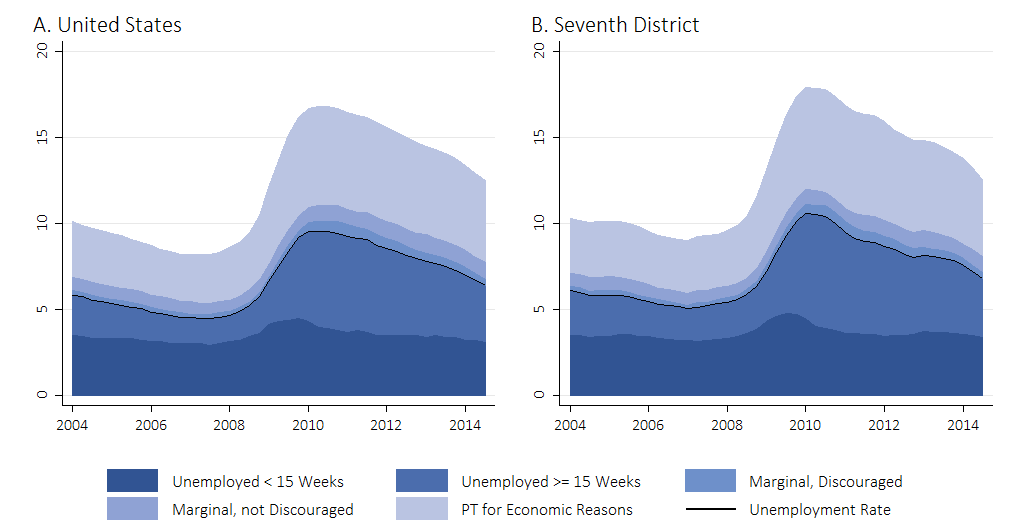
Figure 2 presents the five measures for the United States and the Seventh District. The measures are 12-month moving averages, so trend movements show up later than in figure 1. The bottom, darkest blue area represents the short-term unemployed. Many people in this group are between jobs or will find work without ever being long-term unemployed. Aside from a blip in 2009, this measure has been steady at around 3.5 percent for the United States and 3.7 percent for the District. The story is much different for the long-term unemployed. There was a substantial increase when the Great Recession hit, and the rate remains elevated today, for both the United States and the District. The same is true for marginal workers (discouraged and not discouraged) and part-time workers who would like to have full-time work.
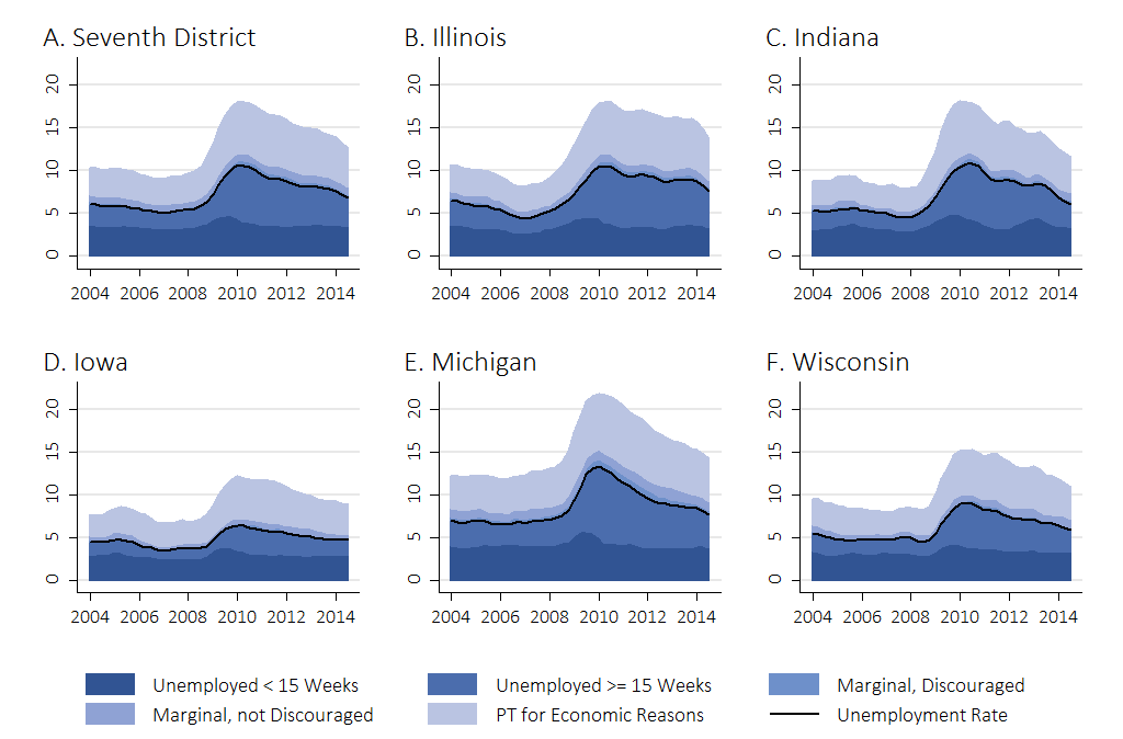
Figure 3 breaks the District’s unemployment and underutilization rates down by state. Each state has a different baseline. Before the recession, Iowa and Wisconsin had the lowest rates in the District, while Michigan had the highest. Despite the differences in labor market structure highlighted by the different baselines, no state has returned to its pre-recession unemployment and underutilization levels.
3. Unemployment and underutilization by district state
The BLS’s household survey provides two additional measures that account for the possibility that the unemployment rate can go down even if labor market conditions don’t improve. The two measures are benchmarked by the overall (working-age) population (specifically, noninstitutional civilians age 16 and over) so that people who leave the labor force are still counted. The disadvantage of benchmarking by the population is that people may not be in the labor force for reasons unrelated to difficulty finding work, such as to attend school, to have a family, or to retire.
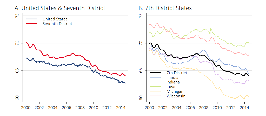
The first measure of these two additional BLS measures is the labor force participation rate, which is the number of people in the labor force as a percentage of the population. The second measure is the employment-to-population ratio, which (as you may guess) is the number of employed people as a percentage of the population. Figures 4 and 5 show the measures since 2000 for the United States, the District, and the District states. There is a downward trend in both measures, which largely reflects an aging population. Given the trends, it is possible to spot cyclical movements as well. There is clear upward movement over the housing bubble years and clear downward movement over the recession. It is difficult to discern visually where the measures are relative to trend, but recent research by Chicago Fed economists suggests that they are currently below the trend.4
4. Labor force participation
5. Employment-to-population ratio
Business Survey Measures
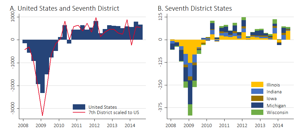
The BLS surveys households to obtain the unemployment rate (and related indicators) and it surveys businesses to obtain their employment levels, openings, turnover, and costs. The most widely discussed indicator from BLS surveys of businesses is payroll employment growth. Figure 6, panel A shows quarterly payroll growth for the United States and the District since the onset of the Great Recession. I’ve scaled the District growth numbers to be as if the District and the nation had the same baseline employment levels.5 Like the unemployment rate, employment growth numbers for the United States and the District are generally in sync, with some notable exceptions. The growth numbers show that the District did worse than the nation during the recession, over 2012, and in the first quarter of 2014, when the District experienced especially harsh winter weather. Figure 6, panel B breaks down employment growth by state. As usual, Michigan is noteworthy. While Michigan was hit hard during the recession, the subsequent strong recovery of the auto industry made important contributions to District employment growth, especially during 2012, when the other states were struggling.
6. Employment growth
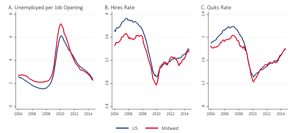
The BLS also asks businesses about their employment turnover, and figure 7 shows three such measures.6 Panel A is the ratio of the number of unemployed workers to the number of job openings that businesses report; panel B is the number of new hires as a percentage of overall employment; and panel C is the number of quits as a percentage of overall employment. Once again, movements in the United States and Midwest are closely related, though the Midwest was doing somewhat worse before the recent recession. Each measure has a clear cyclical component. Taking the pre-recession period as a baseline, the rate of unemployed per job opening is now close to normal (the Midwest’s rate is slightly closer to normal than the nation’s). The hires and quits rates have not yet fully recovered, but have been growing at a strong pace since the middle of 2013. The quits rate, in particular, tends to be a leading indicator of improvement in labor market conditions, as people are more likely to leave their current positions when their job prospects elsewhere are improving.7
7. Labor market dynamics
The BLS also asks businesses about their employment costs, which are driven in large part by wages. Figure 8 shows two indexes of wage growth for the Midwest states (see note 5) and the United States. Panel A is nominal wage growth, panel B is wage growth adjusted for inflation. Taken together, the panels show that while wage growth has consistently been positive, it has not consistently been above inflation (periods of real wage growth are often followed by periods of real wage decline). This reflects a long trend of slow real wage growth for all but the highest wage earners.
8. Employment cost index

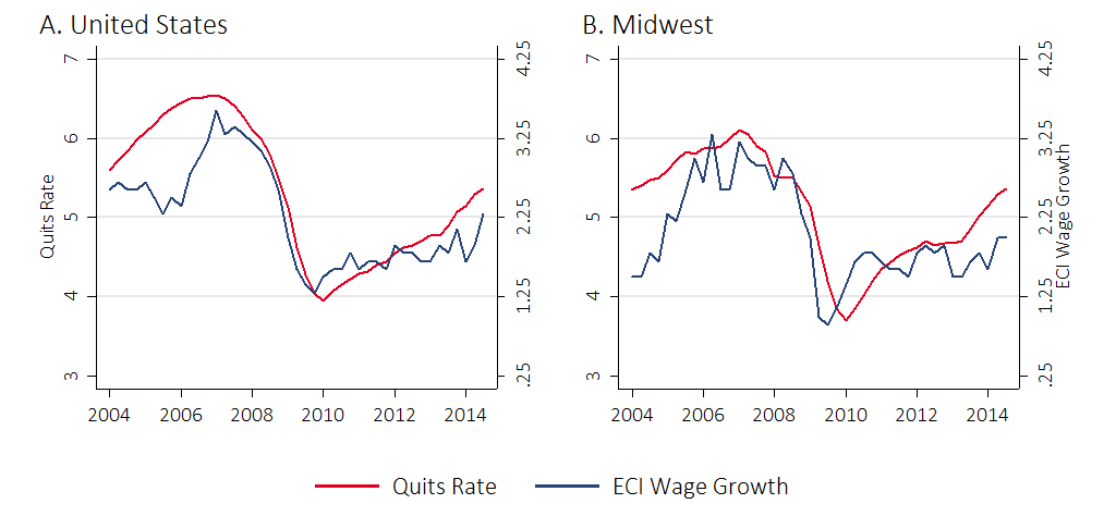
Figure 9 shows that the quits rate and nominal wage growth move together quite closely in both the United States and the Midwest. Figure 9 also shows that nominal wage growth during the recovery has underperformed a bit relative to the quits rate. This may be a sign that wage growth will pick up in the future.
9. Quits and wages
Taken as a whole, this labor market dashboard indicates that while the U.S. and District labor markets continue to recover from the Great Recession, they are still not back to normal. The employment turnover numbers are the most promising, and they may well lead the other indicators I’ve highlighted. The labor market is clearly headed toward full recovery, but the amount of time it will take to get there remains unclear.
Footnotes
1 See for example, Chair Yellen’s first press conference and her August 2014 speech at Jackson Hole.
2 The Seventh District comprises all of Iowa and most of Illinois, Indiana, Michigan, and Wisconsin.
3 For details on how I calculated the rates, please contact me at twalstrum@frbchi.org.
4 See the Explaining the Decline in the U.S. Labor Force Participation Rate by Aaronson, Davis, and Hu and Estimating the Trend in Employment Growth by Aaronson and Brave.
5 Specifically, for each quarter, I calculated the ratio of U.S. employment to District employment and multiplied District employment growth by that factor. U.S. employment is roughly eight times District employment.
6 Note that these measures are not available at the state level; the smallest geographic area for which these measures are available is the Census Region. According to the U.S. Census Bureau, the Midwest region comprises the following states: Illinois, Indiana, Iowa, Kansas, Michigan, Minnesota, Missouri, Nebraska, North Dakota, Ohio, South Dakota, and Wisconsin.
7 See Labor Market Flows in the Cross Section and Over Time by Davis, Faberman, and Haltiwanger.


