Results from a Special Chicago Fed Survey of Business Conditions on the Impact of Covid-19 on Manufacturers
In late May 2020, the Federal Reserve Bank of Chicago collaborated with the Illinois Manufacturing Excellence Center (IMEC) and the Michigan Manufacturing Technology Center (MMTC) to conduct a survey on the impact of the Covid-19 pandemic on businesses affiliated with either of these two organizations. The survey was based on the methodology of the broader Chicago Fed Survey of Business Conditions (CFSBC) and asked questions about the impact of the outbreak so far and expectations for the coming months. The questionnaire was similar to an earlier survey we conducted in collaboration with chambers of commerce in the five Seventh District states (Illinois, Indiana, Iowa, Michigan, and Wisconsin). All survey respondents were from manufacturing companies, and the responses were collected between May 20 and June 5, 2020.
Our main takeaways from the survey results are as follows:
- Most respondents saw substantial declines in revenues compared with what they expected at the beginning of 2020. This led to large reductions in employment and capital spending. A majority of those who had seen lower-than-expected revenues stated that demand had stopped dropping and had either bottomed out or was picking up.
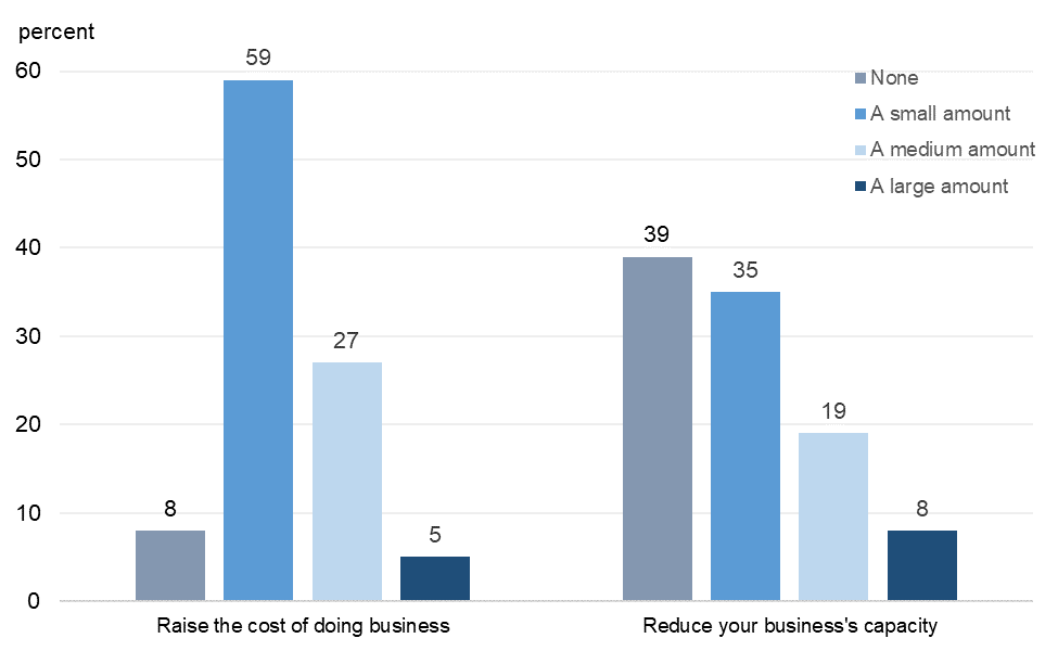
- Nearly all respondents had made changes to their operations to prevent the spread of Covid-19, and most reported that the changes had small effects on their costs and capacity.
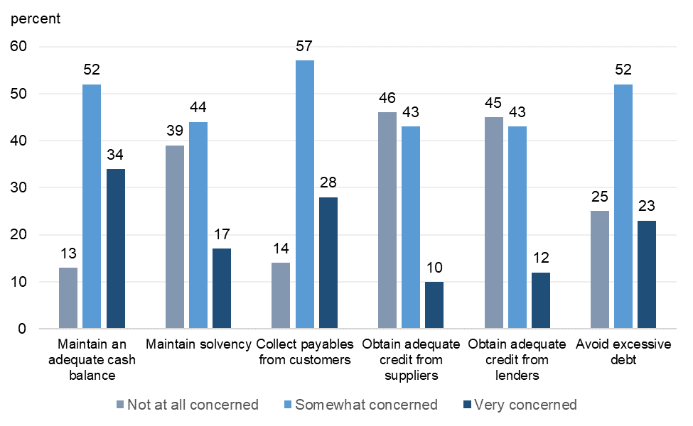
- Most respondents had some, but not strong, concerns about the financial health of their companies.
- Respondents had a wide range of expectations for when U.S. economic activity would return to where it was before the Covid-19 pandemic, but 75% said they expected it would do so by the end of 2021.
In the rest of this post, we present the results from the full set of questions within several charts. For some charts, we provide additional details and commentary.
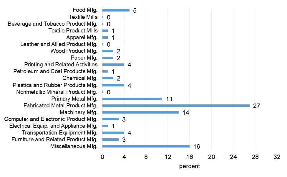
1. What is your firm’s primary industry?
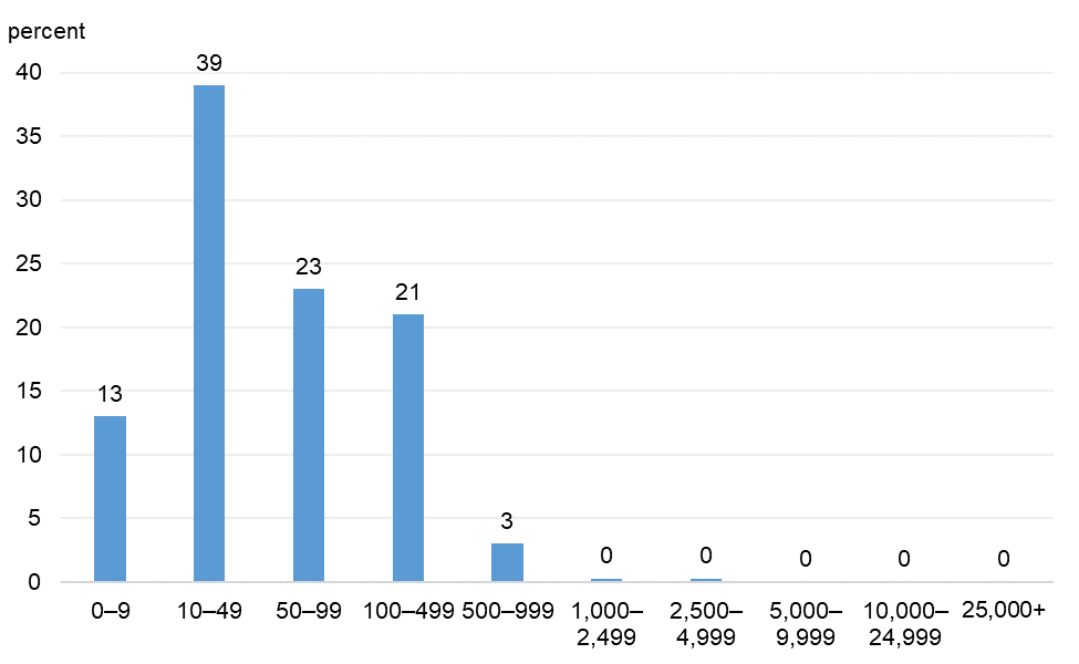
2. How many full-time equivalent employees were at your business as of March 1, 2020?
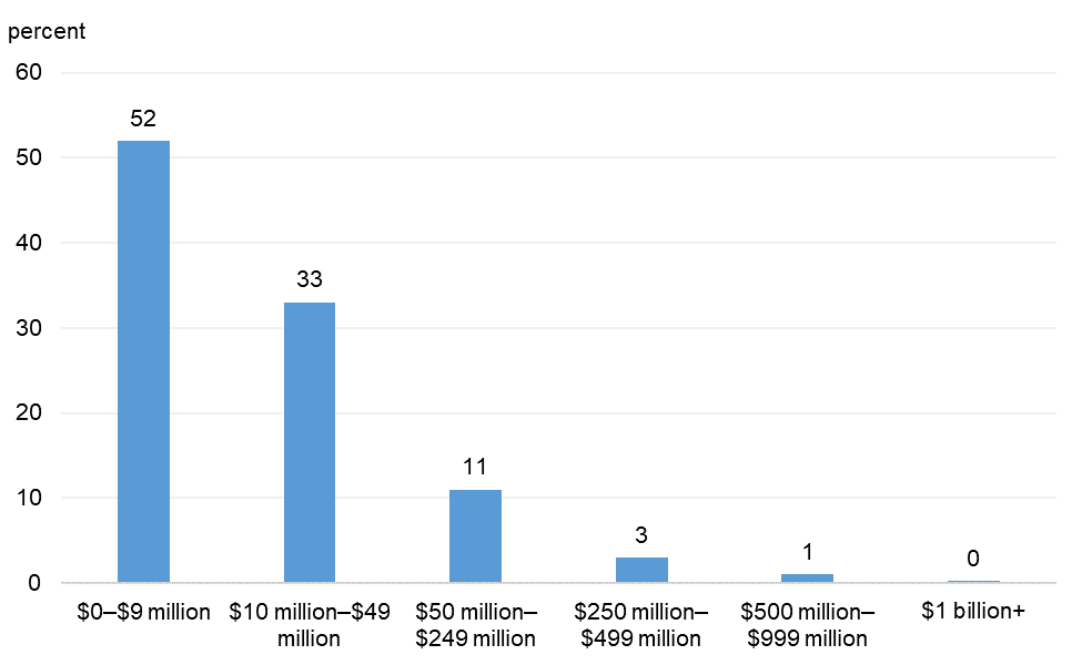
3. What were your business's annual revenues in 2019?
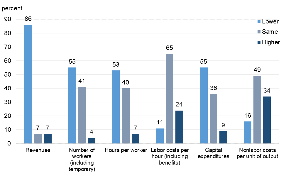
4. How do the following indicators of your business’s performance differ from what you expected them to be back in January of this year?
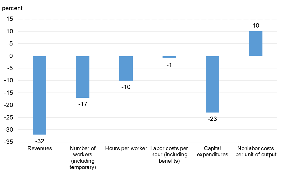
5. How much do the following indicators of your business’s performance differ from what you expected them to be back in January of this year?
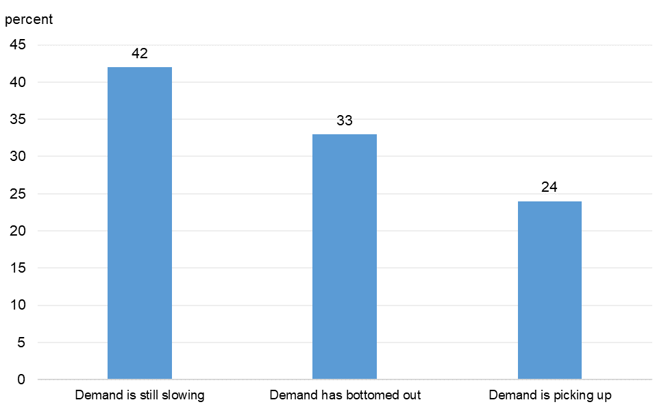
6. If demand is lower than expected for 2020, where do you think it is relative to the bottom?
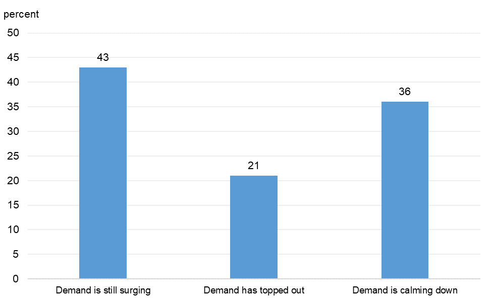
7. If demand is higher than expected for 2020, where do you think it is relative to the top?
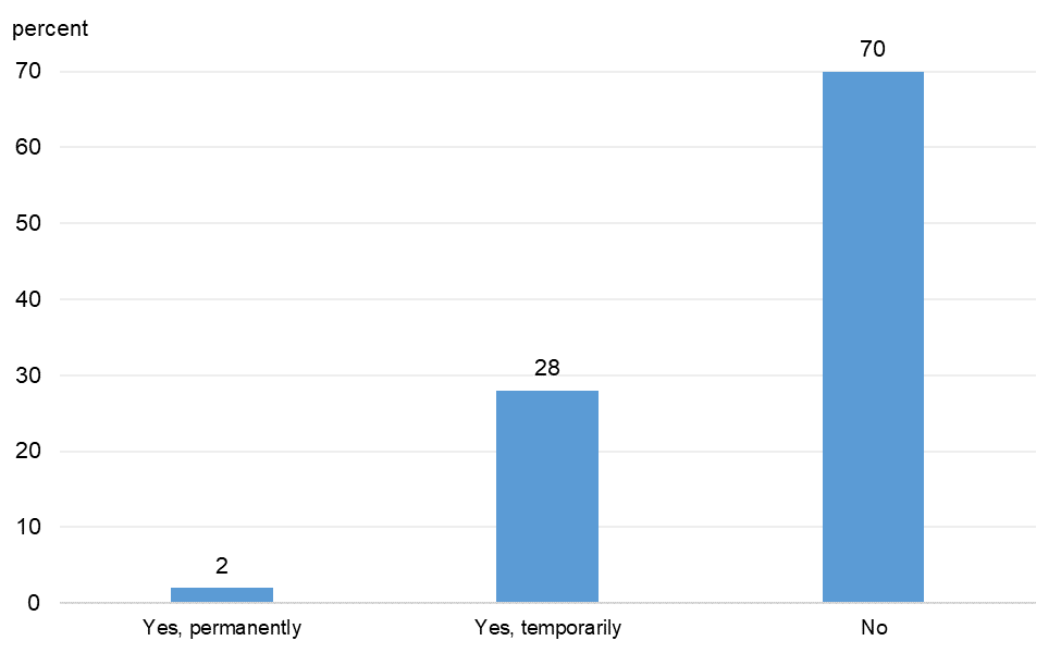
8. Did your business stop operating as a result of the coronavirus outbreak?
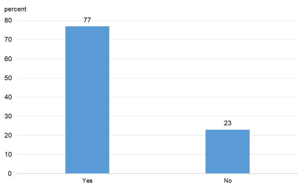
9. Are you making any efforts to maintain customer or supplier relationships that have been put on pause?

Of those who provided details on their efforts, many were regularly reaching out to customers and suppliers via phone and email. Some also cited the use of virtual conferencing (e.g., Zoom) for this purpose. Specific actions taken included communicating updates related to the operations of the company and extending contract terms for customers. Among the approximate 6% of respondents who indicated they were not making an effort to maintain customer or supplier relationships, many stated that they were not experiencing a pause in their customer or supplier relationships (only a slowdown).
10. Are you making any efforts to maintain relationships with employees who have been furloughed or laid off?
Of those who detailed their efforts, many were regularly communicating with furloughed and laid off employees via text, phone, and email. Respondents were updating their employees on a weekly or monthly basis on the status of the company’s operations and the ability to return to work. Some respondents had asked employees to return to work and were working on arrangements that would facilitate their return. Among those who indicated that they were not maintaining relationships with furloughed or laid of employees, all explained that they had either never furloughed or laid off employees or the employees had since returned to work.
11. Have you made any changes to your firm’s operations to protect your employees and customers from the coronavirus?
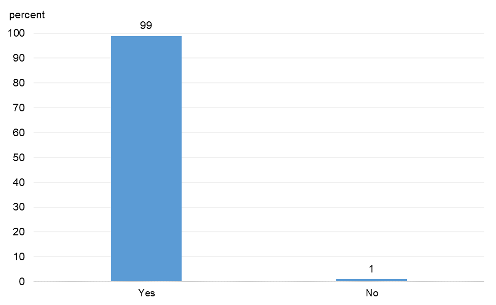
Respondents indicated that they were regularly disinfecting, requiring masks, enforcing social distancing, and restricting the number of outside visitors. Some had developed and implemented work-from-home policies whenever possible. Those who stated that they had not made changes to firm operations provided no explanations.
12. To what extent do changes to your firm’s operations in response to the coronavirus lead to the following?
13. How concerned are you about your firm's ability to achieve each of the following over the next three to six months?
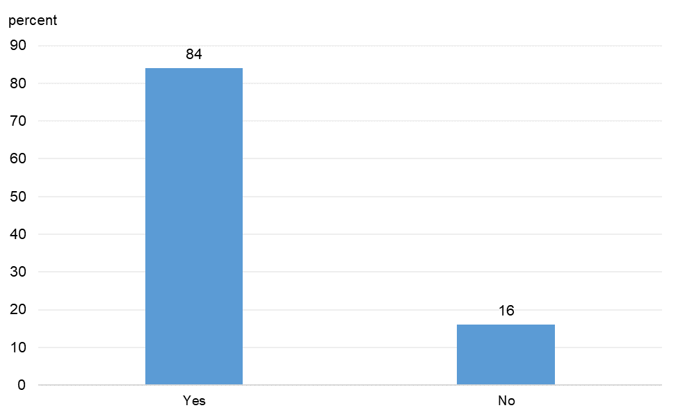
14. Did your firm receive a Paycheck Protection Program (PPP) loan?
15. If you received a Paycheck Protection Program (PPP) loan, have you been able to follow the PPP loan provisions that allow the loan to be forgiven?
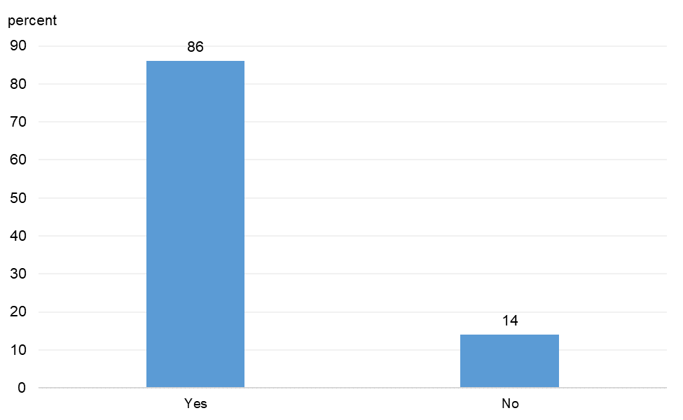
Contacts concerned about their ability to follow the Paycheck Protection Program (PPP) loan provisions indicated that the rules are unclear or in conflict with stay-at-home orders. Others stated that they do not have enough work for all employees to return to work.
16. If you received a Paycheck Protection Program (PPP) loan, do you plan to retain PPP-supported workers once the PPP funds run out?

Regardless of their answers, respondents expressed uncertainty about whether they would be able to retain workers, indicating that it depended on the demand for work and on the broader economy improving in the future.
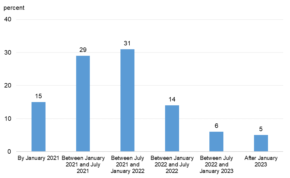
17. When do you think U.S. economic activity will return to where it was before the coronavirus outbreak?