Even as mobile and online platforms emerge as dominant methods to access banking services, physical branches remain important. Using mobile device data on physical visitation patterns, we examine neighborhoods’ access to—and demand for—bank branches. In this article, we focus on branch access and demand in neighborhoods within the Seventh Federal Reserve District, which spans most of Illinois, Indiana, Michigan, and Wisconsin and all of Iowa.1 That is, we present an analysis of branch access and demand across Seventh District states (and the U.S.) accounting for neighborhood characteristics, including income, race, and geography.
Do bank branches still matter?
Despite the rise of digital banking, physical bank branches continue to play a central role in American household finance. We independently analyze the results from the 2019 FDIC Survey of Household Use of Banking and Financial Services for both banked and unbanked households, and find that over 80% of all respondents reported visiting a branch at least once in the previous 12 months, with nearly 30% making ten or more visits. While mobile banking became the primary access method for 31% of banked households (i.e., those with at least one member having a checking or savings account), branch visits were still the primary method for 23% of those respondents.2
The relationship between branch usage and demographics presents a puzzle. Among respondents with the same age and race (White or Black), those in the lowest income bracket are 25% more likely than those in the highest to identify branch tellers and automated teller machines (ATMs) as their primary banking access method. Black households are 6.6 percentage points less likely to primarily use digital banking when holding fixed income and age. Yet despite this greater reliance on physical banking, those in the lowest income bracket are 22% less likely to report having visited a branch in the previous year than those in the highest bracket. Similarly, Black respondents are 10% less likely than White respondents to have visited a branch in the past 12 months when holding fixed income and age (Sakong and Zentefis, 2025). Whether these differences in branch usage reflect differences in preferences or access is a key question for policymakers considering initiatives to expand financial access.
Fewer branch visits may have economic consequences. The 2019 Survey of Consumer Finances indicates that the vast majority of account-holding households that visited branches utilized bank branch services beyond ATMs, suggesting that reduced branch visits may limit access to these services. Moreover, Célerier and Matray (2019) demonstrate that branch presence improves credit access and wealth accumulation.
Neighborhood-level measure of bank branch access and demand
To understand why people in some communities visit bank branches less frequently than others, we need to separate two different forces: how easy it is for residents to reach branches (access) and how much residents want to use branch services (demand).
We use data from SafeGraph,3 a company that tracks anonymized mobile device movements, to observe actual visits from residential neighborhoods to bank branches across the United States in the years 2018–19. These data reveal where people live and which branches they visit, allowing us to study observed behavior rather than relying on surveys or assumptions. We focus on census block groups to define a “neighborhood”; these are geographic areas each containing roughly 600–3,000 people, small enough that all residents within the neighborhood face similar travel conditions to nearby banking services.
Our branch information comes from the Federal Deposit Insurance Corporation’s database of all bank locations during the period 2000–24. We combine this with SafeGraph’s visitor data to create two key measures for each neighborhood: access and demand for bank branch services.
Our measure of access combines branch capacity and household distance from a given branch. Think of access like a neighborhood’s “gravitational pull” toward all available branches. Just as planets closer to the sun experience stronger gravitational force, residents have better access to nearby branches than distant ones. But capacity also matters—just as objects of larger mass have stronger gravitational force, a large, well-staffed branch with extended hours pulls visitors from farther away than a small branch with limited services. Our access measure combines both, weighted by how much travel costs deter visits.
The key insight for measuring travel costs comes from observing how visit rates decline with distance. We find that when the distance to a branch increases by 10%, monthly visits drop by roughly 14%.4 This relationship—captured in what economists call a “gravity coefficient” of –1.4—tells us how much distance matters to bank customers. This steep decline means that even small differences in branch proximity can significantly affect access.
Branch capacity reflects everything that makes a branch attractive regardless of where visitors live, available services, and physical amenities. Measurable aspects of capacity include branch size (i.e., building square footage), property value, and hours of operation.
While access represents the external pull of available banking options, demand captures the “internal push'' that drives residents to seek out branch services. Think of demand like the force that makes someone want to visit a bank branch at all, regardless of how convenient those branches might be to reach. This internal push varies across neighborhoods and reflects factors such as income levels, financial needs, comfort with digital alternatives, and transportation availability. Some communities have strong reasons to visit branches—for instance, needing to deposit cash from businesses, requiring notary services, or preferring face-to-face interactions for complex financial decisions. Other communities might have less need for branch services, either because they conduct most banking digitally or because they have limited financial transactions requiring branch visits.
Demand is how many (or how often) residents would choose to visit branches for a common level of branch access. To separate access from demand, we use the same statistical approach that trade economists use to understand why some countries trade more with each other than others. By comparing each neighborhood’s visits to multiple branches, we can identify patterns that reflect either neighborhood characteristics (demand) or branch characteristics and locations (access). When we see a neighborhood where residents visit all nearby branches less frequently, this suggests lower internal demand. When we see that certain branches attract fewer visitors from all neighborhoods, this suggests lower access due to poor capacity to deliver banking services or inconvenient location.
Broad patterns in bank branch access across the Seventh District
Bank branch access across the Seventh District follows patterns similar to those observed nationally, with urban areas enjoying significantly higher access than rural areas. However, the region’s access trends over the past two decades reveal important differences both between states and over time.
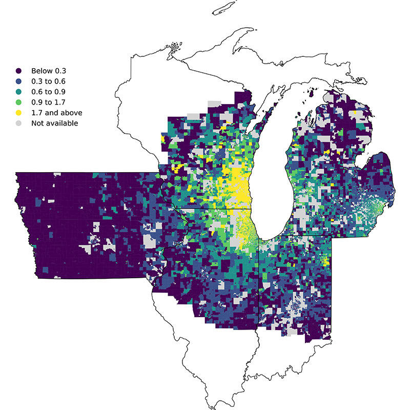
Figure 1 displays branch access levels across the Seventh District in 2024 relative to the District average that year. The map reveals a clear urban–rural divide, with higher access (shown in yellow) concentrated in metropolitan areas. Notably, Chicago and Milwaukee stand out for high access compared with Indianapolis and Detroit. Rural areas, particularly in Iowa, have lower access levels (shown in purple and blue). This pattern reflects both the concentration of branches in densely populated areas and the longer distances required for rural residents to reach branches.
1. Bank branch access across the Seventh District relative to the District average, 2024
Sources: Authors’ calculations based on data from SafeGraph and the Federal Deposit Insurance Corporation.
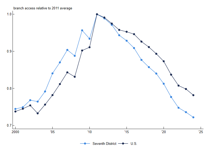
The historical evolution of branch access tells a story of expansion followed by contraction. Figure 2 shows that across the Seventh District, access rose steadily from 2000 through 2011, driven by banking deregulation that allowed institutions to expand more freely across state lines and within local markets (Schneider et al., 2025). This expansion peaked around 2011, coinciding with the recovery from the 2008 financial crisis and the Great Recession, before beginning a sustained decline. The decline in branch access since 2011 can be largely explained by bank mergers and acquisitions, as well as the consolidation of branches due to increased adoption of digital banking services (Narayanan et al., 2025).
2. Change in bank branch access in the Seventh District and the U.S., 2000–24
Sources: Authors’ calculations based on data from SafeGraph and the Federal Deposit Insurance Corporation.
The set of states and major metropolitan areas that we consider follow similar trends.5 In particular, when we consider major metropolitan areas, we observe that Chicago and Detroit saw declines of 30% in branch access over the period 2011–24, which translates to 30% fewer expected branch visits, holding constant residents’ demand for banking services. However, the actual impact of branch access declines on branch visit patterns may be different because of adjusted banking habits, such as increased use of digital alternatives, during this 2011–24 period.
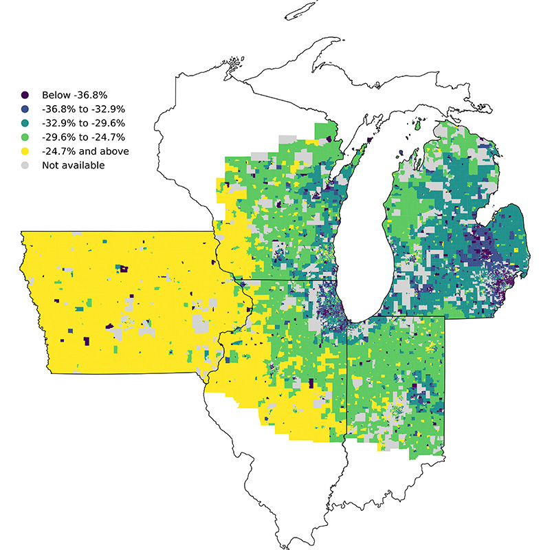
Figure 3 shows a map of change in branch access between 2011 and 2024. The map reveals that rural areas in Iowa (shown in yellow) experienced the smallest declines or even modest increases in access relative to 2011, while the most significant declines (shown in purple) occurred around major metropolitan areas, particularly in areas surrounding Detroit and Chicago.
3. Percent change in bank branch access in the Seventh District, 2011–24
Sources: Authors’ calculations based on data from SafeGraph and the Federal Deposit Insurance Corporation.
Placing Seventh District trends in a national context, we note that branch access declined across all Federal Reserve Districts between 2011 and 2024.6 However, the Seventh District’s 28% decline in access over this period is the largest among all 12 Districts. While some Districts experienced modest declines of 12%–17%, others saw steeper drops of up to 27%, suggesting that local economic conditions and banking market dynamics play important roles in determining the extent of branch consolidation.7
Neighborhood-level comparison of bank branch access and demand
One advantage to our approach becomes apparent when examining differences between neighborhoods with similar characteristics. By comparing communities within the same county and controlling factors such as urban versus rural location and age composition, we can identify how bank branch access and demand vary. This neighborhood-level analysis allows us to make apples-to-apples comparisons between similar communities.
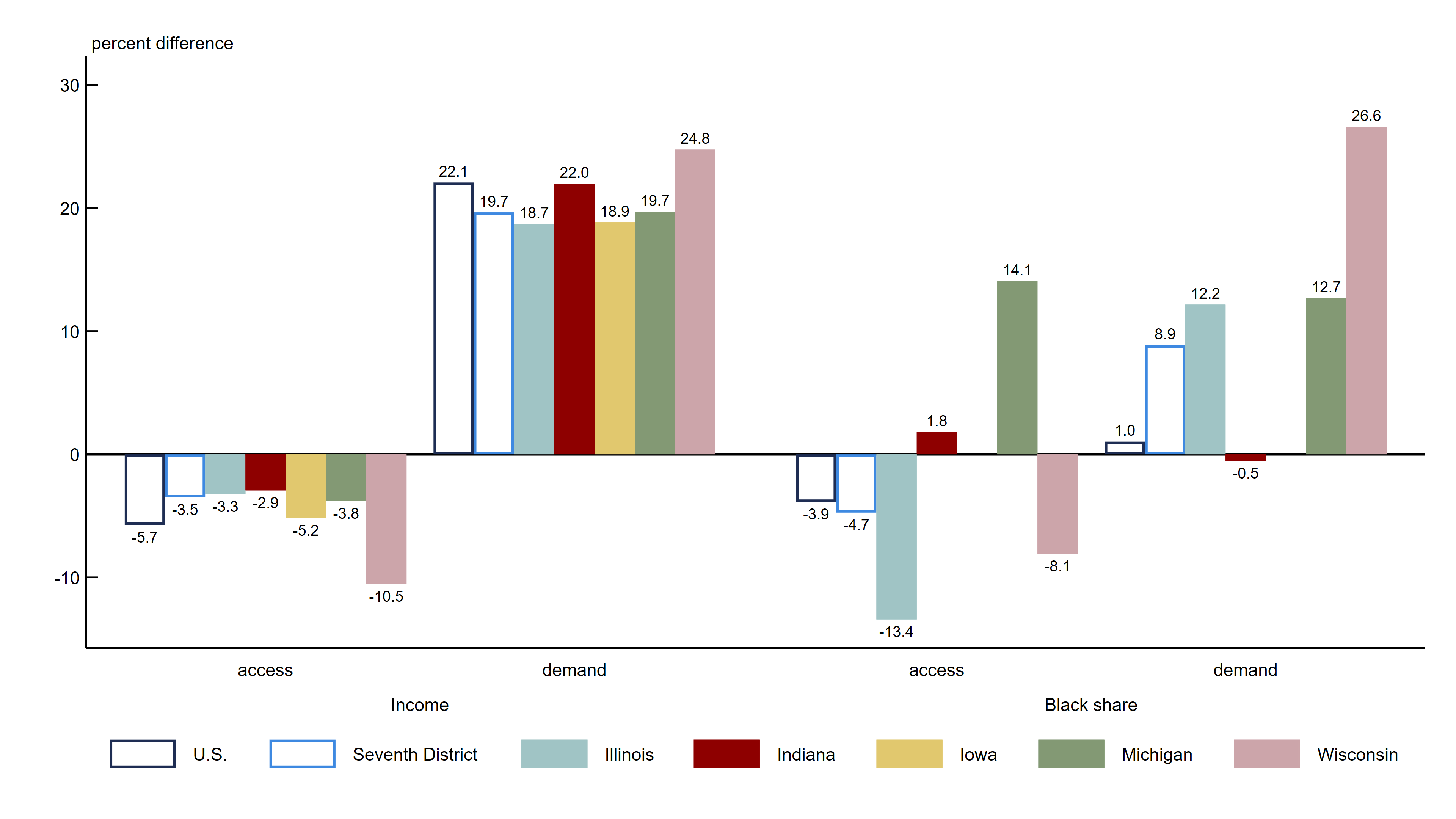
We correlate census block groups’ branch access and demand with their median income and Black population share while controlling for a set of demographic and geographic characteristics.8 Figure 4 plots the relationship between income or Black population share and branch access and demand for the U.S., the Seventh District, and the five states within the District (see note 1). To understand the relationship with income, we plot how much more access or demand is seen for a neighborhood with twice as much household income as another. To understand the relationship with racial composition, we plot how much more access or demand is seen by an all-Black neighborhood relative to an all-White neighborhood.
4. Bank branch access and demand in 2018–19: Variation by income or race and by geography
Sources: Authors’ calculations based on data from SafeGraph, the Federal Deposit Insurance Corporation, and the U.S. Census Bureau, American Community Survey (ACS), five-year estimates for 2007–11.
The results show that Seventh District patterns closely mirror national trends. For income, higher-income neighborhoods show lower branch access but much higher demand for branches across all geographies. All geographies show a negative income–access relationship, meaning higher-income areas have lower access. Holding other neighborhood characteristics constant, doubling a neighborhood’s median household income corresponds to 5.7% lower access nationally and 3.5% lower access for the Seventh District—and among Seventh District states, 2.9% lower access in Indiana and up to 10.5% lower access in Wisconsin. The negative income–access relationship is likely driven by several factors that cannot be determined directly through our analysis; however, some plausible explanations may include increased distance between housing units and areas of commercial activity in higher-income neighborhoods, as well as increased adoption of digital banking among high-income households relative to low-income households.
The income–demand relationship is strongly positive. Holding other factors constant, doubling a neighborhood’s median household income corresponds to 22.1% higher demand for branches nationally and 19.7% higher demand for the Seventh District. Hence, higher-income neighborhoods show substantially higher underlying demand for branch services. The income–demand patterns are also consistent across Seventh District states, where a neighborhood with twice as much household income has roughly 19% higher demand in Illinois and up to almost 25% higher demand in Wisconsin. This consistency in higher demand across all five Seventh District states suggests that economic factors driving demand operate similarly throughout the region.
With regard to racial composition, neighborhoods with higher Black population shares face lower branch access nationally and in the Seventh District. An all-Black neighborhood compared with an all-White one has 3.9% lower access nationally and 4.7% lower access across the Seventh District as a whole. However, the patterns vary across the individual Seventh District states.9 Branch access for an all-Black neighborhood relative to an all-White one is estimated to be 13.4% lower in Illinois, whereas in Michigan, access is 14.1% higher for an all-Black neighborhood relative to an all-White one.
In contrast, demand patterns show that Black communities demonstrate higher demand for branch services, by 8.9% across the Seventh District as a whole. This is also the case in most District states: Wisconsin shows the strongest pattern at almost 27%, followed by Michigan and Illinois at about 13% and 12%, respectively.10 Some plausible explanations for state differences include, but are not limited to, differences in small business activity (requiring increased in-person interactions) and preference for in-person versus mobile or online banking.. For example, for Black communities in Wisconsin, there may be increased preference for building relationships with bankers face to face. It is also possible that if financial circumstances are more challenging or more complex among Black communities (relative to those among their White counterparts) in Wisconsin, in-person banking may not be easily substituted for online alternatives.
These neighborhood-level patterns highlight important differences in branch demand and access that are prominent at the state and metropolitan level.11 The differences by race in branch access are particularly notable in Illinois and Wisconsin, while the income–demand relationships are generally more consistent across Seventh District states.
Where bank branch access fell the most
Understanding which neighborhoods experienced the steepest declines in bank branch access between 2011 and 2024 provides insights into how banking industry changes have affected different communities. By examining changes in access over time while controlling for neighborhood characteristics, we can identify whether certain types of communities bore a disproportionate burden during the era of widespread branch closures. Importantly, the pattern of branch access decline varies across the Seventh District states and metropolitan areas.12
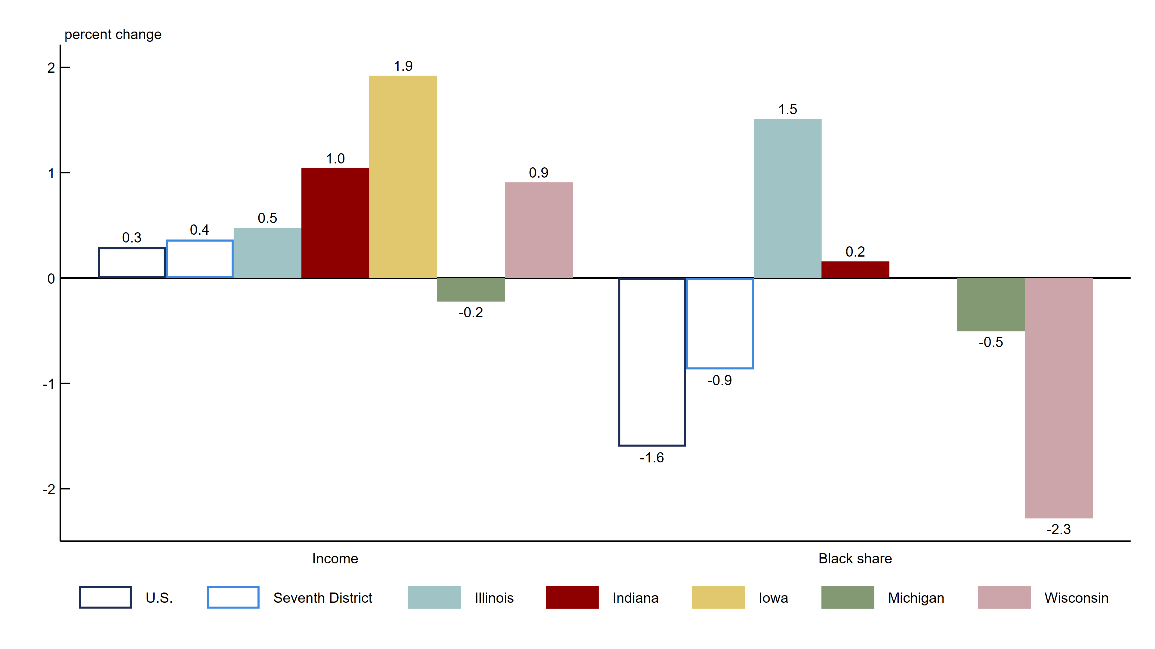
We first measure the change in branch access from 2011 through 2024 within each census block group. The left half of figure 5 shows that with other demographic and geographic factors held constant, how much more (or less) branch access changed over the period 2011–24 in neighborhoods with twice the median household income; the right half of figure 5 shows the analogous gap between all-Black and all-White neighborhoods.13 Recall that bank branch access dropped virtually everywhere across the Seventh District over the period 2011–24 (figure 3). For the Seventh District, a neighborhood with twice as much household income as another experienced smaller declines in branch access of roughly 0.4% between 2011 and 2024; meanwhile, all-Black neighborhoods experienced larger declines in access of roughly 0.9% relative to all-White neighborhoods over the same period.
5. Change in bank branch access over the period 2011–24: Variation by income or race and by geography
Sources: Authors’ calculations based on data from SafeGraph, the Federal Deposit Corporation, and the U.S. Census Bureau, American Community Survey (ACS), five-year estimates for 2007–11.
As shown in figure 5, the patterns are mixed across the Seventh District states. For patterns by income, Indiana shows a positive relationship of 1%, suggesting that higher-income areas actually experienced smaller declines in branch access compared with lower-income areas. For patterns by race, Illinois shows a positive relationship of 1.5%, indicating that predominantly Black neighborhoods experienced smaller declines in branch access compared with similar White neighborhoods. Though the remaining states show mixed patterns between income or race and the change in access relationship, the estimates are not precise enough to claim discernible relationships (see note 13).
Conclusion
Our analysis of bank branch access and demand across the Seventh District reveals both the persistence of regional and state differences and the complex factors that drive them. The value of separating access from demand when studying the differences in usage of banking services is clear with this neighborhood-level measurement approach.
Differences in branch usage by income and race reflect distinct underlying mechanisms. Lower-income neighborhoods generally have higher access but lower demand for branch services. In contrast, predominantly Black neighborhoods face lower access despite having equal or higher demand for such services relative to predominantly White neighborhoods.
These findings have direct implications if policymakers seek to increase usage of formal banking services. Efforts to expand participation in formal banking services through increased branch presence would have their greatest impact in predominantly Black communities, where limited access rather than low demand appears to drive reduced branch usage. Programs targeting low-income communities might be more effective if they address challenges to banking participation, such as minimum balance requirements, unpredictable account fees, or low financial literacy, rather than simply increasing branch density because lower demand rather than access reduces usage.
Historical trends since 2011 show that branch access has declined across the Seventh District (recall figure 3), but not uniformly. The steepest declines occurred around major metropolitan areas and in transitional urban–suburban zones. Moreover, state variations within the Seventh District highlight the importance of local market conditions in shaping banking access patterns (see figures 4 and 5). These variations suggest that policy responses may need to be tailored to local conditions rather than applied uniformly across the region.
The methodology developed here provides a possible framework for ongoing monitoring of banking access that could inform both policy decisions and private sector responses. By tracking access and demand measures over time, interested parties can identify emerging differences by demographics and geography and evaluate the effectiveness of interventions designed to promote greater participation in formal banking services.
Details for Ila Gupta and Jung Sakong are available on their Chicago Fed online profiles (accessed by clicking their respective names in the byline). Alexander K. Zentefis is an assistant professor of finance at the Leavey School of Business at Santa Clara University and a visiting scholar at the Federal Reserve Bank of Chicago.
Notes
1 Throughout this article, when we discuss Seventh District data, those are for areas only within the official boundaries of our Federal Reserve District; however, when we discuss data for individual Seventh District states (namely, Illinois, Indiana, Iowa, Michigan, and Wisconsin), those are for the entirety of those states (including those areas of Illinois, Indiana, Michigan, and Wisconsin that fall outside the official boundaries of the Seventh District).
2 Authors’ calculations based on data from the 2019 FDIC Survey of Household Use of Banking and Financial Services. For further details about this 2019 FDIC survey, see Federal Deposit Insurance Corporation (2020). Other results from our independent analysis of these FDIC survey data for the Seventh District states are available in figure A1 of the appendix.
3 SafeGraph collected and provided the data set of anonymized mobile device movements called Patterns until January 2023, when Advan Research Corporation took over as the data provider.
4 This elasticity (i.e., one variable’s responsiveness to changes in another) is estimated from the gravity model and reflects how visits from a given origin to a given destination vary with the distance between them, conditional on origin and destination fixed effects. It should not be interpreted as the elasticity of any branch use with respect to minimum distance to the nearest branch.
5 See figure A2, panels A and B in the appendix. We use core based statistical areas as defined and determined by the U.S. Census Bureau for metropolitan areas.
6 See figure A2, panel C in the appendix.
7 These percentages reflect changes in access levels rather than absolute access levels. Some Federal Reserve Districts with larger percentage declines may still have higher bank branch access than other Districts with smaller declines.
8 To get the estimation of the difference, we run a linear regression, which is a statistical process that measures the degree of correlation between two variables—an independent (predictor) variable and a dependent (response) variable—while holding constant the other independent variables; the estimated coefficient from a regression represents the mean change in the dependent variable for a one-unit change in the independent variable (and the standard error, which comes up in subsequent notes concerning the results in figures 4 and 5, is the measure of statistical uncertainty for how precisely this relationship is estimated). We regress log access at the census block group level on log median household income, racial/ethnic composition (share of Black, Asian, Hispanic, and other residents), age composition, and log number of mobile devices (weighted by census block group population), comparing within county and within rural–urban classification category. The coefficient on log median household income represents the expected percent higher access for a 1% higher neighborhood median household income. The coefficient on percent Black represents the expected percent higher access for a one-unit higher neighborhood Black share (i.e., 0 to 1, or all White to all Black). To ease interpretation, we plot the estimated percent differences in branch access for 1) doubling median household income or 2) changing to an all-Black neighborhood from an all-White neighborhood.
9 Iowa’s estimates for racial composition are not included as they are often imprecise on account of limited variation in Black population shares across the state's neighborhoods, making it difficult to derive reliable statistical estimates.
10 All the income–access, income–demand, race–access, and race–demand relationships presented in figure 4 are precisely estimated except for the Indiana and Wisconsin race–access and U.S., Indiana, and Iowa race–demand relationships. Standard errors for all these estimates are available upon request.
11 For a similar analysis at the metropolitan area level, see figure A3, panel A in the appendix.
12 For a similar analysis at the metropolitan area level, see figure A3, panel B in the appendix.
13 To get the estimation of the change, we run a linear regression (as defined in note 8). We regress change in log access at the census block group level on log median household income, racial/ethnic composition (share of Black, Asian, Hispanic, and other residents), age composition, and log number of mobile devices (weighted by census block group population), comparing within county and within rural–urban classification category. The coefficient on log median household income represents the expected percent higher change in access for a 1% higher neighborhood median household income. The coefficient on percent Black represents the expected percent higher change in access for a one-unit higher neighborhood Black share (i.e., 0 to 1, or all White to all Black). To ease interpretation, we plot the relationship between 1) doubling median household income or 2) changing to an all-Black neighborhood from an all-White neighborhood and the percent change in bank branch access over the period 2011–24. All relationships between income or race and change in branch access over time reported in figure 5 are precisely estimated except for the Illinois, Iowa, Michigan, and Wisconsin relationships between income and change in branch access and the Indiana, Michigan, and Wisconsin relationships between race and change in branch access. Standard errors for all these estimates are available upon request.