Regional Differences in Home Price Growth Since the Start of Covid-19 Are a Continuation of Long-Run Trends
Soon after the start of the Covid-19 pandemic, the housing market in the United States began booming. From January 2020 through August 2022, the price of the typical U.S. home increased by 40% according to the Zillow Home Value Index (ZHVI).1 Home prices have eased some since the summer of 2022, but they remain much higher than they were a few years ago. In this post, we explore the rise in home prices in the U.S. since the pandemic began and how growth in home prices has varied by region. We find that metropolitan statistical areas (MSAs) in the South and the West have experienced the most significant growth in prices since the pandemic started. We then examine how regional differences in the recent run-up in prices fit into the evolution of regional home prices since 2000. We show that what’s happened recently is an acceleration of trends that started in the recovery from the late 2000s housing bust and that now, homes in the Midwest are easily the most affordable.
Home prices are much higher than they were before the pandemic
In January 2020, the typical U.S. home cost $248,000 according to the ZHVI—which is calculated as the average price of homes within the 35th to 65th price percentiles for a place (also known as a trimmed mean).2 By August 2023 the ZHVI had moved up to $350,000, amounting to a 41% increase. This dramatic price jump occurred during a time of rapid aggregate inflation, but even after adjusting for inflation, the typical home price had increased by 19%, which comes out to a real appreciation rate of 5% per year.3 Figure 1 displays the full evolution of the ZHVI in nominal and August 2023 dollars. Most of the price run-up occurred from the middle of 2020 through August 2022, after which home prices declined for some months. More recently, prices have started moving up again a bit.
1. The average home price in the United States has risen substantially since January 2020
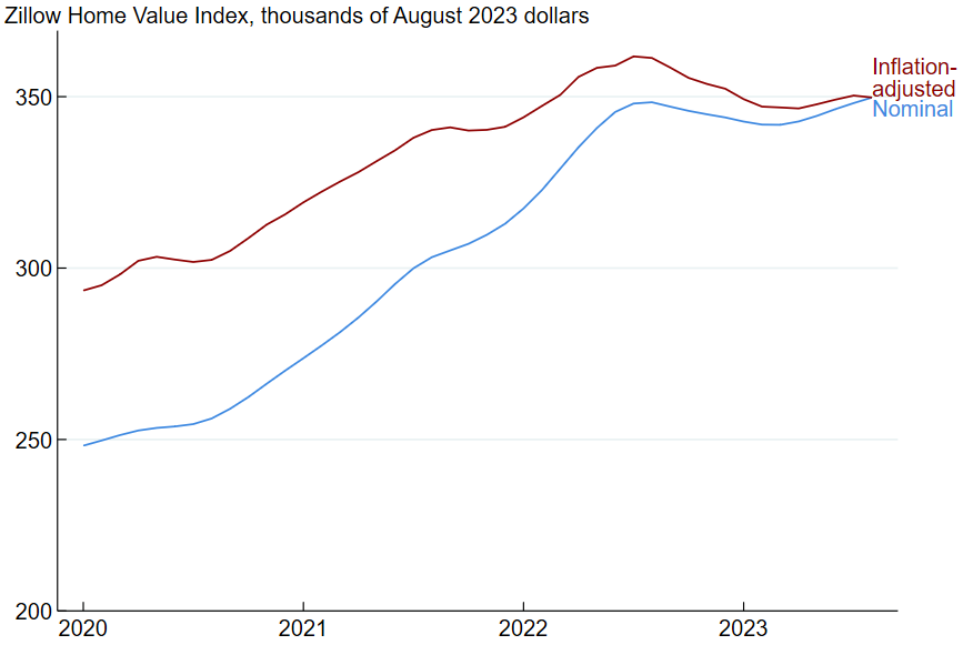
Source: Authors’ calculations based on data from Zillow from Haver Analytics.
What was behind the steep increase in prices? Economists are still working on answering this question, but some plausible answers have already emerged. The price rise was likely the result of both strong growth in demand and tight limits on supply. There were several factors that contributed to strong demand. First, the pandemic led many households to spend more time at home and to start using homes as work or educational spaces.4 Second, historically low mortgage rates reduced the cost of borrowing. Third, pandemic-related barriers to spending outside of the home and large federal government stimulus payments pushed up the amount of household savings available for down payments.5 On the supply side, supply chain problems and rapidly rising wages for construction workers led to higher homebuilding costs.6
Starting in August 2022, inflation-adjusted house prices declined for a few months and then roughly leveled off. The drop in prices is linked to a steep increase in mortgage rates. According to data from Freddie Mac, the 30-year mortgage rate was around 3% at the end of 2021, but jumped to about 6% by the middle of 2022 and has been near 7% since the fall of 2022.
Home price appreciation has been uneven across U.S. metro areas
As we noted before, the typical home price in the U.S. has risen by 19% since January 2020, according to the ZHVI (after adjusting for inflation). But home price growth within individual MSAs has varied significantly. Seventy-seven metro areas saw home prices rise by more than 25% (including Atlanta, Dallas, and Miami), while home prices actually declined in ten MSAs (including Beaumont, TX, Lafayette, LA, and Shreveport, LA). Figure 2 shows how home prices (adjusted for inflation) changed from January 2020 through August 2023 for all metro areas in the contiguous United States. One thing the map makes clear is that there is an important regional component affecting recent home price growth: Metro areas in the South and West have tended to see more appreciation than those in the Northeast and Midwest.
2. Metro areas in the Southeast and Southwest generally saw the fastest home price appreciation
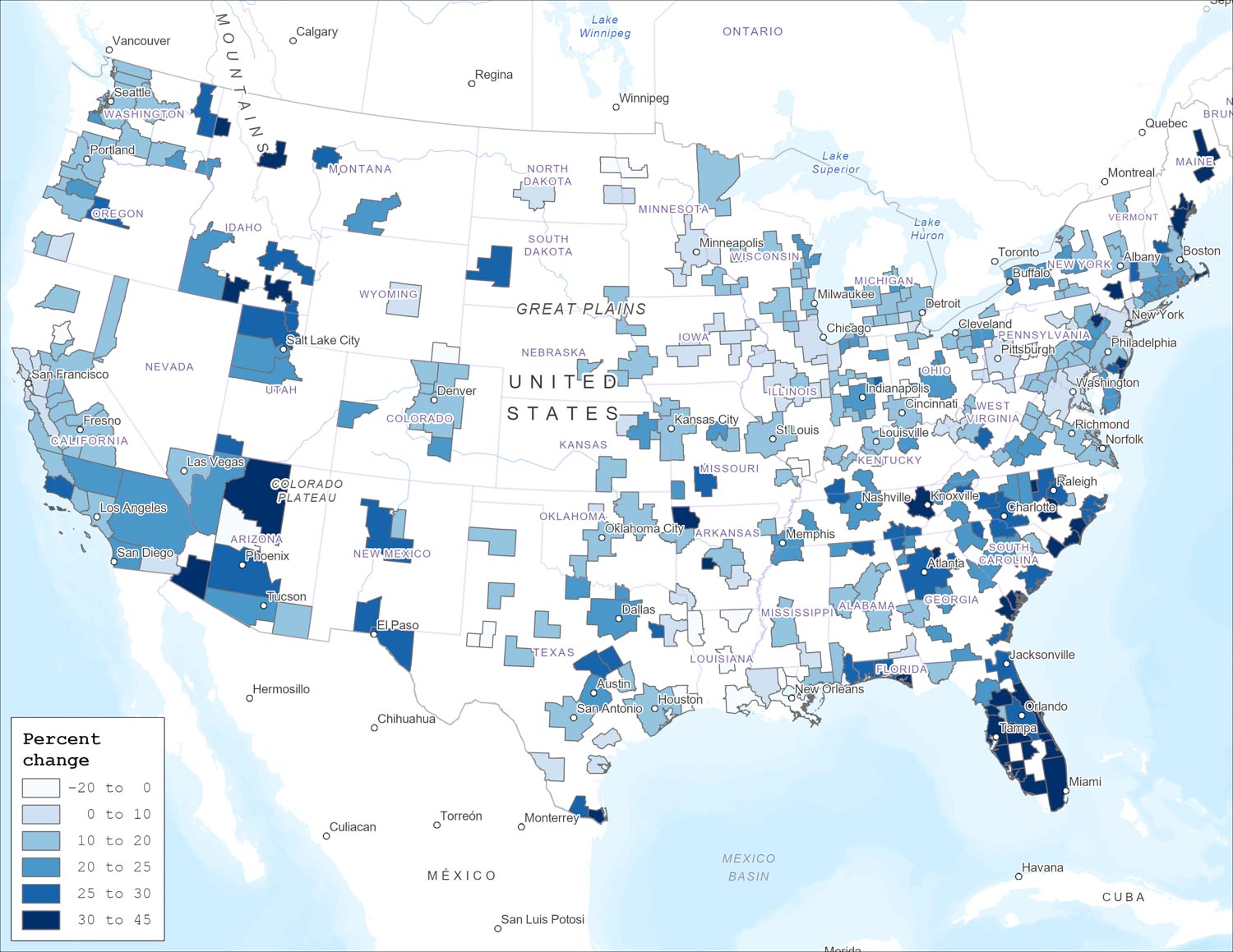
Sources: Authors’ calculations based on data from Zillow from Haver Analytics; and ArcGIS.
Pandemic-era home price changes were an acceleration of longer-run trends
In this section, we explore how regional home prices have evolved over a longer period of time than just the past few years. To do so, it is first important to understand that the broader region in which an MSA is located matters a lot for that MSA’s average home price. Figure 3 shows the ZHVI price level for metro areas as of August 2023; in this map, a darker shade of blue indicates a higher typical home price. (Note that when making regional price comparisons, the ZHVI does not adjust for differences in places’ housing stocks, such as differences in average square footage or average age.) While there are exceptions, home prices in MSAs in the West and Northeast are generally higher than home prices in MSAs in the Midwest and South. Prices in some California MSAs are remarkably high, according to the ZHVI: In August 2023, the typical house cost $1.4 million in San Jose and $1.1 million in Santa Cruz and San Francisco.
3. Home prices are much higher in the West and along the East Coast than in the middle of the country
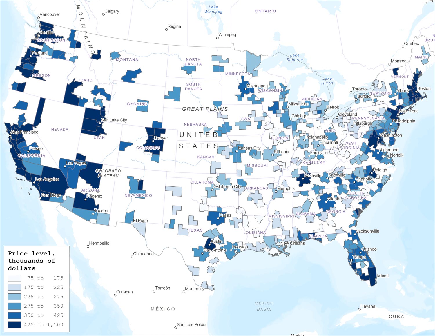
Sources: Zillow from Haver Analytics; and ArcGIS.
A second important factor for an MSA’s home price is its population. In figure 4 we show a relationship that many readers will know intuitively—homes in bigger MSAs tend to cost more. The relationship holds within and across regions, and we highlight within-region relationships in figure 4, where we’ve drawn fit lines and color-coded individual MSAs by region.7 Note that both the horizontal axis (population) and vertical axis (ZHVI) are displayed on a logarithmic scale so that the relationship is approximately linear. The fit lines capture both the fact that there are significant differences in average home prices across regions (e.g., the yellow line for the West is higher than the red line for the Northeast) and that homes get more expensive as population increases (the lines slope upward). The relationship between population and home price is similar for the West, Northeast, and Midwest, but it is stronger in the South because home prices in large southern MSAs are close to those in large northeastern MSAs, while home prices in small southern MSAs are close to those in small midwestern MSAs.
4. There is a positive relationship between metro area population and home price within U.S. regions
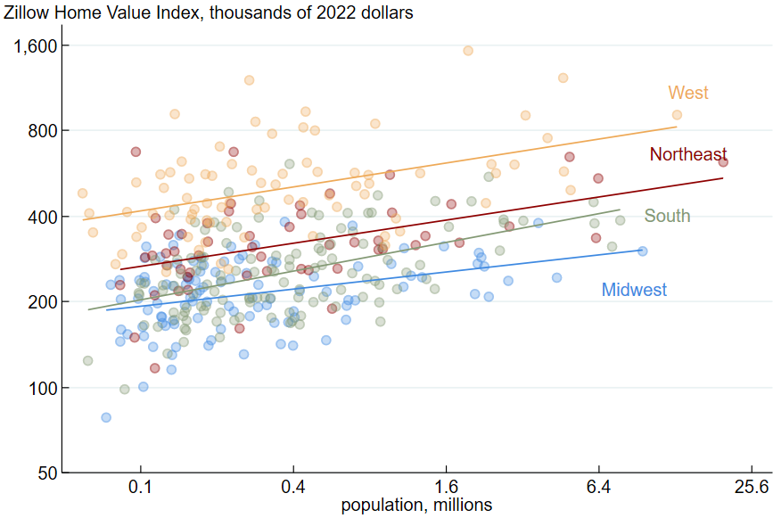
Sources: Authors’ calculations based on data from Zillow and the U.S. Census Bureau from Haver Analytics.
To track the evolution of home prices for U.S. regions over time, we pick a summary measure of the data in figure 4 and apply it across time periods. Our approach is to use the estimated ZHVI for an MSA with a population of 2 million from each region’s fit line. We choose a population of 2 million because the median U.S. resident lives in an MSA close to that size. As an example of our procedure, the blue fit line in figure 4 estimates that in 2022, the typical home in a metro area with 2 million people cost $258,000 in the Midwest and $633,000 in the West. We do this procedure for each year going back to 2000, and we display the results in figure 5, where prices are in 2022 dollars.8
5. The recent run-up in home prices was an acceleration of post-housing-bubble trends
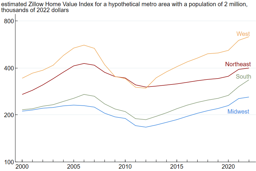
Sources: Authors’ calculations based on data from Zillow and the U.S. Census Bureau from Haver Analytics.
The long-run perspective on home price changes across regions provided by figure 5 demonstrates that the faster growth of prices in the South and West in the pandemic era was an extension of trends that had started in the recovery from the late 2000s housing bust. For most of the 2010s, home price growth was faster in the West and South than in the Northeast and Midwest. Home price growth accelerated everywhere during the pandemic, but the acceleration was higher in the South and West. These trends are consistent with greater population growth in the South and West, since population growth tends to push up home prices.9
There are a few other interesting findings to note from figure 5. First, the recent run-up in prices pushed home values higher than they were at the peak of the mid-2000s bubble in most regions, except for in the Northeast. Second, the West has been the most expensive region in which to buy a home since at least 2000 except for a few years after the housing bubble burst in the late 2000s. The gap between the West and Northeast is now larger than it was in the mid-2000s. Third, in the early 2000s, the South and the Midwest had similar home prices. The South became modestly more expensive than the Midwest in the mid-2000s, and the gap grew slowly until the pandemic, when home prices in the South grew at the fastest rate of anywhere in the country. The South is now closer to the Northeast in terms of home prices than it is to the Midwest, making the Midwest easily the most affordable part of the country.
Conclusion
Our review of the evolution of regional home prices since 2000 found that pandemic-era developments were a continuation of trends that started in the recovery from the housing bust of the late 2000s. Home prices in the South and West had already been growing faster than in the Midwest and Northeast prior to the pandemic, and the pandemic accelerated the trends. The continuation of pre-pandemic regional home price trends during the pandemic era is in line with results from an earlier Midwest Economy post, which found that a state’s pre-pandemic employment growth rate is a strong predictor of its pandemic-era growth rate. In other words, for both home prices and employment growth, pre-pandemic trends are predictive of pandemic-era trends. While the pandemic has had a strong and likely lasting effect on the U.S. economy in many ways, it does not appear to have altered the relative economic trajectories of U.S. regions.
Notes
1 Zillow Home Value Index data are available online.
2 See Hryniw (2019) on Zillow’s website for more details.
3 This is calculated as a compound annual growth rate, which is the fixed rate of growth that transforms the price level at the start of the reference period to the level at the end. The formula is $100\times\left(\left(\frac{{Price}_{Jan\ 2020}}{{Price}_{Aug\ 2023}}\right)^{^1/_{3.583}}-1\right)$.
4 See Gamber, Graham, and Yadav (2023) and Mondragon and Wieland (2022).
5 See Abdelrahman and Oliveira (2023).
6 See Coulter et al. (2022).
7 We assigned metro areas to one of the four regions based on the analysis of Hagler (2009). Metro areas not covered by Hagler’s megaregion definitions are assigned to whichever megaregion is closest. We assign metro areas in the Arizona Sun Corridor, Cascadia, Front Range, Northern California, and Southern California megaregions to the West; the Great Lakes megaregion to the Midwest; the Gulf Coast, Piedmont, Southern Florida, and Texas Triangle megaregions to the South; and the Northeast megaregion to the Northeast.
8 Our specific procedure is the following: For the years 2000 through 2022 and separately for each region, we estimate the regression model $\ln{\left({ZHVI}_m\right)}=\unicode{x03B1}+\unicode{x03B2}\ln{\left({Population}_m\right)}+\unicode{x03B5}_m$, where m indexes MSAs in a given region; ZHVI is the Zillow Home Value Index for a metro area; Population is the population of an MSA; α is a constant; β is the association between the natural logarithm of Population and ZHVI; and ε is an error term. We then evaluate the expression $Estimated\ ZHVI=e^{\left(\hat{\unicode{x03B1}}+\hat{\unicode{x03B2}}\ln{\left(2,000,000\right)}\right)}$ for each region and year. (In general, a regression model is a statistical method that estimates the strength of relationships between variables.)
9 See Saiz (2007).


