The Pandemic Business Cycle Is an Outlier for State Economies
Business cycles are periodic fluctuations in economic activity around its long-term historical trend. Over the past 70 years, the U.S. economy has gone through several business cycles, with each one involving a recession phase and expansion phase.1 No business cycle is exactly the same in terms of what led to the recession, which sectors of the economy were most adversely affected, and how the expansion took shape, but most business cycles share some characteristics. That said, the Covid-19 pandemic recession and the subsequent expansion—hereafter referred to as the “pandemic cycle” or “pandemic era”—have less in common with those of other business cycles.
The pandemic cycle is a notable outlier in many regards. First, the pandemic cycle has progressed much more rapidly than previous cycles. The New York Fed’s Weekly Economic Index indicates that the pandemic recession lasted just six weeks and that real gross domestic product (GDP) returned to its pre-recessionary peak about one year after the start of the cycle (because GDP trends upward over time, this does not represent a full economic recovery). The pandemic recession’s length and the time in expansion needed to get back to the pre-recessionary level of GDP were both far briefer than the historical averages. For the ten recessions that began between July 1953 and December 2007, the average time in recession was 3.7 quarters and the average time in expansion before returning to the previous GDP peak was 5.6 quarters. Second, along with its unprecedented speed, the pandemic recession was much deeper than prior recessions. And third, the pandemic recession was unusual in that it hit the leisure and hospitality sector the hardest; during most modern recessions, manufacturing has suffered the most. Given that the pandemic cycle is an outlier among business cycles for the United States as a whole, we would also expect it to be an outlier in how it has affected individual state economies.
In this post, we track how states’ economies have differentially evolved during the pandemic era and compare the results with those of prior business cycles. To track states’ economies, we focus on two key predictors of a state’s relative economic performance during the pandemic era and previous business cycles: a state’s pre-recessionary employment growth and the size of a state’s initial employment loss—what we refer to as its “recession size.” Two previous Midwest Economy blog posts—one published in February 2022 and the other in May 2022—demonstrated that two years into the pandemic cycle, both measures strongly predict overall employment change since the start of the pandemic.2 In what follows, we first document how the prediction strength of the two measures has changed during the pandemic era. We then compare these two measures’ evolutions over the pandemic cycle with their evolutions over earlier business cycles. We find that across states the pandemic cycle is playing out much more rapidly than past business cycles and that pre-recessionary growth has become a much stronger predictor of economic performance than it’s been historically. This suggests that the recession caused by the Covid-19 pandemic might leave a lighter imprint on states’ employment levels than recessions typically do.
The pandemic cycle
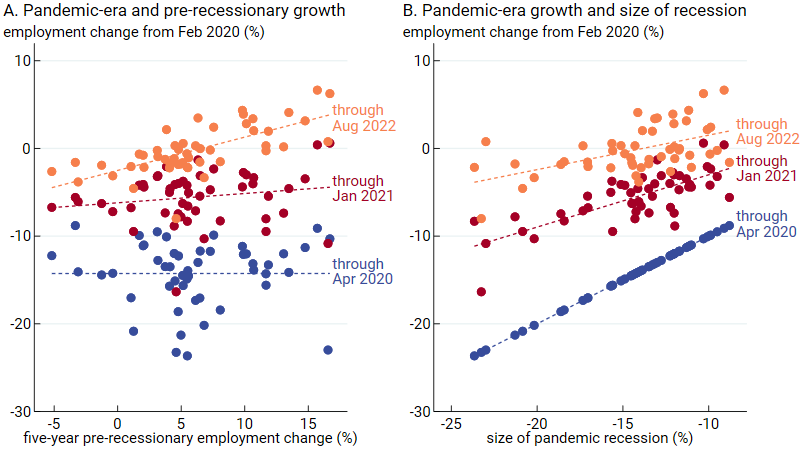
We start by building on two earlier Midwest Economy blog posts that demonstrated that pre-recessionary growth and recession size (both measured by the percent change in nonfarm payroll employment over time) predict state employment growth two years into the pandemic era.3 Figure 1 shows that the strength of these predictive relationships has changed as the pandemic cycle has matured. In panel A of figure 1, we display the relationship between states’ pre-recessionary growth (measured as the change in employment over the five years leading up to the pandemic recession) and their changes in employment from February 2020—the pre-recessionary peak (see note 3)—through three different points in the pandemic cycle. The orange dots in panel A represent the relationship documented in one of the earlier posts: States with stronger pre-recessionary growth tend to have stronger pandemic-era growth when the pandemic era is defined as February 2020 through August 2022. However, as depicted by the blue dots in panel A, if the pandemic era is defined solely as its recessionary part (February through April 2020), the relationship is essentially flat, meaning that pre-recessionary growth has no predictive power. The red dots show the recovery path of the pandemic cycle when the pandemic era is defined as February 2020 through January 2021. This relationship is only slightly positive, but it’s moving toward the relationship shown by the orange dots. Together, the lines in panel A indicate that the relationship between pre-recessionary growth and pandemic-era growth has been strengthening over time (the slope of the dashed lines is increasing), as factors driving long-run differences in employment growth across states have time to show through again.
1. Evolution of the relationship between states’ employment changes since February 2020 and states’ pre-recessionary growth or pandemic recession sizes
Source: Authors’ calculations based on data from the U.S. Bureau of Labor Statistics from Haver Analytics.
Panel B of figure 1 presents the relationship between the size of states’ pandemic recessions (measured as the change in employment from February through April 2020) and their employment changes from February 2020 through the same three points in the pandemic cycle used for panel A. As in panel A, the orange dots in panel B show the positive association documented in an earlier post. This time, however, the blue dots represent a perfectly positive relationship because the variables of the horizontal and vertical axes in this case are identical: The size of the pandemic recession is defined as the employment change from February through April 2020. The red dots show that as of January 2021, the relationship was weaker than that represented by the blue dots, but not as weak as that represented by the orange dots. Although the relationship in panel B has been weakening as the pandemic era matures (the slope of the dashed lines is decreasing), the relationship remains robust more than two years later. Taken together, panels A and B of figure 1 show two solid predictors of states’ economic performance—with one growing stronger and the other growing weaker over time.
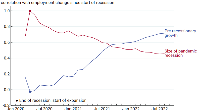
Figure 2 displays the full, month-to-month progressions of the changing predictive power of pre-recessionary growth and recession size over the pandemic era, as measured by the correlation coefficient.4 So, for instance, the April 2020 value of the blue, pre-recessionary growth line in figure 2 (–0.03) is the correlation coefficient for the blue dots plotted in panel A of figure 1; and the August 2022 value for the red, size of recession line in figure 2 (+0.46) is the correlation coefficient for the orange dots plotted in panel B of figure 1. In figure 2, we mark the April 2020 correlations with dots to highlight the point in the cycle when the recession ended and the expansion began. The positive correlation shown by the red line for March 2020 indicates that states’ declines in employment between February and March of 2020 are predictive of the declines from February through April 2020, but not perfectly so. In April 2020, our size of recession measure is fully realized, which is why the correlation for that month is 1 (see note 4). From this figure, we can see clearly how the predictive power of pre-recessionary growth has been steadily increasing, while the predictive power of recession size has been steadily decreasing.
2. Month-to-month evolution of the correlation between states’ employment changes since February 2020 and states’ pre-recessionary growth or pandemic recession sizes
Source: Authors’ calculations based on data from the U.S. Bureau of Labor Statistics from Haver Analytics.
The paths shown in figure 2 raise a few questions: How much further should we expect the progressions to go? Past employment trends will never perfectly predict future ones, but how much stronger might the relationship between pre-recessionary growth and pandemic-era growth get? And should we expect harder-hit states to fully catch up to other states so that the correlation between recession size and pandemic-era growth goes to zero? As we will see in what follows, while the pandemic cycle is an outlier in many ways, the opposing paths of the correlations in figure 2 are what typically happens with states’ economies as they recover from a recession: Places that had deeper recessions bounce back so that relative recession size matters less and less, while prior differences in states’ long-run growth rates matter more and more. Yet, on average, the blue line never reaches 1 and the red line never reaches 0.
Previous cycles
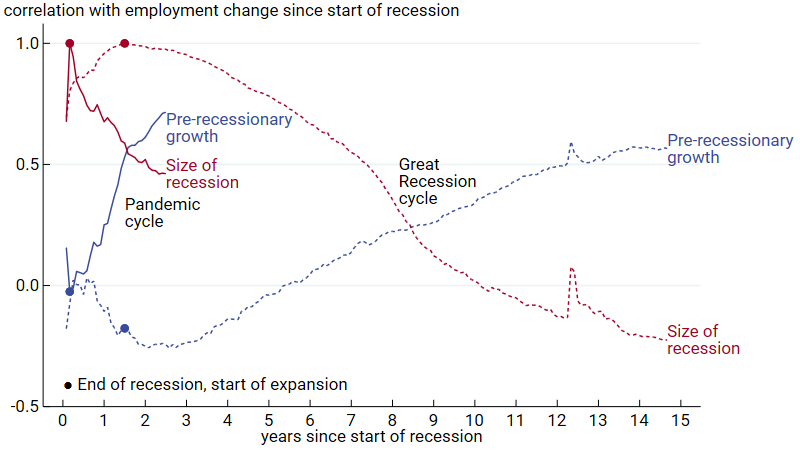
To get an idea of where the correlations shown in figure 2 might be headed over the long run—including beyond the start of a subsequent recession—we now turn to what happened after the start of previous business cycles. We begin with a comparison of the pandemic cycle and the Great Recession cycle, which we explore in figure 3. Zero on figure 3’s horizontal axis is the date of the pre-recessionary business cycle peak (February 2020 for the pandemic recession and December 2007 for the Great Recession). Overall, the same pattern is present in both cycles: Pre-recessionary growth (blue lines) has little predictive power to start, but its power increases over time; meanwhile, recession size (red lines) has very strong predictive power to start (reaching 1 by construction when the recession ends), but its power declines over time. For the Great Recession (dashed lines), nearly 15 years later the pre-recessionary growth correlation appears to have settled at around +0.6, while the recession size correlation has turned negative and is now at around –0.2, meaning that states with larger recessions now have higher employment levels.
3. Evolution of the correlation between states’ employment changes since the start of a business cycle and states’ pre-recessionary growth or recession sizes: Pandemic cycle versus Great Recession cycle
Source: Authors’ calculations based on data from the U.S. Bureau of Labor Statistics from Haver Analytics.
There are also some clear differences, though, between the two cycles. First, the pandemic cycle has progressed much more rapidly than the Great Recession cycle did. Also, for the Great Recession cycle, the pre-recessionary growth correlation was in negative territory for a while, meaning that states hit hardest at the endpoint of the recessionary period were growing faster prior to the recession. However, five years into the Great Recession cycle, the correlation sign flipped and became quite large. These patterns are consistent with the fact that the Great Recession cycle was closely tied to the housing market. Before the Great Recession, the fastest-growing places were those with the largest housing booms, so they were the places with the largest declines when the Great Recession hit. The housing boom story also helps explain why the correlation coefficient for recession size turned negative for the Great Recession cycle around the ten-year mark: States with housing booms tended to have better long-run growth prospects.
In figure 3, the pandemic cycle shows up in the Great Recession cycle’s progression in year 12. The rise in correlation values in year 12 indicates that states with faster employment growth before the Great Recession and with larger employment declines during the Great Recession did relatively better at the start of the pandemic cycle. The pandemic effects in the Great Recession (dashed) lines appear to have gone away by the end of the observation period.
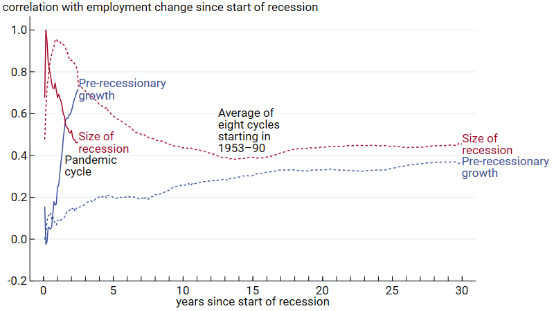
Because each business cycle has its own story, we are also interested in how states’ experiences of the pandemic cycle compare with their experiences of cycles other than the Great Recession cycle. In figure 4, we compare the pandemic cycle’s progression with the average progression across the eight business cycles that started between 1953 and 1990. By stopping the analysis with the business cycle that started in 1990, we are able to examine states’ experiences over the first 30 years from the start of each of the eight cycles. The design of figure 4 is nearly identical to that of figure 3; however, the dashed lines now represent the average of the correlations across the eight cycles that started between 1953 and 1990.5
4. Evolution of the correlation between states’ employment changes since the start of a business cycle and states’ pre-recessionary growth or recession sizes: Pandemic cycle versus the eight business cycles starting in the period 1953–90
Source: Authors’ calculations based on data from the U.S. Bureau of Labor Statistics from Haver Analytics.
Figure 4 demonstrates that the pandemic business cycle is turning out to be an outlier for a few reasons. First, the rate of change in the pandemic era’s correlations is much higher. Second, the pandemic era’s pre-recessionary growth correlation is on track to settle at a very different place than the eight cycles’ average correlation. It is less clear, though, whether the path of the pandemic cycle’s size of recession correlation will end up looking more like that of the eight cycles’ average correlation (by flattening out at a positive level) or more like that of the Great Recession cycle’s correlation (by dropping to zero or even a negative level). Finally, unlike for business cycles starting between 1953 and 1990, for the pandemic cycle, pre-recessionary growth, rather than recession size, is on track to be more predictive of employment change in the long run. In this respect, the pandemic cycle looks more like the Great Recession cycle than earlier cycles.
Understanding the long-run impact of recessions on states’ economies
Figures 3 and 4 show that business cycles can be quite different in how they play out, but figure 4 also makes clear that when averaging across many previous business cycles, both measures we examine often have lasting predictive power for states’ employment growth. Why is that so? There is a straightforward explanation for the sustained predictive power of pre-recessionary growth: Some determinants of state employment growth are long lasting; and while they may be interrupted by a recession, they should reemerge as the recession moves into the past. It is more complicated to explain the lasting relationship between recession size and employment growth, mainly because business cycles are sometimes presented as short-run fluctuations that are independent of long-run trends. However, figure 4 indicates that recession size typically has a positive correlation with long-run employment change, which means that recessions often have long-lasting effects.
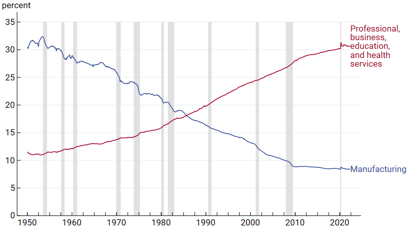
One clear long-lasting effect of many recessions since 1950 is that they accelerated the shift in the national economy from employment in manufacturing to employment in services. Figure 5 shows that the share of workers in manufacturing (the blue line) fell from about 30% in the 1950s to about 8% in recent years. Over the same decades, the share of workers in professional, business, education, and health services grew from about 11% to 31%. This shift has favored jobs growth in states concentrated in services and held back jobs growth in states concentrated in manufacturing (the case for all five Seventh Federal Reserve District states). While some of the shift away from manufacturing has been gradual, figure 5 shows that the blue line representing employment in this sector fell faster during most recessions (represented by shaded bars in the figure); in other words, there was an acceleration in manufacturing employment decline during the majority of downturns. The pandemic recession is once again an outlier in this story because manufacturing’s share of total employment actually went up.
5. Share of total U.S. employment in manufacturing and in professional, business, education, and health services, 1950–2022
Source: Authors’ calculations based on data from the U.S. Bureau of Labor Statistics from Haver Analytics.
At this point, it’s unknown whether or not the pandemic recession will accelerate structural changes to the industrial composition of U.S. employment and have lasting differential effects on states’ employment levels. However, there are a couple of signs that the pandemic recession’s long-term impact may be weaker than those of previous recessions. First, the pandemic cycle is playing out quickly, and the ability of recessions to leave a lasting mark may be a function of their length. Second, the pandemic has not yet resulted in significant changes to the employment shares of the sectors that traditionally fall or rise during recessions, as shown by the blue and red lines in figure 5. That said, the most adversely affected industry during the pandemic—leisure and hospitality—has not yet seen its employment share return to its pre-pandemic level. Prior to the pandemic era, leisure and hospitality’s employment share had been rising over many decades. It remains to be seen whether that trend could reemerge.
Conclusion
In this post we’ve shown that from the perspective of the states, the pandemic business cycle has looked markedly different from previous business cycles. The pandemic recession was very severe, but the recovery has been rapid. States that were hit harder are catching up faster than usual, and long-run pre-recessionary trends are showing up more quickly and strongly than they typically do after a recession. There is still potential for the pandemic recession to have a lasting impact on states’ economies the way that previous recessions often have. But despite the pandemic cycle’s rapid pace, it’s too soon to tell.
Notes
1 The timing of the phases is officially identified by the National Bureau of Economic Research (NBER). In this post, we define a business cycle as a recession and the expansion that follows it (until the next recession begins).
2 Throughout the post we use nonfarm payroll employment data to measure economic performance. While employment is a less comprehensive measure of performance than a state’s gross domestic product (GDP), it is released on a monthly rather than quarterly basis, offering greater precision in measuring the size of the pandemic recession. In addition, note that the NBER classifies the business cycle in terms of GDP growth, not employment growth, though the two often coincide. Note too that peak and trough dates for individual states might differ somewhat from the national NBER dates.
3 In the previous two blog posts, the pandemic era starts in January 2020. But in this post, we define the start of the pandemic era as February 2020, in alignment with when the official NBER recession begins, to facilitate clean comparisons with earlier business cycles.
4 Correlation coefficients range from –1 to +1, with a positive value indicating an upward sloping relationship and a negative value indicating a downward sloping relationship. The coefficient is +1 or –1 if the variables perfectly predict each other. A value of 0 indicates neither a positive nor a negative relationship.
5 The average of the correlations is measured by first calculating the correlations for each individual cycle and then taking the average. Because of differences in when recessions end and expansions start, the average correlation for the size of recession line (red dashed line) never reaches 1 in figure 4, in contrast with the red lines in figure 3.


