State Economies Hit Hardest by the Pandemic Are Still Playing Catch-up
The Covid-19 pandemic caused a massive worldwide economic shock. Within the United States, no region was spared. The state with the smallest employment decline at the beginning of the pandemic—Wyoming—still lost 9% of its workers from January through April of 2020. Moreover, there were six states—Hawaii, Michigan, Nevada, New York, Rhode Island, and Vermont—that saw employment drop by over 20% during the same span. While the economic rebound commenced quickly across the U.S., two years later the pandemic’s impact on states’ employment numbers endures. And just as the pandemic-induced declines in employment varied in size across states, so have their jobs recoveries. About a quarter of states had higher employment in March 2022 than they did in January 2020, but others still have sizable holes to refill. As shown by a Midwest Economy blog post published in February 2022, one important reason for these differences is that states with slower growth rates before the pandemic have recovered more slowly. In this post, we show that the size of the pandemic-induced employment decline between January and April 2020 (hereafter “initial decline”) is also an important factor in how much states have recovered: Those with bigger holes to refill are lagging those with smaller ones. The hardest-hit states have made some progress in catching up, and as the economic impact of the pandemic wanes, they are likely to catch up further (though maybe not completely). But as of March 2022, these differences between states remained meaningful.
As in the February 2022 post we just mentioned, we use nonfarm payroll employment to measure differences in states’ pandemic-era economic performance. While this measure is less comprehensive than gross domestic product by state, it is released on a monthly rather than quarterly basis and goes through March 2022 instead of 2021:Q4. We measure the initial decline as the percent change in employment from January through April of 2020 and pandemic-era growth as the percent change in employment from January 2020 through March 2022. We are interested in whether the initial decline predicts pandemic-era jobs growth. Notably, the time range of our pandemic-era growth measure overlaps with that of the initial decline, which means at least part of their relationship is “mechanical.” The mechanical portion of this relationship can be better understood by considering an alternative measure of pandemic-era growth: Let’s say we defined pandemic-era growth as January–May 2020 instead of January 2020–March 2022. The predictive relationship between the initial decline and this alternative definition of pandemic-era growth would be very strong because the pandemic-era measure adds just one month beyond the initial decline measure. The more months we add to the pandemic era, the more time there is for the relationship to be driven by factors other than the mechanical portion that’s due to the time period overlap. The other factor we are particularly interested in could be called the “rebound effect,” where harder-hit states grow faster after the initial decline because their drops were bigger. A full rebound would mean the initial decline has been completely reversed and has little relationship to pandemic-era growth.1 By including the initial decline in our pandemic-era growth measure, we can easily see how much of a rebound has occurred and, at the same time, how much of an imprint the initial decline has left on states’ economies.
Through March 2022, states’ initial declines remain quite predictive of their pandemic-era growth, as demonstrated in figure 1. The positive association between our two measures means that states with larger initial declines have generally been slower to recover, and those with smaller declines have recovered more quickly. For example, among the ten states with the largest drops at the start of the pandemic, none have returned to their pre-pandemic, January 2020 level. Nevada, which was a fast-growth state prior to the pandemic, is closest, but it still lags far behind other fast-growth states, such as Idaho and Utah.
Turning to states in the Seventh Federal Reserve District, there are noticeable differences in the sizes of the initial declines: Michigan had the largest initial employment decline among all 50 states, while Iowa had one of the smallest. Oddly, though, the positive relationship that we can see across all 50 states does not hold up for the five Seventh District states. Instead, the relationship is essentially flat—there is little difference in pandemic-era growth across the five states. Indiana’s change in employment from January 2020 through March 2022 (0.2% growth) is higher than that of either Illinois, Iowa, or Wisconsin, despite the fact that Indiana experienced a larger initial decline. And Michigan’s pandemic-era growth is only slightly behind that of Illinois, Iowa, and Wisconsin. The mostly likely explanation for the weakness of the relationship among Seventh District states is that five states are too few to pick up the pattern.
1. Association between overall pandemic-era employment growth and the initial pandemic-induced employment decline across U.S. states
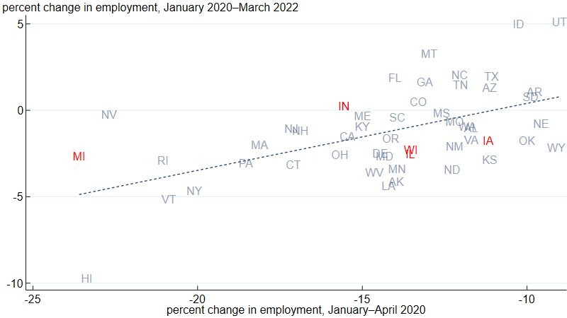
Source: Authors’ calculations based on data from the U.S. Bureau of Labor Statistics from Haver Analytics.
To track the impact of the initial employment shock throughout the pandemic, we divide states into four groups2 (quartiles) based on the size of their employment drops in January–April 2020. In figure 2, we plot each group’s average percent change in employment from their January 2020 levels over time. By design, the fourth quartile saw the largest drop in employment from January through April of 2020, averaging a nearly 20% loss. In contrast, states in the first quartile averaged about a 10% loss. If the economic effects of the pandemic are temporary, we should see the gaps between the quartiles close. So far, this has largely been the case just for the fourth quartile, and primarily through the middle of 2021. Since then, the second quartile has been catching up to the first, but the gaps between the first and third quartiles and between the first and fourth quartiles have been steady.
2. Change in employment from January 2020, by quartile of initial pandemic-induced employment decline
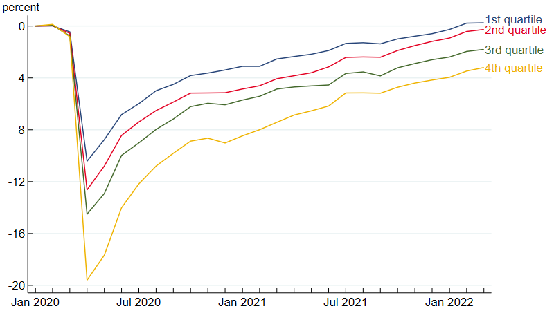
Source: Authors’ calculations based on data from the U.S. Bureau of Labor Statistics from Haver Analytics.
Because of the continuing significance of the pandemic employment shock for current employment levels, it is natural to ask, what can account for the differences in the sizes of the initial declines? There are a couple of clear predictors of initial decline size, but we must emphasize that they are merely predictors (or correlates) and not necessarily causal channels. The first clear predictor is the relative size of the first national wave of Covid deaths in the state: By July 1, 2020, the states with the highest number of Covid deaths per capita were Connecticut, Massachusetts, New Jersey, New York, and Rhode Island—all states that experienced large initial declines. A second clear predictor is industry mix. Leisure and hospitality experienced the largest employment loss of any industry, and the two states with the highest concentrations of leisure and hospitality employment,3 Hawaii and Nevada, saw some of the largest initial employment declines (although in Florida, another state with a lot of tourism, the decline was relatively small). A third factor that may also have played a role was lockdown stringency during the first Covid wave, which varied by state (see this Philadelphia Fed study for details). Determining the relative importance of these three explanations (and potentially others) remains an active area of research. The task is not simple because the explanations are not independent of each other. For example, states with industry mixes (second factor) that include a large share of essential workers may have had larger outbreaks and more Covid deaths per capita (first factor) because a greater share of the population remained at work in person. Another potential complication in determining the relative importance of the first and third factors is that greater lockdown stringency may have limited outbreak size, while at the same time bigger outbreaks may also have led to stricter lockdowns.
The relationship we document in figure 1 raises another question: Why does it persist two years later? This is another area for further research, but we can offer a couple of potential explanations. The first one is, again, industry mix: While overall U.S. employment in March 2022 was 1.0% below its pre-pandemic level, employment in leisure and hospitality was still 9.7% lower. Therefore, it’s not that surprising to see employment in Nevada and Hawaii lagging the national average. The industry mix factor is likely to matter less as the pandemic recedes. Eventually demand for leisure and hospitality services should return and with that, employment in leisure and hospitality. Another potential explanation is that many workers who lost their jobs early in the pandemic have spent a long time out of the labor market, and they may be slow to come back. In some cases they may never come back, and this could leave a permanent imprint on states’ economies. There are undoubtedly factors beyond these two at play as well.
The Midwest Economy blog post we referenced earlier shows that states with faster pre-pandemic employment growth rates have fared better in the pandemic era. So, it is possible that pre-pandemic growth rates are affecting the results shown in figure 2. For this reason, we redo our calculations for figure 2 after removing states’ five-year pre-pandemic (January 2015–January 2020) growth trends from the data. Figure 3 shows visually how we detrend the data, using Iowa as an example. The solid blue line is the actual percent difference in employment for Iowa relative to January 2020. For example, Iowa’s employment was about 2% lower in January 2015 (and in March 2022) compared with where it was in January 2020. The dashed line is what we define as Iowa’s five-year trend growth—the constant monthly rate of change (0.071%) that gets Iowa from its January 2015 employment level to its January 2020 level.4 The portion of the blue dashed line that continues past January 2020 is where Iowa’s employment would have been if it had continued growing at 0.071% per month from January 2020 through March 2022. We calculate the detrended version of Iowa’s employment relative to January 2020—plotted as the solid red line—as the difference between the solid blue line and the dashed blue line. The solid red line therefore measures the gap between Iowa’s actual employment and its pre-pandemic trend. By construction, it is centered on zero in the years leading up to the pandemic and is lower than the solid blue line during the pandemic because Iowa’s trend is positive. One insight from the difference between the solid red and blue lines is that the solid blue line likely overstates how much Iowa’s employment has recovered from the pandemic. It may be tempting to say Iowa’s employment has fully recovered once it reaches its January 2020 level. But Iowa’s employment was trending upward before the pandemic. So, it may be more appropriate to say Iowa’s employment hasn’t fully recovered until it returns to its trend level.
3. Actual and detrended differences in employment from January 2020 for Iowa
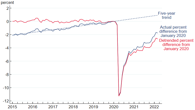
Source: Authors’ calculations based on data from the U.S. Bureau of Labor Statistics from Haver Analytics.
Figure 4 displays the detrended version of figure 2, where we split the states into quartiles5 based on the size of their detrended initial declines and plot for each group the average detrended percent difference in employment from January 2020. As is the case with Iowa, because employment was trending upward for each quartile before the pandemic, the lines in figure 4 are shifted down relative to those in figure 2. That said, the overall pattern is the same in both figures: States with larger initial declines lag states with smaller ones. Also, similar to figure 2, the gaps between the fourth quartile and the first three quartiles were quite large from April 2020 through January 2021 and closed some from January 2021 through March 2022. Overall, the results in figure 4 indicate that the impact of the initial decline on pandemic-era employment does not go away after adjusting for pre-pandemic employment growth.
4. Change in detrended employment from January 2020, by quartile of detrended initial pandemic-induced employment decline
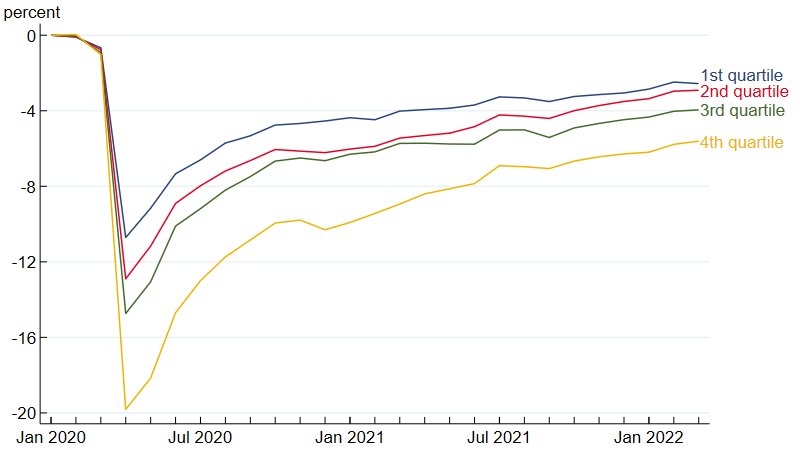
Source: Authors’ calculations based on data from the U.S. Bureau of Labor Statistics from Haver Analytics.
The U.S. economy has come a long way back from the depths it fell to in April 2020, but employment in most states remains lower than it was before the pandemic and lower still when compared with an upward pre-pandemic trend. Two years later, the size of the initial drop in jobs is still a strong predictor of the employment situation in states today. If the effect of the pandemic on states’ employment is largely temporary, this relationship will fade over time, but as of March 2022, it remained quite strong.
Notes
1 To make this point more concrete, consider two states where both experience a negative employment shock in the same month. In response to the shock, employment in the first and second states drops by 10% and 20%, respectively. But then, in the next month, there is a full rebound—where both the 10% and 20% declines in employment are reversed and employment for both states goes back to where it was two months ago. In this case, the size of the employment declines will have no predictive power for the level of employment in the month after the shock.
2 States in the first quartile (with an average initial decline of 10.4%) are Alabama, Arizona, Arkansas, Idaho, Iowa, Kansas, Nebraska, Oklahoma, South Dakota, Texas, Utah, Virginia, and Wyoming. States in the second quartile (with an average initial decline of 12.6%) are Colorado, Georgia, Illinois, Mississippi, Missouri, Montana, New Mexico, North Carolina, North Dakota, Tennessee, Washington, and Wisconsin. States in the third quartile (with an average initial decline of 14.5%) are Alaska, California, Delaware, Florida, Indiana, Kentucky, Louisiana, Maine, Maryland, Minnesota, Oregon, South Carolina, and West Virginia. States in the fourth quartile (with an average initial decline of 19.6%) are Connecticut, Hawaii, Massachusetts, Michigan, Nevada, New Hampshire, New Jersey, New York, Ohio, Pennsylvania, Rhode Island, and Vermont.
3 We are going by concentration as measured by location quotient. See this table for details.
4 This rate is also known as the compound monthly growth rate and is equal to \[100\,\times \ {{\left( \frac{Employment\ in\ January\ \mathit{2020} }{Employment\ in\ January\ \mathit{2015} }\right)}^{1/60}}-100.\]
5 The detrended initial pandemic-induced employment decline is the detrended percent change in employment from January through April of 2020. The quartile groupings are the same for figure 2 (see note 2) and figure 4 except that Ohio is in the fourth quartile in figure 2 and third quartile in figure 4, and California is in the third quartile in figure 2 and fourth quartile in figure 4. The average detrended initial declines were 10.7% for the first quartile, 12.9% for the second quartile, 14.7% for the third quartile, and 19.8% for the fourth quartile.


